18 Lecture 6 Handouts
Advanced visualisations
18.1 Today’s session
Recap advanced data visualisation plots
Creating advanced plots in R
Creating advanced plots in Tableau
18.2 Today’s learning objectives
- Recall what to think about when using charts to display proportions and associations
- Recall what to think about when using charts displaying time data
- Able to create advanced plots in R
- Able to create advanced plots in Tableau
18.3 Recap data visualizations plots
18.3.1 Scatter plots
Very useful for:
Displaying a association between two continuous variables
Exploration
When aggregation is not required or preferred
Think about:
Axis - independent variable preferably on x-axis
Formatting of points
Annotate
18.3.2 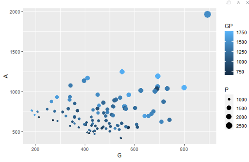
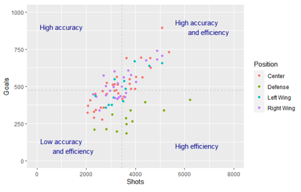
18.3.3 Quadrants
Builds on the scatter plot
Divides area into 4 to indicate main message for each area.
Can be very effective to share main points
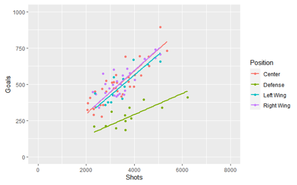
18.3.4 Associations/ regression plots
Builds on the scatter plot
Adds statistical information to a graph
Useful to see differences in trends between groups
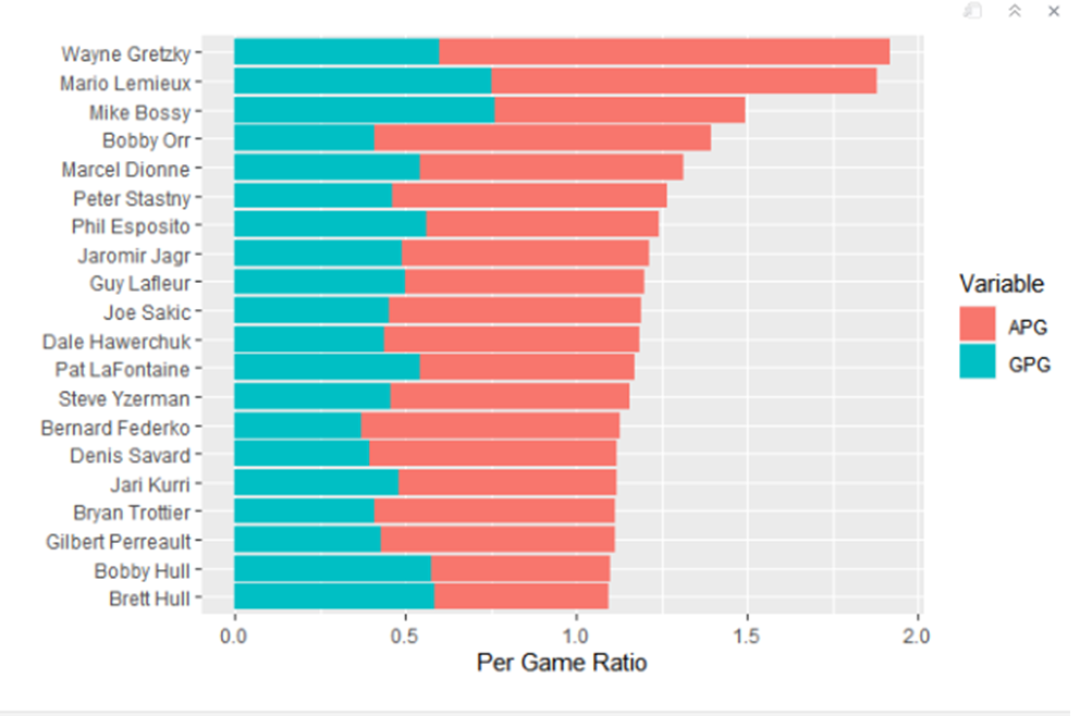
18.3.5 Stacked bar charts
Useful for:
- Displaying the overall total and the category breakdown, but the main goal is to focus on the total length of the bars
Do not use to compare categories directly
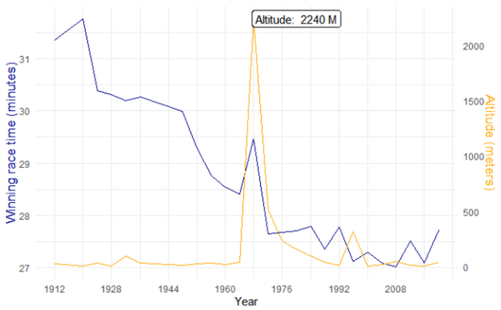
18.3.6 Line charts
Useful for:
Displaying changes and trends over time
Highlighting anomalies
Forecasting analysis
Not always the best for categorical data
If you need to include a categorical variable make sure it does not become a spaghetti jungle!
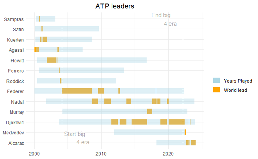
18.3.7 Gantt charts
Useful for:
- Displaying time event data for categories
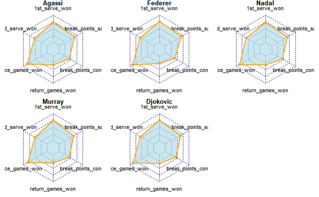
18.3.8 Radar charts
Useful for:
Comparing performance on different variables
Comparing to a benchmark or other players/athletes
They are not the easiest to understand. Simpler alternatives are available.
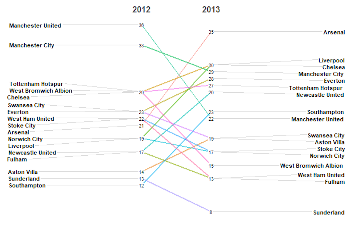
18.3.9 Slope charts
Useful for:
- Displaying the direction of change from one moment in time to another.
Be aware that the absolute quantity of change is not as clear (requires more brainpower than say when you use a bar chart)
18.4 Building advanced plots in R
18.4.1 Plots in R
Time for a demonstration
18.5 Creating basic plots in Tableau
18.5.1 Plots in Tableau
Time for a demonstration