22 Practical 10: Advanced plots in Tableau part 2
In this practical we continue with creating and refining advanced plots. We will look in to more advanced ways in which we can visualise data (i.e. timelines/ gantt charts, maps, and slope graphs).
If you want to follow along with the demonstration you can find the P8_Demonstration_Completed.twbx file here.
22.1 Exercises
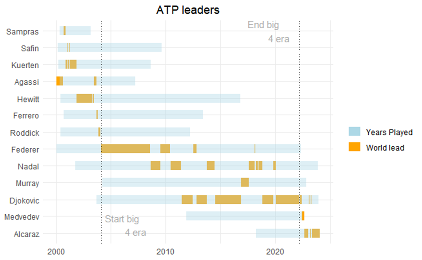
The data files we used in our previous practical was a fairly straight forward data file where all we had to consider was the year. During these practice exercises you will use a data file which contains historical data week by week. The data set you will use includes the World Tennis Ranking data from 2000 until now. We will use this to create a visualisation which shows who was leading the world rankings when and for how long they led the world rankings (gantt chart). The files used in the exercises below can be found here
Exercise 1: Open up the ATPLeaders.csv data set.
22.2 Creating gantt charts
If you had a look at the data you will see this file includes the ATP ranking leaders between 2000 and 2023. This is a subset created from the ATP file which you will use in the R practical. The data prep required to create the ATPLeaders file is however incredibly cumbersome to do in Tableau and therefore I have prepared this for you using R (don’t worry you will complete these steps yourself during practical 11).
Exercise 2: Create a bar chart which shows the total number of weeks the players were ranked number one and sort descending. The weeks a player was ranked number one for per period is indicated in the variable Duration.
For video demonstration click here
From the exercise above you will see we have 13 players who have led the world rankings with Djokovic leading a maximum of 411 weeks and Safin led for only 8 weeks. Next up let’s create our gantt chart.
Exercise 3: Can you create a gantt chart displaying the periods each of the 13 players were leading the rankings and sort the visualisation based on their first time leading the ranks?
For video demonstration click here
From the visualisation above we can see how from 2005 the big 4 dominated the world rankings. Between 2000 and 2005 we had 8 different world leaders, yet from 2004 to 2022 the top was taken by just 4 players. We can put more emphasis on this by annotating our graph. We can also improve the formatting of the graph a bit more.
Exercise 4: Try to add a rectangle which highlights the main period of the big 4 and see how you can improve the chart further.
For video demonstration click here
Another thing worth adding may be the total period the players were playing at the top level. We can do that by using the ATPL.csv file and calculating the time between the first time they entered the rankings and the last time they were listed on the rankings.
Exercise 5: Open up the ATPL.csv data set, which can be found here.
Exercise 6: Using the ATPL and ATPLeaders csv files, can you recreate the figure below:
22.2.1 Tip
You will need to set up a relationship between the two data files.
For video demonstration click here
22.3 Slope graphs
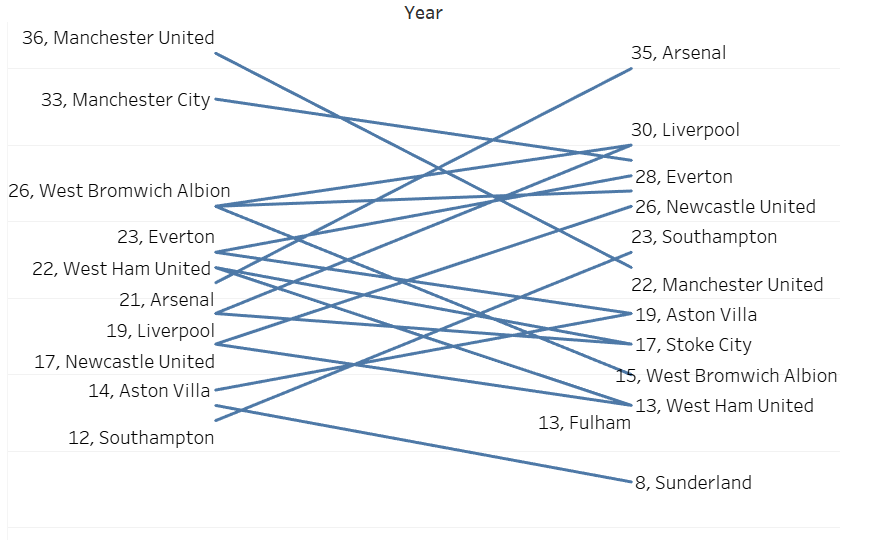
In the previous example we examined a long period of time. What if we are interested in change from one point in time to another? For example, we may want to visualise the progress of athletes from the start to the end of the season or training block. Or, as we will do in this example, we may want to visualise how teams are performing compared to the previous season. Slope charts are a pretty good choice to show a change over 2 time points. A slope chart is basically a line chart with two time-points.
For this exercise we will use some historical Premier League data from 2012/2013 and 2013/2014. We will focus in on the first 15 weeks of play.
Exercise 7: Open up PLHistorical.xlsx, which can be found here.
Next we create a first version of the slope chart.
Exercise 8: See if you can create the slope chart below.
For video demonstration click here
Now as you will have seen you can create a slope chart pretty quickly in tableau. However, what if we want to highlight those who improved and declined most? Or perhaps even better how about we let the audience decide which clubs they want to see highlighted based on the % improvement or decline compared to the clubs 2012 point total. To do that we will have to first calculate the change score and next set up a couple of parameters.
For video demonstration click here
Feel free to continue editing the charts you have created today, the more you practice the more familiar and easier it becomes.