library(tidyverse)
library(ggimage)
load("C:/Users/wkb14101/OneDrive - University of Strathclyde/MSc SDA/R Projects/B1703/Data/P9a_F1.RData")23 Practical 11a: Advanced plots in R part 2
In this practical we continue with creating and refining advanced plots. We will look in to more advanced ways in which we can visualise data (i.e. timelines, annotated maps, slope graphs). We will continue to use the F1 data for demonstration.
Packages needed are tidyverse, ggplot, ggiraph, and maps.
23.1 Getting your data
Open P9a_F1.RData which can be found here.
Show the code
23.2 Creating a time line overview
We would like to create an image in which we have the flag of the champion, with the name, year and number of wins per year below the flag. We want 8 drivers per row and given we have 66 years of data we have 9 rows (filter from 1958). The way to plot each driver on a row and column is by giving them X and Y coordinates. To do this we will create a XPosition and YPosition variable. We will use flag images as our datapoints.
Show the code
# Filter for the correct years and focus on the last round
DriversRaces2DF<- DriversRacesDF %>%
filter(RaceYear>=1958 & DriversFinalPosition==1)
# Create X and Y Position variables.
DriversRaces2DF <- DriversRaces2DF %>%
mutate(XPosition = case_when(
RaceYear %in% c(1958, 1966, 1974, 1982, 1990, 1998, 2006, 2014, 2022) ~ 0.5,
RaceYear %in% c(1959, 1967, 1975, 1983, 1991, 1999, 2007, 2015, 2023) ~ 2.5,
RaceYear %in% c(1960, 1968, 1976, 1984, 1992, 2000, 2008, 2016, 2024) ~ 4.5,
RaceYear %in% c(1961, 1969, 1977, 1985, 1993, 2001, 2009, 2017) ~ 6.5,
RaceYear %in% c(1962, 1970, 1978, 1986, 1994, 2002, 2010, 2018) ~ 8.5,
RaceYear %in% c(1963, 1971, 1979, 1987, 1995, 2003, 2011, 2019) ~ 10.5,
RaceYear %in% c(1964, 1972, 1980, 1988, 1996, 2004, 2012, 2020) ~ 12.5,
RaceYear %in% c(1965, 1973, 1981, 1989, 1997, 2005, 2013, 2021) ~ 14.5),
YPosition = case_when(RaceYear>=1958 & RaceYear<=1965 ~ 0.5,
RaceYear>=1966 & RaceYear<=1973 ~ 5.5,
RaceYear>=1974 & RaceYear<=1981 ~ 10.5,
RaceYear>=1982 & RaceYear<=1989 ~ 15.5,
RaceYear>=1990 & RaceYear<=1997 ~ 20.5,
RaceYear>=1998 & RaceYear<=2005 ~ 25.5,
RaceYear>=2006 & RaceYear<=2013 ~ 30.5,
RaceYear>=2014 & RaceYear<=2021 ~ 35.5,
RaceYear>=2022 & RaceYear<=2024 ~ 40.5),
# Link to where our flag images are stored and add the location as a variable called Flags.
Flags = case_when(nationality=="Australian" ~ "https://strath-my.sharepoint.com/:i:/g/personal/xanne_janssen_strath_ac_uk/EW6zowiMVxpPvNVc5yj3YcYBC9e4PNcrbkEZwT3d9yu_0Q?download=1",
nationality=="American" ~ "https://strath-my.sharepoint.com/:i:/g/personal/xanne_janssen_strath_ac_uk/EeuVUMF3FhZJsrkrx7t_RdEBDI3931OD-TTZjdHTKTlujg?download=1",
nationality=="Austrian" ~ "https://strath-my.sharepoint.com/:i:/g/personal/xanne_janssen_strath_ac_uk/EZTzfb857DFJpBEbeWJdKycBxIYlmlEqjMuoMgTcD1AzPg?download=1",
nationality=="Brazilian" ~ "https://strath-my.sharepoint.com/:i:/g/personal/xanne_janssen_strath_ac_uk/EXebqZY486NEltJgytBWa5gBb8NFju2Aiy5M8dzKpkxYVA?download=1",
nationality=="British" ~ "https://strath-my.sharepoint.com/:i:/g/personal/xanne_janssen_strath_ac_uk/EUi-1hsj8ihMnQ849jb2_GsB3sSE7knMQlmuxBZJyWQmDQ?download=1",
nationality=="Canadian" ~ "https://strath-my.sharepoint.com/:i:/g/personal/xanne_janssen_strath_ac_uk/EQLX-d2LH9VHmu8FceHyMCgBKFrhPJM4vbpa84SheHkWqQ?download=1",
nationality=="Dutch" ~ "https://strath-my.sharepoint.com/:i:/g/personal/xanne_janssen_strath_ac_uk/EZfcd_-8IfpMi8RbNsmhiGUB00HDorYnAgOB5GUUHt3qXw?download=1",
nationality=="Finnish" ~ "https://strath-my.sharepoint.com/:i:/g/personal/xanne_janssen_strath_ac_uk/ERy_SHggXRxJnRwlPL6JweoB13GGlpFxLSJeVQM4Gkr6dQ?download=1",
nationality=="German" ~ "https://strath-my.sharepoint.com/:i:/g/personal/xanne_janssen_strath_ac_uk/EQ1hWxfy0yhPgWuJuh8Ue7EBj3iiJUsDM7vNlj6m2iR_sA?download=1",
nationality=="New Zealander" ~ "https://strath-my.sharepoint.com/:i:/g/personal/xanne_janssen_strath_ac_uk/EfghDr6BlK5AsmJl8OecWRwBgDcjhHg7lYR6Z1OJkC_ADw?download=1",
nationality=="South African" ~ "https://strath-my.sharepoint.com/:i:/g/personal/xanne_janssen_strath_ac_uk/EcVKLI5D2H1KkzOF_3DokHwBjNBO5jnky_K4UJDKth1DVQ?download=1",
nationality=="Spanish" ~ "https://strath-my.sharepoint.com/:i:/g/personal/xanne_janssen_strath_ac_uk/EaFZXC0uBCtBt_uM-NUNInsBaoU2ro05v9Rj6DEMze7d8g?download=1",
nationality=="French" ~ "https://strath-my.sharepoint.com/:i:/g/personal/xanne_janssen_strath_ac_uk/EUauXs7vmQNBl19vtgi7RYYB2G2TFcPZEZvGP3099kfGVQ?download=1")
)
# Create our base plot
Flaggraph<-ggplot(DriversRaces2DF, aes(x = XPosition, y = YPosition)) +
geom_image(aes(image = Flags), size = 0.05) + # Loads the flag images. Adjust size as needed
theme_minimal()+
scale_y_reverse(limits = c(max(DriversRaces2DF$YPosition)+10, min(DriversRaces2DF$YPosition)))+ # Reverse the scale so the years start at the top left corner and go up from left to right and top to bottom.
theme(
axis.title = element_blank(),
axis.text = element_blank(),
axis.ticks = element_blank(),
axis.line = element_blank(),
panel.grid= element_blank()
) +
geom_text_interactive(aes(label = paste(RaceYear, "\n",DriversRaces2DF$LastName), tooltip = paste(DriversRaces2DF$LastName, "\n", DriversRaces2DF$RaceYear, "\n", "Wins:",DriversRaces2DF$DriverWins)), vjust = 2, hjust = 0.5, size = 1.5)
# you will have seen I have added an interactive text, this is because adding the full text as a label is very tricky in R. Using interactive tooltips is much better.
#Flaggraph # loading the graph just like that means the interactivity doesn't work we need to use the girafe function for this.
FlaggraphInt<-girafe(ggobj=Flaggraph)
FlaggraphInt<-girafe_options(FlaggraphInt,
opts_zoom(min= 0.3, max=5))
FlaggraphIntNext do the same for constructors with team name and year below the flag, and the number of wins in the tooltip.
Show the code
ConstructorsChampsDF<- ConstructorsRacesDF %>%
filter(RaceYear>=1958 & ConstructorFinalPosition==1)
ConstructorsChampsDF <- ConstructorsChampsDF %>%
mutate(XPosition = case_when(
RaceYear %in% c(1958, 1966, 1974, 1982, 1990, 1998, 2006, 2014, 2022) ~ 0.5,
RaceYear %in% c(1959, 1967, 1975, 1983, 1991, 1999, 2007, 2015, 2023) ~ 2.5,
RaceYear %in% c(1960, 1968, 1976, 1984, 1992, 2000, 2008, 2016, 2024) ~ 4.5,
RaceYear %in% c(1961, 1969, 1977, 1985, 1993, 2001, 2009, 2017) ~ 6.5,
RaceYear %in% c(1962, 1970, 1978, 1986, 1994, 2002, 2010, 2018) ~ 8.5,
RaceYear %in% c(1963, 1971, 1979, 1987, 1995, 2003, 2011, 2019) ~ 10.5,
RaceYear %in% c(1964, 1972, 1980, 1988, 1996, 2004, 2012, 2020) ~ 12.5,
RaceYear %in% c(1965, 1973, 1981, 1989, 1997, 2005, 2013, 2021) ~ 14.5),
YPosition = case_when(RaceYear>=1958 & RaceYear<=1965 ~ 0.5,
RaceYear>=1966 & RaceYear<=1973 ~ 10.5,
RaceYear>=1974 & RaceYear<=1981 ~ 20.5,
RaceYear>=1982 & RaceYear<=1989 ~ 30.5,
RaceYear>=1990 & RaceYear<=1997 ~ 40.5,
RaceYear>=1998 & RaceYear<=2005 ~ 50.5,
RaceYear>=2006 & RaceYear<=2013 ~ 60.5,
RaceYear>=2014 & RaceYear<=2021 ~ 70.5,
RaceYear>=2022 & RaceYear<=2024 ~ 80.5),
TeamFlags = case_when(nationality=="Australian" ~ "https://strath-my.sharepoint.com/:i:/g/personal/xanne_janssen_strath_ac_uk/EW6zowiMVxpPvNVc5yj3YcYBC9e4PNcrbkEZwT3d9yu_0Q?download=1",
nationality=="American" ~ "https://strath-my.sharepoint.com/:i:/g/personal/xanne_janssen_strath_ac_uk/EeuVUMF3FhZJsrkrx7t_RdEBDI3931OD-TTZjdHTKTlujg?download=1",
nationality=="Austrian"~"https://strath-my.sharepoint.com/:i:/g/personal/xanne_janssen_strath_ac_uk/EZTzfb857DFJpBEbeWJdKycBxIYlmlEqjMuoMgTcD1AzPg?download=1",
nationality=="Brazilian" ~ "https://strath-my.sharepoint.com/:i:/g/personal/xanne_janssen_strath_ac_uk/EXebqZY486NEltJgytBWa5gBb8NFju2Aiy5M8dzKpkxYVA?download=1",
nationality=="British" ~ "https://strath-my.sharepoint.com/:i:/g/personal/xanne_janssen_strath_ac_uk/EUi-1hsj8ihMnQ849jb2_GsB3sSE7knMQlmuxBZJyWQmDQ?download=1",
nationality=="Canadian" ~ "https://strath-my.sharepoint.com/:i:/g/personal/xanne_janssen_strath_ac_uk/EQLX-d2LH9VHmu8FceHyMCgBKFrhPJM4vbpa84SheHkWqQ?download=1",
nationality=="Dutch" ~ "https://strath-my.sharepoint.com/:i:/g/personal/xanne_janssen_strath_ac_uk/EZfcd_-8IfpMi8RbNsmhiGUB00HDorYnAgOB5GUUHt3qXw?download=1",
nationality=="Finnish" ~ "https://strath-my.sharepoint.com/:i:/g/personal/xanne_janssen_strath_ac_uk/ERy_SHggXRxJnRwlPL6JweoB13GGlpFxLSJeVQM4Gkr6dQ?download=1",
nationality=="German" ~ "https://strath-my.sharepoint.com/:i:/g/personal/xanne_janssen_strath_ac_uk/EQ1hWxfy0yhPgWuJuh8Ue7EBj3iiJUsDM7vNlj6m2iR_sA?download=1",
nationality=="New Zealander" ~ "https://strath-my.sharepoint.com/:i:/g/personal/xanne_janssen_strath_ac_uk/EfghDr6BlK5AsmJl8OecWRwBgDcjhHg7lYR6Z1OJkC_ADw?download=1",
nationality=="South African" ~ "https://strath-my.sharepoint.com/:i:/g/personal/xanne_janssen_strath_ac_uk/EcVKLI5D2H1KkzOF_3DokHwBjNBO5jnky_K4UJDKth1DVQ?download=1",
nationality=="Spanish" ~ "https://strath-my.sharepoint.com/:i:/g/personal/xanne_janssen_strath_ac_uk/EaFZXC0uBCtBt_uM-NUNInsBaoU2ro05v9Rj6DEMze7d8g?download=1",
nationality=="French" ~ "https://strath-my.sharepoint.com/:i:/g/personal/xanne_janssen_strath_ac_uk/EUauXs7vmQNBl19vtgi7RYYB2G2TFcPZEZvGP3099kfGVQ?download=1",
nationality=="Italian" ~ "https://strath-my.sharepoint.com/:i:/g/personal/xanne_janssen_strath_ac_uk/EbFi8AaK95lHr95ZVEdoaRIBWCmRHNEds350td_aSjVwdA?download=1"
))
Flaggraph2<-ggplot(ConstructorsChampsDF, aes(x = XPosition, y = YPosition)) +
geom_image(aes(image = TeamFlags), size = 0.05) + # Adjust size as needed
theme_minimal()+
scale_y_reverse(limits = c(max(ConstructorsChampsDF$YPosition)+10, min(ConstructorsChampsDF$YPosition))) +
geom_text_interactive(aes(label = paste(RaceYear, "\n", TeamName), tooltip=paste(RaceYear, "\n", TeamName, "\n", "Wins:",ConstructorWins)), vjust = 2, hjust = 0.5, size = 1.5) +
geom_point(size = 40, alpha = 0) +
theme(
axis.title = element_blank(),
axis.text = element_blank(),
axis.ticks = element_blank(),
axis.line = element_blank() ,
panel.grid = element_blank()
)
FlaggraphInt2<-girafe(ggobj=Flaggraph2)
FlaggraphInt2<-girafe_options(FlaggraphInt2,
opts_zoom(min= 0.3, max=5))
FlaggraphInt223.3 Maps
Next let’s have a look at how we create maps in R. We will create a map showing the race circuit locations (us longitude and latitude in race data).We will use colour to distinguish between the number of races ran at each circuit. We will also add a few permanent annotations and use tooltips to show other information. Our basemap will be created using the maps package.
Show the code
# The maps package downloads the coordinates which shape all the countries in the world.
library(maps)
world <- map_data("world")
# The downloaded coordinates can then be used to plot the world map
worldplot <- ggplot() +
geom_polygon(data = world, aes(x=long, y = lat, group = group),fill = "lightgrey", color = "darkgrey") +
coord_fixed(1.3)+
theme(
panel.background = element_rect(fill = "white", color = NA), # Light grey background
panel.grid.major = element_blank(), # Remove major grid lines
panel.grid.minor = element_blank(), # Remove minor grid lines
)
worldplot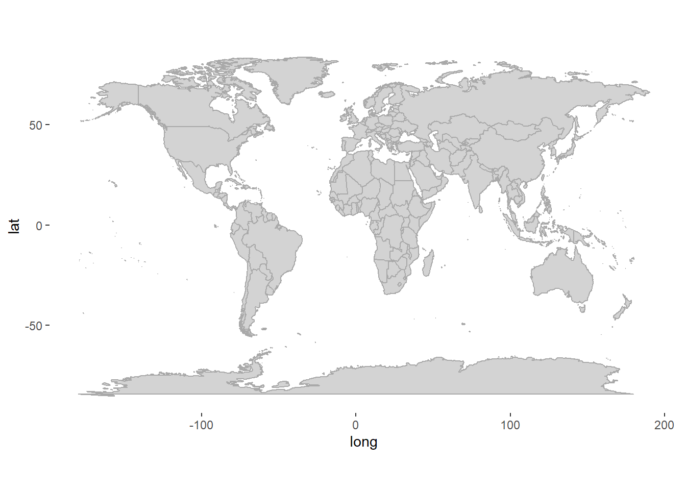
# Count the number of times a race has been held on a specific circuit
Races_aggregatedDF <- RacesDF %>%
group_by(Latitude, Longitude, CircuitName, RaceCountry) %>%
count(CircuitName) %>%
rename(events=n)
# Plot frequency data onto the world map
worldplot <- worldplot +
geom_point_interactive(data = Races_aggregatedDF, aes(x = Longitude, y = Latitude, colour = events, tooltip= paste(CircuitName, "\n", RaceCountry, "\n", "Number of Races: ", events))) +
scale_color_continuous(low = "lightblue", high = "darkblue")+
ylab("")+
xlab("")
# girafe is another package used to make plots interactive. The benefit over ggplotly is that it handles more complicated graphs more easily.
worldplot2<-girafe(ggobj=worldplot)
worldplot2<-girafe_options(worldplot2,
opts_zoom(min= 0.3, max=3))
worldplot2## Add labels
worldplot <- worldplot+
geom_text(
data = subset(RacesDF, date == min(date)), # Filter to rows where first_event == 1
aes(x = Longitude, y = Latitude, label = paste("First race in", CircuitName, "\n", "in", RaceYear)),
hjust = 0.4, vjust = -0.8, size = 3, color = "black"
) +
geom_label(
data = subset(Races_aggregatedDF, events == max(events)),
aes(x = Longitude, y = Latitude, label = paste(CircuitName, "\n", "has hosted the most GPs", "\n", "a total of", max(events)), label.padding = unit(0.5, "lines")), nudge_y=-40, nudge_x=5,
size = 3, color = "black"
)+
geom_segment(
data = subset(Races_aggregatedDF, events == max(events)),
aes(x = Longitude, y = Latitude, xend = Longitude + 5, yend = Latitude -28),
color = "black", size = 1, arrow = arrow(type = "closed", length = unit(0.1, "inches"))
)
worldplot2<-girafe(ggobj=worldplot)
worldplot2<-girafe_options(worldplot2,
opts_zoom(min= 0.3, max=5))
worldplot2
Tip
If you want to showcase a specific country, you can filter by region. See example below for the UK.
UK <- world %>%
filter(region=="UK")
UKplot <- ggplot() +
geom_polygon(data = UK, aes(x=long, y = lat, group = group),fill = "lightgrey", color = "darkgrey") +
coord_fixed(1.3)+
theme(
panel.background = element_rect(fill = "white", color = NA), # Light grey background
panel.grid.major = element_blank(), # Remove major grid lines
panel.grid.minor = element_blank(), # Remove minor grid lines
)
UKplot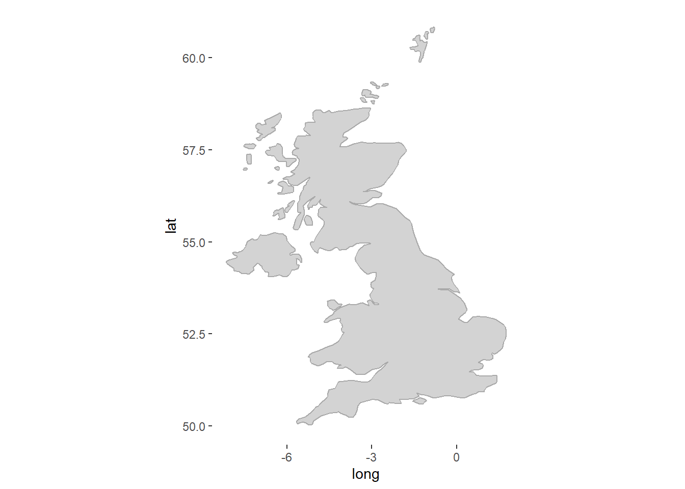
23.4 Slope charts
Last we will look at changes from one season to the next. We will create a slope graph showing the constructor competition results from 2022 to 2023. We will also use colour to differentiate between thos who improved and those who did not.
Show the code
# Add a progression variable indicating 1 if improved or equal and 0 if declined.
SlopeChartDF <- ConstructorsRacesDF %>%
filter((RaceYear == 2022 | RaceYear == 2023) & !(is.na(ConstructorFinalPosition))) %>%
distinct(TeamName, raceId, .keep_all=TRUE)%>% # each team has two drivers but we only need the team data ones so we keep only the distinct rows based on teamname and raceId (this will keep two rows per team, one fore 2022 and one for 2023)
group_by(TeamName) %>% # Group by team to calculate progression
mutate(
Progression = if_else(
RaceYear == 2023 & ConstructorFinalPosition <= lag(ConstructorFinalPosition), 1,
if_else(RaceYear == 2022 & ConstructorFinalPosition >= lead(ConstructorFinalPosition), 1, 0))
) %>%
ungroup()
#Create our slopechart with year on the x-axis and the final position on the y-axis. We will use progression as our colour variable.
SlopeChart <- ggplot(SlopeChartDF,
aes(x = RaceYear,
y = ConstructorFinalPosition,
color = factor(Progression),
group = TeamName)) +
#interactive elements of layers (points, lines and text at final) #
geom_line_interactive(size = 1.2,
alpha = 0.4) +
scale_y_reverse() +
geom_point_interactive(
aes(tooltip = paste(TeamName, "\n", "Wins: ", ConstructorWins)), #specifies tooltip for ggiraph
fill = "white",
size = 2.5,
stroke = 1.5,
shape = 21) +
geom_text_interactive(data = SlopeChartDF %>% filter(RaceYear == 2023),
aes(x = RaceYear + 0.2 , y = ConstructorFinalPosition,
label = TeamName),
check_overlap = T,
vjust = 0.5, # Adjust vertical alignment if necessary
hjust = 0)+
geom_text_interactive(data = SlopeChartDF %>% filter(RaceYear == 2022),
aes(x = RaceYear - 0.2, y = ConstructorFinalPosition,
label = TeamName),
check_overlap = T,
vjust = 0.5, # Adjust vertical alignment if necessary
hjust = 1) +
scale_color_manual(
values = c("1" = "darkblue", "0" = "darkorange"), # Assign green to 1 and orange to 0
labels = c("Improved", "Declined") # Optional: Customize legend labels
) +
labs(color = "Progression")
SlopeChart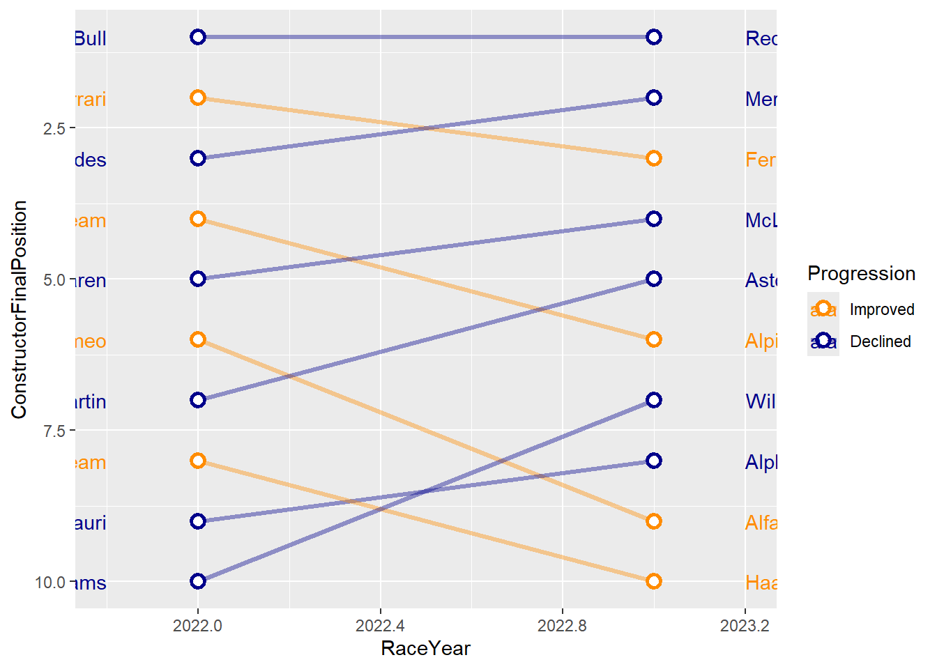
# Tweak the graph to make it look better
SlopeChart2 <- SlopeChart +
labs(x = NULL, y = NULL) +
scale_x_continuous(expand = c(1, 1), # Adds space to the right for labels
limits = c(min(SlopeChartDF$RaceYear)-1, max(SlopeChartDF$RaceYear) + 1), #set x-axis limits
breaks = seq(2022, 2023),
position = "top") + #label the axis at the top.
theme_minimal() +
theme(
panel.grid = element_blank(),
plot.background = element_rect(fill = "gray95", color = NA),
panel.background = element_rect(fill = "gray95", color = NA),
axis.text.y = element_blank(),
axis.text.x = element_text(color = "gray50", size = 10,
face = "bold"),
legend.position = "none"
) #you can set pretty much anything within a theme. We can't cover these all in class but definitely worth looking at the dfferent options available.
SlopeChart2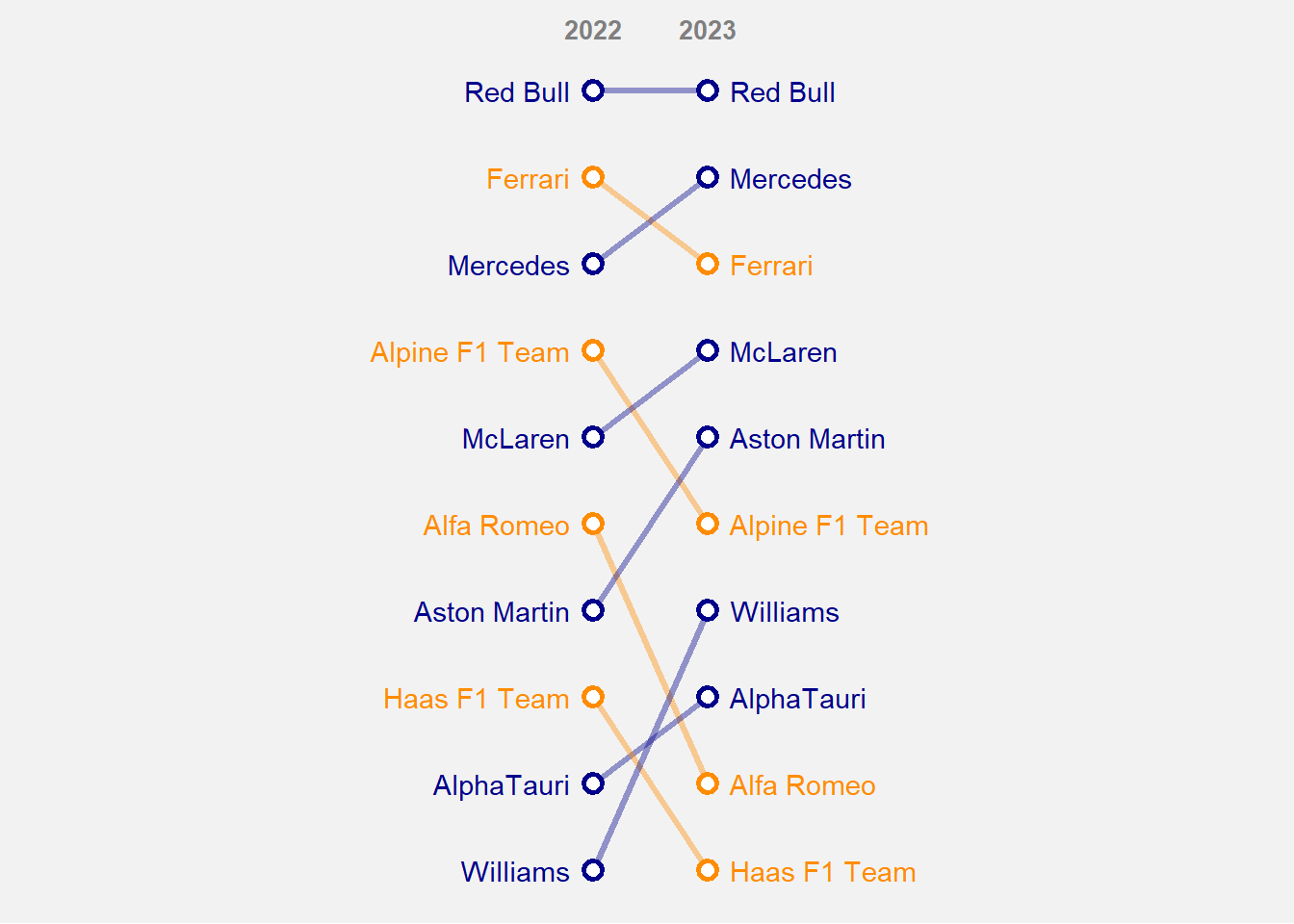
# Make the chart interactive
girafe(ggobj = SlopeChart2,
width_svg = 8, height_svg = 5, #sizes the output plot you do not have to include this.
options = list(
opts_tooltip(
opacity = 0.8, #opacity of the background box
css = "background-color:#4c6061; color:white; padding:10px; border-radius:5px;"),
opts_hover_inv(css = "stroke-width: 1;opacity:0.6;"),
opts_hover(css = "stroke-width: 4; opacity: 1;")
)
)Save the data and visuals.
save.image(file="C:/Users/wkb14101/OneDrive - University of Strathclyde/MSc SDA/R Projects/B1703/data/P11a_F1.RData")