26 Practical 12: Building dashboards in Tableau
In this practical we will look at how we can combine all the visualisations we learned to create over the last couple of weeks into an interactive dashboard. The demonstration will show some quick formatting examples, as well as how to add interactivity. After that you will work through the exercises below. These exercises will work through some of the steps we took to create the visualisations (extra practice for you) and then go into how to put them all together on a dashboard. We look at linking filters and different formatting options.
If you want to follow along with the demonstration, the P10_Demonstration_Completed.twbx file can be found here
26.1 Exercises
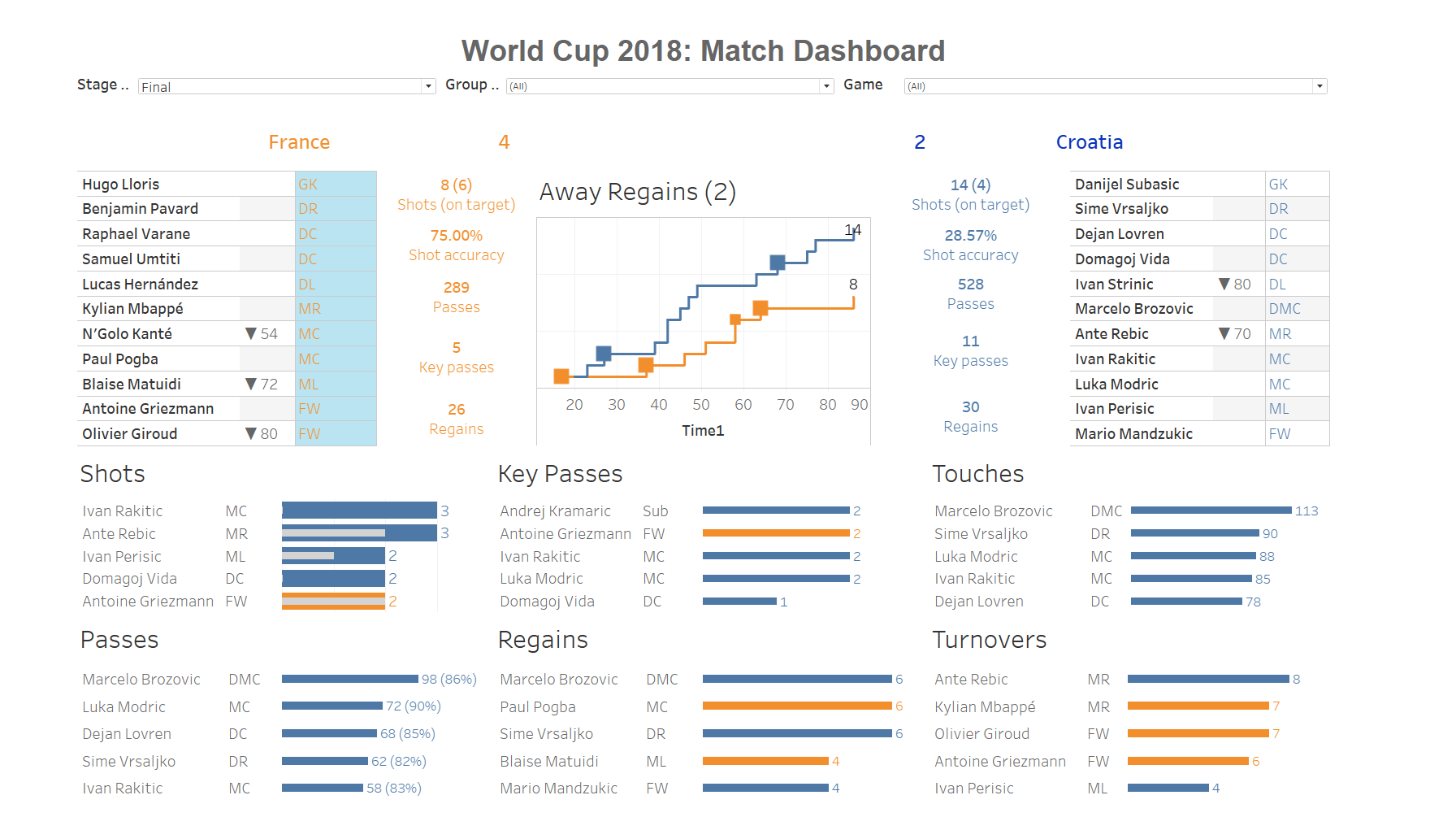
We will be using world cup 2018 data which can be found here and are planning to create the below dashboard (adapted from Ravi Mistry’s example on Tableau Public)
The first thing we will need to do is get an understanding of the data within the two files. We will start with the Tidy Data data file.
Exercise 1: Load in the Tidy Data datafile, which can be found and inspect the data.
Looking at this data file we can see it has all the world cup matches listed and the actions (e.g. assists, aerials won, etc) of each player in a team are listed per match (so a player has one row per match). The data also indicates who played at home and who played away, as well as whether the match was a group phase match our elimination phase. Some of the key variables you will use and their definitions are listed below:
Team = Team player plays for
Home = Home playing team
Subbed? = Minute in match sub happened and if player came in or out (only available for relevant players)
Sub? = True or False variable indicating if player came in as a Sub
Player Name = Players name
Position = Players position
26.2 Creating our starting 11 tables
Next we want to do is create a table which lists the starting 11 for the home team and another table which lists the starting 11 for the away team.
Exercise 2: Create the table (see dashboard above for layout). Think about which variables you need to use for you data visualisation and which you may need to use as a filter. We do not want all matches displayed just the starting 11 for selected matches and remember separate table for home and away teams.
For video demonstration click here
Some key steps:
1. You will need to create a Home Team variable which gives True for the home team and false for the away team and add this to the filter box.
2. You will create a P variable which gives each position a number (i.e. GK = 1, DR = 2, etc). This will be used to sort later.
3. You will also want to add a Game and Sub? Filter to the filter box.
4. We want Player Name and Subbed? in the rows.
5. We want to add position details by pulling Position into the text mark box, P into the detail box, and I also pulled Home Team Y/N into the colour box to give the home and away teams different colours (you could have done this later when you started refining your visualization). 6. We will sort Player Name on the sum of P
26.3 Creating team performance outcomes
Next up we are looking to create the performance outcome data (e.g. shots on target, shot accuracy, passes, key passes, and regains). The way we display these is using text. This means you will need to use the text box in the marks card.
Exercise 3: Create the performance stats for home and away (see dashboard above and check if you can get similar formatting)
For video demonstration click here
Some key steps:
1. You will need to create a two variables, one is shot accuracy (sum of shots OT / sum of shots), and one is regains (tackles + interceptions).
2. You will need to use the game filter and Home Away T/F filter.
3. Drag the relevant variables into the text box on the marks card (all should be sum except for shots accuracy which will be an aggregate).
4. Edit how the results are displayed via the text box in the marks card.
5. Add Home Away T/F to the colour box in the marks card.
26.4 Creating player performance outcomes
Next up we are looking to create the performance outcome data (e.g. shots on target, shot accuracy, passes, key passes, and regains) for each player and we want to show the top 5 per outcome. We will use bar charts to display this.
Exercise 4: Create a bar chart which displays the total number of shots a player took during a specific match and overlay this bar chart with another bar chart showing how many of those shots were on target. Remember to ensure that your shots OT bar has a different colour compared to your shots bar.
For video demonstration click here
Some key steps:
1. You will need to use the game filter.
2. You will also need to use the Player Name filter and filter for the top 5 based on sum of shots.
3. Drag Shots and Shots OT into the columns and Player Name and Position into the rows.
4. Note how only two players show up, to prevent this add the Game filter to context.
5. Create a dual axis for Shots OT and ensure the axis are synchronised.
6. Add Home Away T/F to the colour box in the marks card and Shots to the label box.
7. Last add Measures Names to the colour box for Sum(Shots OT) and change the colour to light grey.
Exercise 5: Create a bar chart which displays the total number of passes a player engaged in during a specific match and also display the passing accuracy in between brackets as a label (see dashboard above).
For video demonstration click here
Some key steps:
1. You will need to use the game filter.
2. You will also need to use the Player Name filter and filter for the top 5 based on sum of passes.
3. Drag Passes into the columns and Player Name and Position into the rows.
4. Add Home Away T/F to the colour box in the marks card and Passes and PA% to the label box.
5. Edit the Label box settings so the pass accuracy is displayed in between brackets after the total number of passes.
Exercise 6: Create 4 more bar charts displaying the total number of key passes, touches, regains and turnovers a player engaged in during a specific match (see dashboard above).
For video demonstration click here
Some key steps:
1. You will need to use the game filter.
2. You will also need to use the Player Name filter and filter for the top 5 based on sum of the relevant variable.
3. Drag variables over into the columns and Player Name and Position into the rows.
4. Add Home Away T/F to the colour box in the marks card and the relevant variable to the label box.
5. Edit the Label box settings so the labels have the team colour.
26.5 Create the score line
The last thing we want to do before we link a different data set is create the score line. Looking at the dashboard above this is done in the form of text which displays goals and then country.
Exercise 7: Create the score line visualisation.
For video demonstration click here
Some key steps:
1. You will need to use the game filter and Home Away T/F filter.
2. Create a Goals2 variable which replace Null values in Goals with a 0, if Goals != Null then keep the Goals value.
2. Drag the Goals2 and Team into the text box on the marks card.
4. Edit how the results are displayed via the text box in the marks card.
5. Add Home Away T/F to the colour box in the marks card.
26.6 Create the shot timeline
To create the shot timeline we will need to use another dataset named Shot Timeline. We will need to create a union between the new data set and our Tidy dataset based on the Match, Home, and Team variable.
Exercise 8: Load the data which can be found here and create a union between the two datasets.
For video demonstration click here
Exercise 9: Next we can create our shot timeline (see dashboard for example).
For video demonstration click here
Some key steps:
1. You will need to use the game filter.
2. Drag Time into the column box and change to dimension.
3. Drag the Number of Records into the row box and duplicate this (so you will have two Number of Records variables in your rows). Ensure it displays the running total for both.
4. Create a Goals variable which gives each goal a 1 and if it wasn’t a goal a 0 (make sure you use the shot timeline data set Goal variable).
4. In the marks box put Number of records in the first mark section and Goals (average) in the second.
5. Change the mark type for the one containing the Goals variable to shape.
We now have all the visualisations we need for our dashboard so it’s time to put it all together.
Exercise 10: Build the dashboard as displayed above but do not worry about the filters just yet.
- If you want to show dashboard grid lines so you can align your graphs better, go into the
Dashboardmenu at the top and click onshow grid.
- You can choose to move your worksheets in as tiled or floating. It may look easier to use Floating and put them exactly where you want them, however, if you care about lining everything up perfectly you may want to get used to using the Tiled option.
- If you want to add a dashboard title you can either select
Show dashboard titleor you could add aTextobject to the dashboard.
The last thing we want to do is add interactivity. We will do this using the filters we used in our worksheet. We want users to have the option to choose the stage of the world cup (i.e. group stage or elimination stages), then if group stage is selected we want them to select the group of interest and last we want them to see the relevant matches for their selections. This means we will require 3 filters, 1) stage, 2) group, 3) match.
Exercise 11: Can you add the three filters and ensure they work on all visualizations not just one.
- If you want a filter to be applied to all worksheets using the relevant dataset you can do this by going into the filter settings and selecting
Apply to worksheets - All using related data sources
For video demonstration click [here]https://strath-my.sharepoint.com/:v:/g/personal/xanne_janssen_strath_ac_uk/EaV-dlDHayJDgAqiuafpYsUBAf_P89Zc462Jrp6h_X7BwQ?e=qs7UsC){target=“_blank”}
From the video you may have seen that we got the filters to work on all visualisations, however, they showed all options, e.g. when I selected group A, I still saw all the matches meaning I need to know which matches were played in group A or no data will show. This is obviously not very user friendly. The way we can get around this is to tell Tableau to only show the relevant values for a filter. You can do this via the filter settings.
For video demonstration click here
You will have seen I only changed this for the match filter. If I also changed it for group filter as well, my interactivity would result in errors if I didn’t remove the match selection first (play around with it to see what I mean). To overcome this we can replace our first filter (stage filter) by a parameter, this will overrule all and ensure the relevant stage data and match data will be show.
To do this we will first create a stage parameter, then we will create a true or false variable indicating true or false based on the stage selection, which we will then turn into a Set and only use those where the value is True (the set will be used as our filter and is dynamic based on the parameter we select).
For video demonstration click here