14 Lecture 5 Handouts
Basic plots
14.1 Today’s session
Recap data visualisation plots
Building basic plots in R
Building basic plots in Tableau
14.2 Today’s learning objectives
- Recall what to think about when using charts to display how much and how many
- Recall what to think about when using charts displaying distributions
- Able to create basic plots in R
- Able to create basic plots in Tableau
14.3 Recap data visualizations plots
14.3.1 Chart types
- Can you remember the different types of graphs and their use?
14.3.2 Importance of visualisation
- Enhances understanding
- Facilitates analysis
- Identifies trends and patterns
- Communicates insights
14.3.3 Importance of visualisation
- Better memory retention
- Enables interactivity and exploration
- Efficient decision making, monitoring, and reporting
14.3.4 Good and bad practice
Before we start building our own charts, let’s reflect on some good and bad practices.
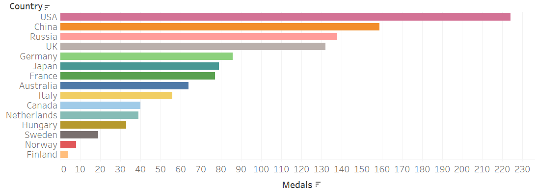
14.3.5 Bar charts
Very useful for:
- Displaying amounts per category
- Show rankings of categories
- Show crude differences
14.3.6 Grouped bar charts
Useful for:
- comparing variables based on two categorical measures.
- Careful, they can become hard to understand.
- Primary purpose would be understanding difference in one category (e.g. countries) across another (e.g. years).
- Consider if a faceted chart would maybe be a better option.
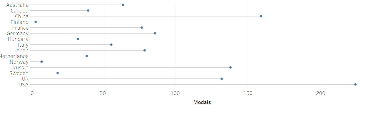
14.3.7 Lollipop charts
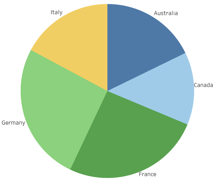
14.3.8 Pie charts
Very useful for:
- Percentage of whole when limited number of categories are presented
Be careful when groups are very similar or you have too many categories!
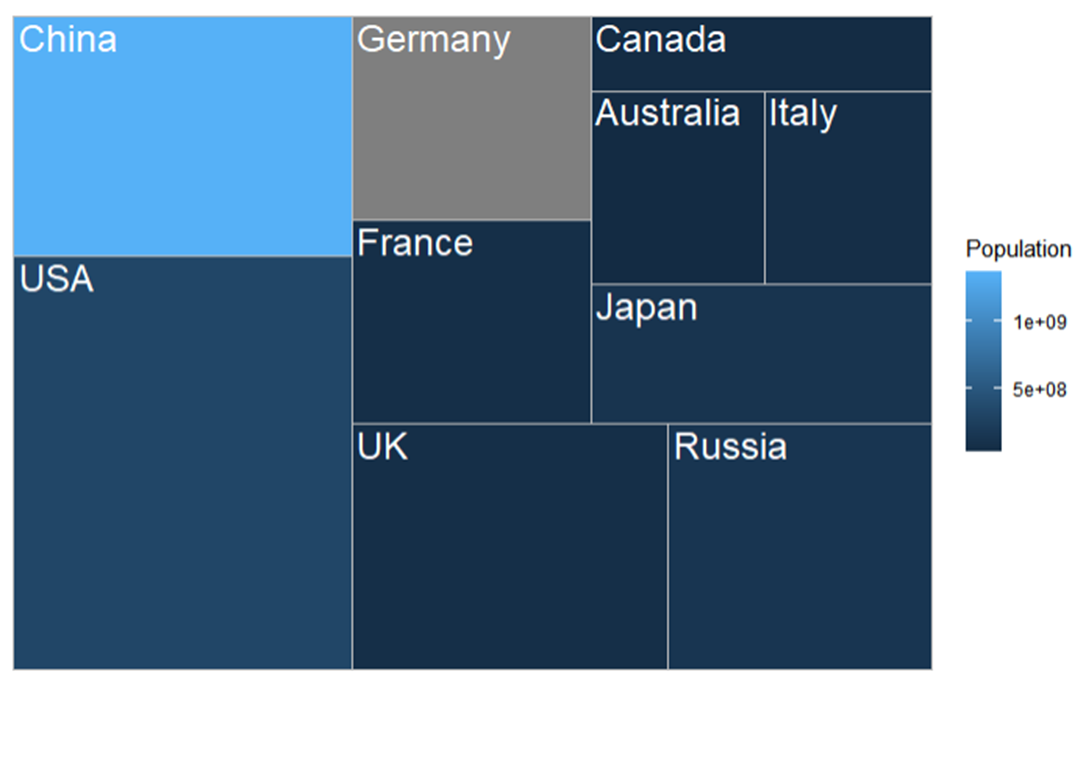
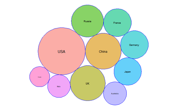
14.3.9 Tree maps
Very useful for:
- Part of the whole with large number of categories
- Precision is not important
For precise comparison consider a different type of chart.
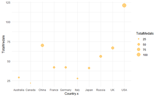
14.3.10 Bubble charts
Very useful for:
- Data with 3 dimensions (or perhaps even 4)
- When your plotted data has a wide value interval
Ensure all your dimension are important
If you have only 2 dimensions, stick to a scatter plot!
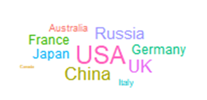
14.3.11 Word clouds
Useful for:
- Quick overview
Careful:
- They can become misleading (i.e. the length of words has an influence!)
Consider how you could display your information differently
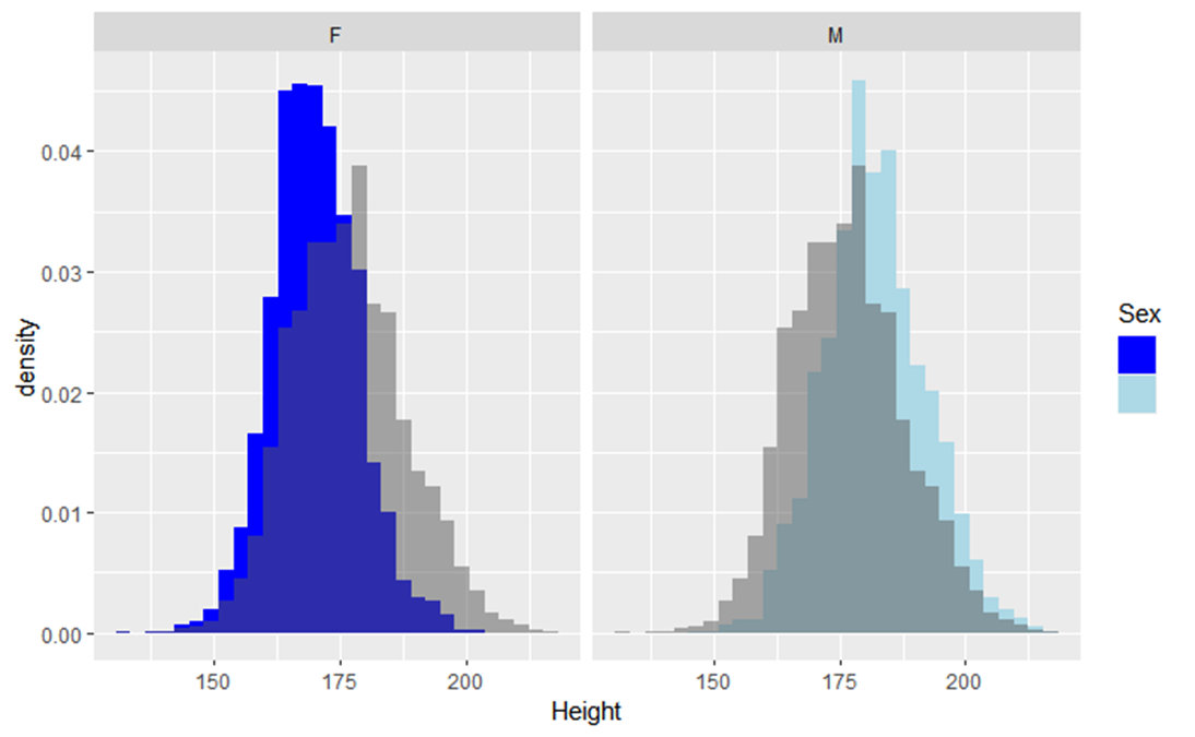
14.3.12 Histogram
What’s the difference between a histogram and bar chart?
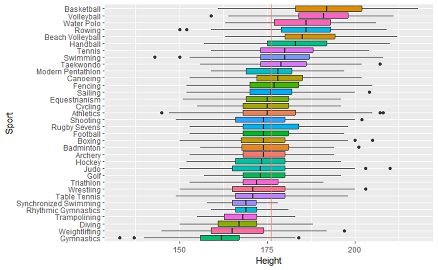
14.3.13 Boxplot
Use to: - Display distributions of multiple groups or datasets side by side
- Be aware can be hard to understand for those not familiar with it.
Distribution isn’t shown as precise as with a histogram
14.4 Building basic plots in R
14.4.1 Plots in R
- The main package we will use is ggplot2
- Remember the basics
- Let’s look at how to advance your basic plots with formatting options
14.4.2 Plots in R
Time for a demonstration
14.5 Creating basic plots in Tableau
14.5.1 Plots in Tableau
Time for a demonstration