5 Practical 1: Introduction to Tableau
During this practical you will become familiar with the tableau interface, how to connect to different data source and understand the roles of different data types. During the demonstration I will be using three files which you can find here.
5.1 Data files in Tableau
Tableau can connect to almost any type of data file and allows you to connect different data file types and sources. Tableau does work best when your data is formatted as ‘long’. This means that if you have data with multiple time points, these time points would all be on a separate row with one variable indicating which time point your value refers too.
5.1.1 Connecting to files
To connect to a file click on the file type (if it’s not listed click on “more”). If you want to connect to a database server you can click on the relevant server and set up access. This approach can be a bit slower compared to when a file is stored on your laptop or computer, however, it is often the only way to access sensitive data.
There isn’t much difference between uploading a file stored on your local computer or a file stored on a database. The only way you will be able to tell whether you’re using a database is the text in between brackets.
5.2 Joining files
We often use more than one file, and more often than not we want to link these files together somehow. To do this we are going to look at joining. Joining a file means you combine the columns from one data table with another based on a common join variables. In Tableau there are two ways in which data from two tables can be combined:
- Establish a relationship
- Establish a join
When we set up a relationship, the files itself are not actually merged but Tableau knows that they link via the unique identifiers we indicate. When joining files, tables will be physically merged together and you will be able to select a left, right or central join. These join types indicate which data is included. If we choose a left join we would include all data from the file located on the left side, and from the file located on the right hand side we would only include those unique identifiers which match those in the left dataset. Vice versa for the right join and a central join would only include unique identifiers which appear in both datasets.
E.g. your left dataset includes Participant 1-5 but your right dataset only includes participant 1, 3, 5, and 6, a left join would include participants 1-5, a right join would include participants, 1, 3, 5, and 6, whereas a central join would only include participants 1, 3, and 5.
5.3 Cleaning your data
We will cover cleaning our data with Tableau Prep in a future practical. However, for now after we have imported and joined our data files we always want to do a quick data check to ensure all data has been assigned the correct data type as well making sure variables are named correctly.
5.4 Worksheet layout
After loading your data, joining relevant files, and having checked for any data cleaning issues, you can start creating your first visualisations. To do this we will need to open up a Sheet. When opening up a sheet you’ll see a typical worksheet layout for Tableau. On the left you will see all your data, sorted by tables. Note Tableau splits variables in dimensions (often categorical or textual data) and measures (continuous). The other components are listed in the image below:
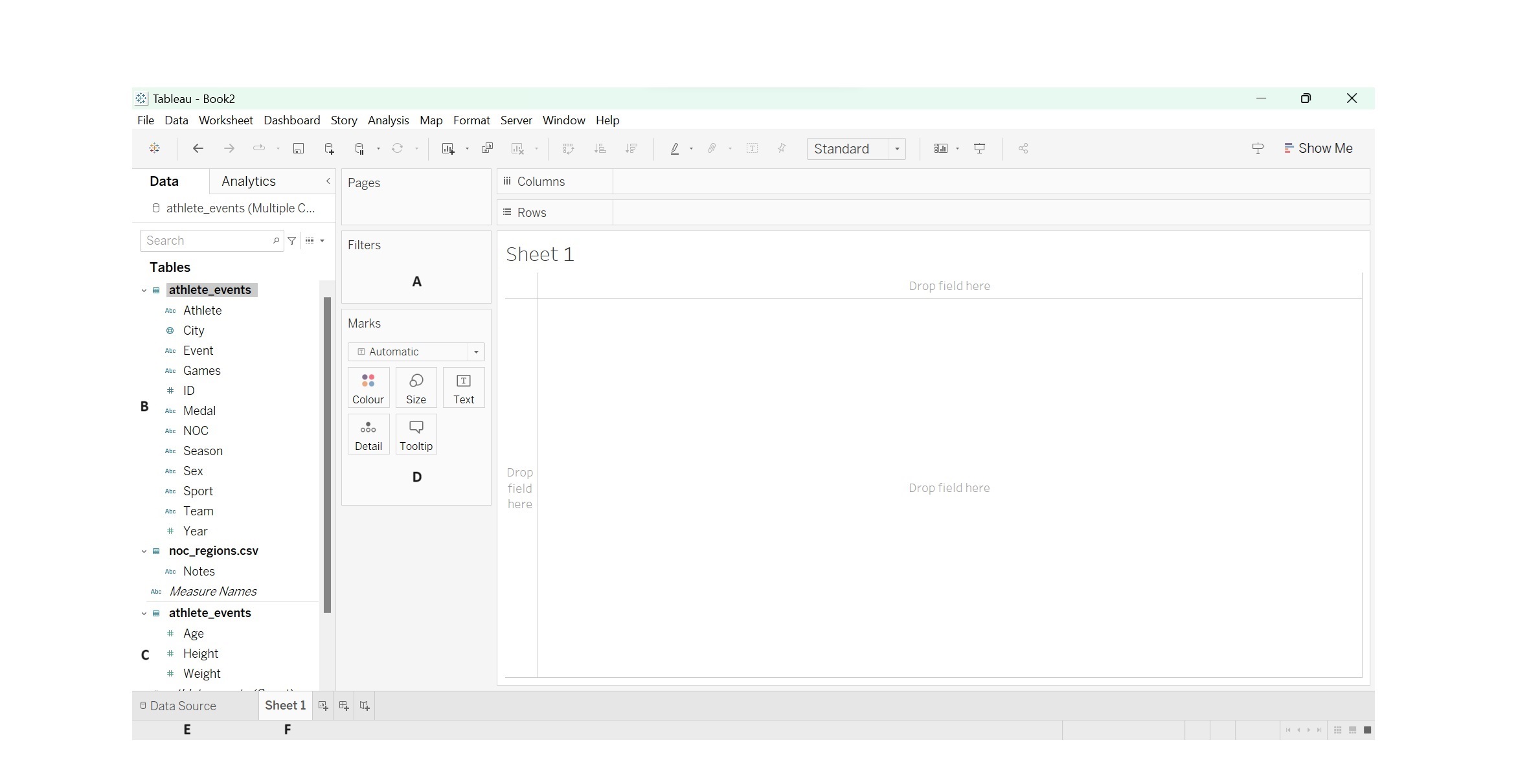
A - Filters shelf, allows you to add filters to the view;
B - Dimension data variables, lists all dimension data;
C - Measures data variables, lists all measures data;
D - Marks cards, used to add context and detail to the marks in the view;
E - Data source tab, takes you back to the data source view enabling you to add additional data sources and/or create more joins;
F - Sheets, each sheet will display a visualisation.
When creating visualisations it’s important to understand and know if you’re working with a dimension or measure. Dimensions often make up the axis and measures are often the data points. However, in some instances we can swap between the two and a dimension can become a measure (e.g. when we count the total number of a specific instance or event).
5.5 Saving your work
Last, if you want to save your work, go into “File” - “Save as…” and save it as a Tableau Packaged Workbook. Note it is important to save it as “Packaged” so that even if you do not have the original files handy you can open the tableau file.
5.6 Exercises
During the exercises you require two files. These can be found here
Exercise 1: Download the “athlete_events.xlsx” data file from myplace and open the file in Tableau.
Exercise 2: Download the “noc_regions.csv” file from myplace and store it on your OneDrive. In Tableau connect to your OneDrive database and add the file.
If the video above does not work click here
- Click on connect to “Microsoft Excel”.
- Select the “athlete_events.xlsx” file.
- Once the athlete_events file has opened, click on “Add” - “OneDrive” (you find “OneDrive” in the “To a Server section”.
- Log in to your OneDrive account and select the and add the “noc_regions.csv” file.
- You should now see both files on the left hand side of the screen.
Exercise 3: Create a relationship between the “athlete_events” data table and the “nocregions” data table.
If the video above does not work click here
- Make sure you are on the Data Source tab in Tableau.
- Make sure the athlete_events data table is visible on the canvas.
- Pull the noc_regions.csv over to the canvas.
- Ensure the unique identifier you want to use is selected - in this case NOC and NOC (noc_regions.csv) as both indicate the country code.
- You now have two data sets linked which means you can use data from both in one visualisation.
Exercise 4: Still working on the Data Source sheet scan through the variables and rename the “Name” variable to “Athlete”. Are there any data types you want to change?
- Name would be changed by double clicking on the name and typing in the new name.
- Year could have been changed to Year by clicking on the # and changing it to “Date”.
Exercise 5: Can you create a line graph which shows the change in total medals over the years?
If the video above does not work click here
- Click on “Sheet 1”.
- Drag the years variable into the column shelve;
- We want to count the total number of medals, therefore we will need to change “Medal” variable to a measure. To do this, click on the little arrow next to “Medal” and click on “Convert to Measure”;
- Once you have changed medals to measure drag the variable to the rows shelve;
- Wait this can’t be right, only 3 medals for each Olympic games. Tableau automatically used Count(Distinct) as a measure, this means it only counts unique variables.
- Change Count(Distinct) to Count (by clicking on the little arrow next to the “Medal” variable on the row shelf.
- Voila we have a simple line chart.
We can now see that the total medal count (and therefore the number of events) increased over the years until they became fairly steady in 1992. Do you know why we see a tooth pattern towards the later years?