load("C:/Users/wkb14101/OneDrive - University of Strathclyde/MSc SDA/R Projects/B1703/Data/P11a_F1.RData")28 Practical 13a: Building dashboards in R
In this practical we will look at how we can combine some of the visualisations we learned to create over the last couple of weeks into an interactive dashboard. The practical will work through some of the steps we took to create the visualisations (extra practice for you) and then go into how to put them all together on a dashboard. We look at linking filters and different formatting options. To build a dashboard in R you will need the shinyand bslib packages. We will also use the shinyWidgets and ggimage packages and as always tidyverse including ggplot2. Go ahead and install (if necessary) and load these.
28.1 Building a basic dashboard
28.1.1 Before starting to build your dashboard
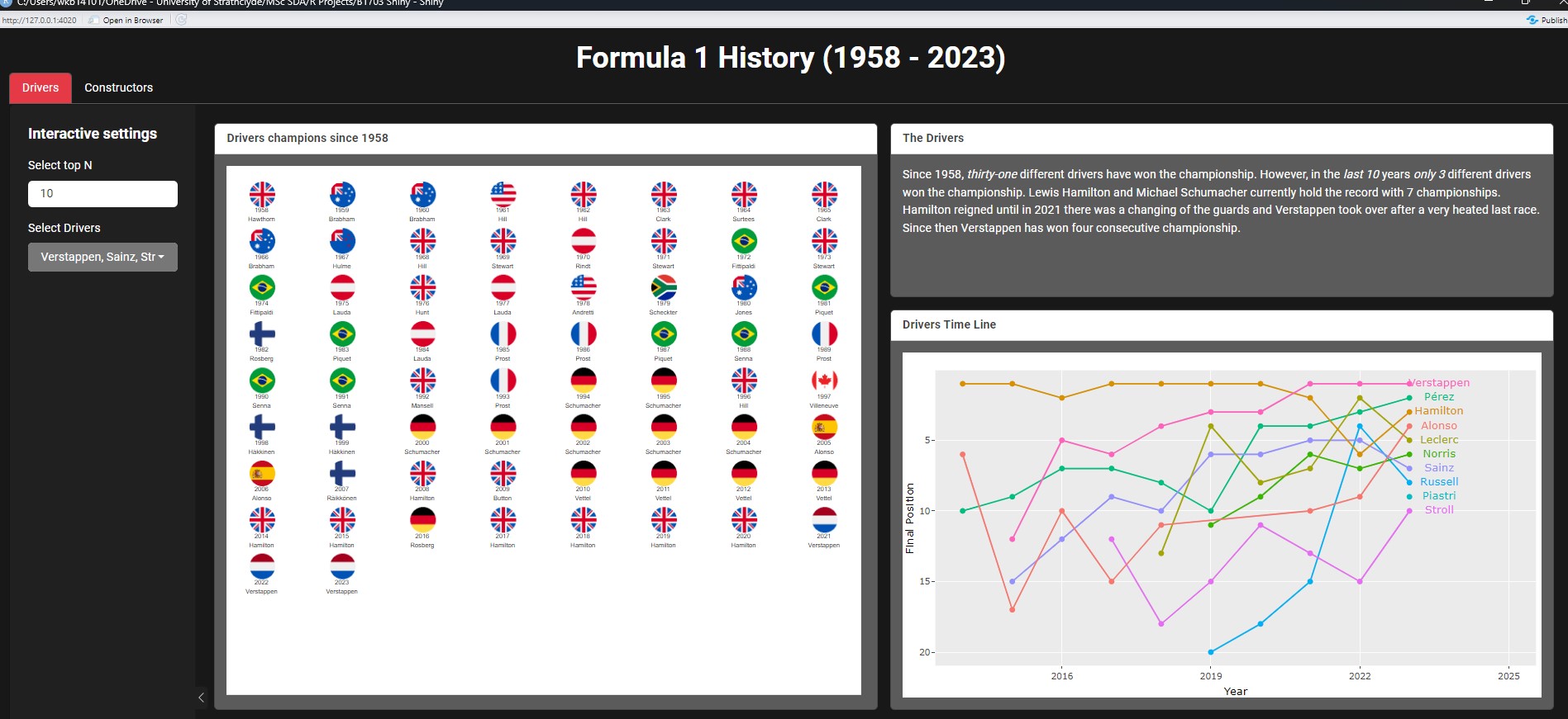
As R uses code to build the dashboard it is much harder to visualise what you are building (unlike using Tableau). Therefore, I will start by making a draft of what I want my dashboard to look like and then build my code to match my drawing. In our case we want to build something like the dashboard below:
28.1.2 The structure of an app
When building a shiny app it is useful to set up a brand new directory. The best way to do this is via New Project, and choosing Shiny Application. This will automatically create a basic structure for your shiny app.
You can see R created the code below. This code includes a user interface (UI) and a server (the place were all the magic happens). All Shiny Apps will always have an UI and a server component. In addition to the code you will also have seen that in the project folder there is now a file called app.R. When creating an app you will always have to have an app.R file OR two files called ui.R and server.R. In this module we will continue with the one file format (but if you explore other shiny apps you may come across the two separate files for the UI and Server).
Show the code
Define UI for application that draws a histogram
ui <- fluidPage(


# Application title
titlePanel("Old Faithful Geyser Data"),

# Sidebar with a slider input for number of bins
sidebarLayout(
    sidebarPanel(
        sliderInput("bins",
                    "Number of bins:",
                    min = 1,
                    max = 50,
                    value = 30)
    ),

    # Show a plot of the generated distribution
    mainPanel(
       plotOutput("distPlot")
    )
  )
)
Define server logic required to draw a histogram
server <- function(input, output) {


output$distPlot <- renderPlot({
    # generate bins based on input$bins from ui.R
    x    <- faithful[, 2]
    bins <- seq(min(x), max(x), length.out = input$bins + 1)

    # draw the histogram with the specified number of bins
    hist(x, breaks = bins, col = 'darkgray', border = 'white',
         xlab = 'Waiting time to next eruption (in mins)',
         main = 'Histogram of waiting times')
})

}
Run the application
shinyApp(ui = ui, server = server)Running the code above will result in a dummy app with a histogram and a slider which lets you change the bin size. The first step we will take is to change the UI to format to our requirements. We will use bslib to create our dashboard. The bslib package gives us more flexibility when it comes to the layout of our dashboard or app. We will work with several different components within the page_fluid. The UI will be build on the following structure:
Note
ui <- page_fluid(
  titlePanel(),
  tabsetPanel(
    tabPanel(
      layout_sidebar(
        layout_column_wrap(
          card(
            card_header(),
            card_body()
          ),
          layout_column_wrap(
            card(
              card_header(),
              card_body()
            ),
            card(
              card_header(),
              card_body()
            )
          )
        )
      )
    ),
    tabPanel(
      layout_sidebar(
        layout_column_wrap(
          layout_column_wrap(
            card(
              card_header(),
              card_body()
            ),
            card(
              card_header(),
              card_body()
            ),
          ),
          card(
            card_header(),
            card_body()
          ),
        )
      )
    )
  )
)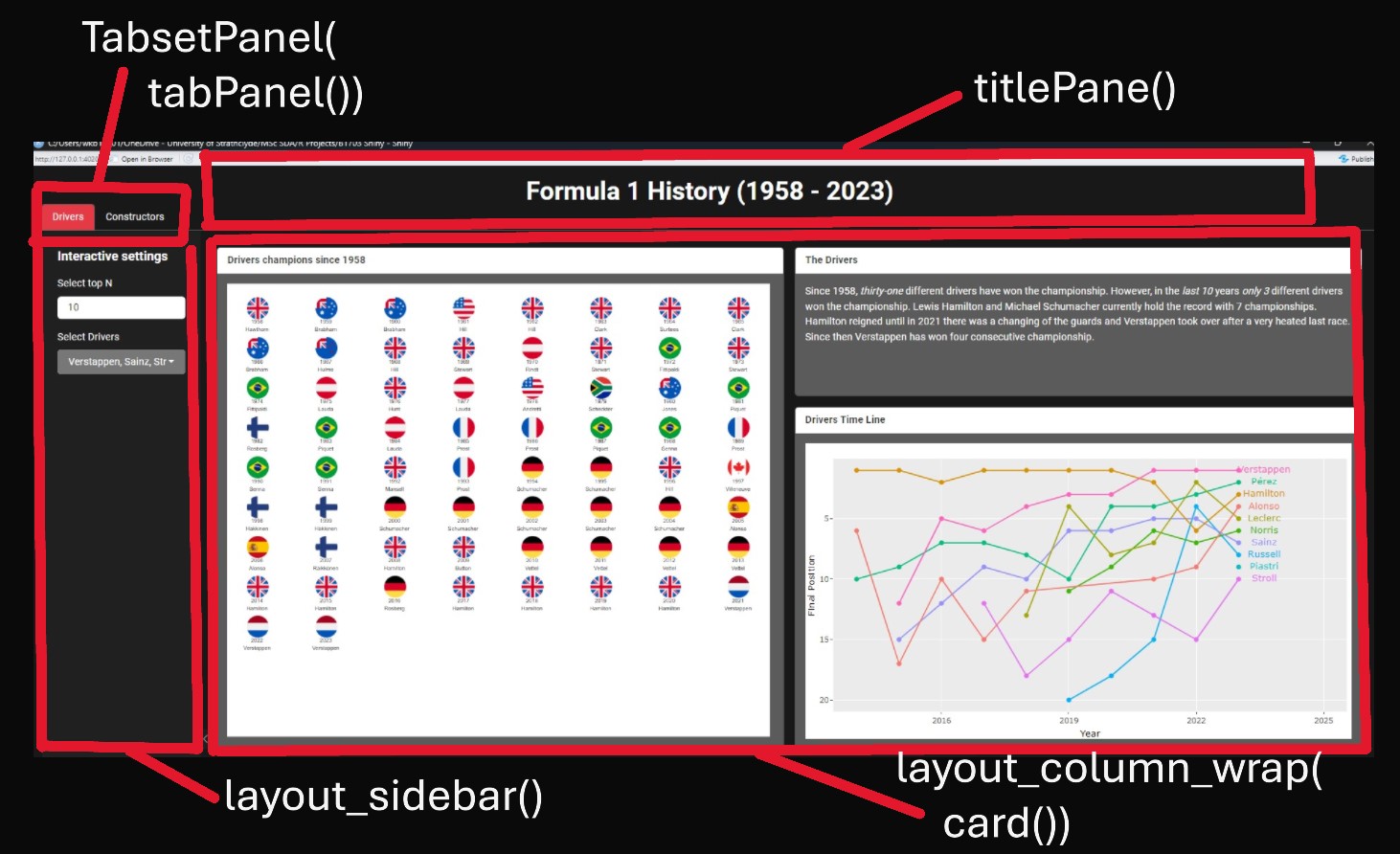
Title (titlePanel):
This adds a title to your app which is visible on all tabs/pages.
Main Interface Layout (tabsetPanel and tabPanel):
This organizes the app into tabs (in our case “Drivers” and “Constructors”). Each tab (tabPanel) contains its own UI components and layouts tailored to the specific type of data or visualization being displayed.
Sidebar Layout (layout_sidebar):
Found in the “Drivers” and “Constructors” tabs (i.e. in the tabPanel sections). This function creates a sidebar layout, which typically includes a sidebar for inputs and a main area for outputs.
Column formatting (layout_column_wrap) The layout_column_wrap() function is used within the main area of layout_sidebar() to create a responsive grid layout for UI elements. This function helps arrange content in a structured and visually appealing manner, making it easy to navigate.
Setting width = 1/2: This creates two columns within the main area, each taking up half of the available width.
Nested layout_column_wrap(): Wrapping a second layout_column_wrap() inside the first one allows you to further divide one of the two columns according to the specified width.
Cards and Content Layout:
Each main content section is wrapped in a card(). Cards are used to visually group information and components. They have headers (card_header) and bodies (card_body) for structure. For example: In the “Drivers” tab, one card contains a timeline visualization, while another displays textual information.
So now let’s add some specifications to our UI.
Show the dashboard code
Define UI for application
ui<- page_fluid(
  titlePanel(title= "Formula 1 History (1958 - 2023)"),
  tabsetPanel(
    tabPanel("Drivers",
      layout_sidebar(
        sidebar=sidebar(
          "Interactive settings",
          numericInput("TopD", "Select top N", 10),
          pickerInput(
            inputId="driver",
            label="Select Drivers",
            choices=c("Verstappen","Hamilton"),
            selected="Verstappen",
            multiple=TRUE,
            pickerOptions(actionsBox=TRUE, liveSearch = TRUE, liveSearchStyle="contains")
          )
        ),
        layout_column_wrap(
          width=1/2,
          card(
            card_header("Drivers champions since 1958"),
          card_body()
          ),
          layout_column_wrap(
            width=1,
            card(
              card_header("The Drivers"),
              card_body()
            ),
            card(
              card_header("Timeline"),
              card_body()
            )
          )
        )
      )
    ),
    tabPanel("Constructors",
      layout_sidebar(
        sidebar=sidebar(
          "Interactive settings",
          numericInput("TopD", "Select top N", 5),
          pickerInput(
            inputId="team",
            label="Select Teams",
            choices=c("Ferrari","Red Bull"),
            selected="Ferrari",
            multiple=TRUE,
            pickerOptions(actionsBox=TRUE, liveSearch = TRUE, liveSearchStyle="contains")
          ),
        ),
        layout_column_wrap(
          width=1/2,
          layout_column_wrap(
            width=1,
            card(
              card_header("The Constructors"),
              card_body()
            ),
            card(
              card_header("Timeline"),
              card_body()
            )
          ),
          card(
            card_header("Constructor champions since 1958"),
            card_body()
          )
        )
      )
    )
  )
)
server <- function(input, output, session){}

shinyApp(ui, server)
The code above provides a good start for the user interface, but none of this will work without any actual code so let’s have a look at that next.
28.2 Writing the global.R code (code running in background)
Now we have an idea of our UI layout we will need to ensure we load in our data and get the server working. All the code we will write from now on will be stored in a file called global.R. At the start of our app.R code we will call this file via:
source('global.R', local = T)
Our app.R file will know to call on global.R when it runs the functions within the app (but ensure this file is saved in the project folder!).
Next up let’s start working on our actual analytical code. We will use the data saved in practical 11a, which can be found here.
Show the code
First up we want to create two dataframes which contain the unique driver and team names. This will help the interactive filtering later on.
Show the code
Drivers_list <- DriversRacesDF %>%
  filter(RaceYear==2023 & !is.na(DriversFinalPosition))


Teams_list <- ConstructorsRacesDF %>%
  filter(RaceYear==2023 & !is.na(TeamName) & !is.na(ConstructorFinalPosition)) %>%
  distinct(TeamName, .keep_all=TRUE)
Next we will recreate some of the graphs we created in the previous tutorials. The ones we will recreate are:
Drivers and Constructors Line Graphs
Drivers and Constructors Champions overview (flag graph).
When building a Shiny app, it’s a good idea to write the code for your outputs as functions. By doing this, you can simply call these functions in the server section of your app.R file. This approach keeps your app.R file cleaner and easier to understand, as it reduces the amount of code clutter.
So let’s start with creating our functions for the two line graphs.
Show the code
#Function for Drivers Line Graph
driverlinec <- function(data=DriversRacesDF, TopD=10, driver=Drivers_list$LastName) { #we provide the three inputs required for the functions, a general rule of thumb is that we will include the main dataset used and anything that may change due to user input. In our case the Top N drivers and the drivers name will become interactive selection features and are therefore included as inputs. TopD is set as 10 but will be one of the interactive features later on (i.e. users can set this to show only top 5 or show all 22 drivers), and driver is another interactive feature which will highlight the selected drivers.

  #First we create a list of the top drivers based on the users numeric input
  TopDrivers <- data %>%
    filter(RaceYear==2023 & DriversFinalPosition<=TopD) %>%
    distinct(driverId)

  #create datatable of the top drivers (in our example 10 but this changes based on the TopD entered)
  DataTop <- data %>%
    filter(driverId %in% TopDrivers$driverId & RaceYear >=2014 & !is.na(DriversFinalPosition))

  #create a datatable for those drivers that should be highlighted (based on driver input and the TopD (in our case all drivers in the TopD but can be as little as 1))
  DataHighlight <- DataTop %>%
    filter(LastName %in% driver)

  #create a datatable with just data for the last year.
  DataTop_last <- DataTop %>%
    group_by(LastName) %>%
    filter(RaceYear == max(RaceYear))

  #create the linechart
  LineChartTop <- DataTop %>%
    ggplot(aes(x = RaceYear, y = DriversTotalPosition, group = as.factor(LastName))) +
    geom_line(data=DataTop, aes(y = DriversTotalPosition),colour = alpha("grey", 0.7))+
    geom_line(data=DataHighlight, aes(y = DriversTotalPosition, color=as.factor(LastName)))+
    geom_point(data=DataTop,aes(text= paste(LastName,"\n", RaceYear,"\n", "Position:", DriversTotalPosition)), colour = alpha("grey", 0.7)) +
    geom_point(data=DataHighlight,aes(color=as.factor(LastName), text= paste(LastName,"\n", RaceYear,"\n", "Position:", DriversTotalPosition))) +
    scale_y_reverse()+
    geom_text(data=DataTop_last,aes(label = LastName, color = as.factor(LastName)),
              nudge_x = 0.6)+
    guides(color = "none", fill = "none") +
    xlim(2014,2025)+
    ylab("Final Position")+
    xlab("Year")

  #make it interactive by adding a tooltip
  LineChartTop<-ggplotly(LineChartTop, tooltip="text")
  LineChartTop
}

#Function for Constructors Line Graph
constructorlinec <- function(data=ConstructorsRacesDF, TopC=5,team=Teams_list$TeamName){
  TopConstructors <- ConstructorsRacesDF %>%
    filter(RaceYear==2023 & ConstructorFinalPosition<=TopC) %>%
    distinct(constructorId)

  DataTopconstructors <- ConstructorsRacesDF %>%
    filter(constructorId %in% TopConstructors$constructorId & RaceYear >=2014 & RaceYear <=2023 & !is.na(ConstructorFinalPosition))

  DataHighlight <- DataTopconstructors %>%
    filter(TeamName %in% team)

  DataTop_lastconstructor <- DataTopconstructors %>%
    group_by(TeamName) %>%
    filter(RaceYear == max(RaceYear))

  LineChartTopConstructors <- DataTopconstructors %>%
    ggplot(aes(x = RaceYear, y = ConstructorsPosition, group = as.factor(TeamName))) +
    geom_line(data=DataTopconstructors, aes(y = ConstructorsPosition),colour = alpha("grey", 0.7))+
    geom_line(data=DataHighlight, aes(y = ConstructorsPosition, color=as.factor(TeamName)))+
    geom_point(data=DataTopconstructors,aes(text= paste(TeamName,"\n", RaceYear,"\n", "Position:", ConstructorsPosition)),colour = alpha("grey", 0.7)) +
    geom_point(data=DataHighlight,aes(color=as.factor(TeamName), text= paste(TeamName,"\n", RaceYear,"\n", "Position:", ConstructorsPosition))) +
    scale_y_reverse()+
    geom_text(data=DataTop_lastconstructor,aes(label = TeamName, color = as.factor(TeamName)),
              nudge_x = 0.6) +
    guides(color = "none", fill = "none") +
    xlim(2014,2025)+
    ylab("Final Position")+
    xlab("Year")

  LineChartTopConstructors<-ggplotly(LineChartTopConstructors, tooltip="text")
  LineChartTopConstructors
}
Next up create the two functions for the champions timeline.
Show the code
# Functions for champions overview
driver_champs <- function(data){
  DriversRaces2DF<- data %>%
    filter(RaceYear>=1958 & DriversFinalPosition==1)

  # Create X and Y Position variables.
  DriversRaces2DF <- DriversRaces2DF %>%
    mutate(XPosition = case_when(
      RaceYear %in% c(1958, 1966, 1974, 1982, 1990, 1998, 2006, 2014, 2022) ~ 0.5,
      RaceYear %in% c(1959, 1967, 1975, 1983, 1991, 1999, 2007, 2015, 2023) ~ 2.5,
      RaceYear %in% c(1960, 1968, 1976, 1984, 1992, 2000, 2008, 2016, 2024) ~ 4.5,
      RaceYear %in% c(1961, 1969, 1977, 1985, 1993, 2001, 2009, 2017) ~ 6.5,
      RaceYear %in% c(1962, 1970, 1978, 1986, 1994, 2002, 2010, 2018) ~ 8.5,
      RaceYear %in% c(1963, 1971, 1979, 1987, 1995, 2003, 2011, 2019) ~ 10.5,
      RaceYear %in% c(1964, 1972, 1980, 1988, 1996, 2004, 2012, 2020) ~ 12.5,
      RaceYear %in% c(1965, 1973, 1981, 1989, 1997, 2005, 2013, 2021) ~ 14.5),

      YPosition = case_when(RaceYear>=1958 & RaceYear<=1965 ~ 0.5,
                            RaceYear>=1966 & RaceYear<=1973 ~ 5.5,
                            RaceYear>=1974 & RaceYear<=1981 ~ 10.5,
                            RaceYear>=1982 & RaceYear<=1989 ~ 15.5,
                            RaceYear>=1990 & RaceYear<=1997 ~ 20.5,
                            RaceYear>=1998 & RaceYear<=2005 ~ 25.5,
                            RaceYear>=2006 & RaceYear<=2013 ~ 30.5,
                            RaceYear>=2014 & RaceYear<=2021 ~ 35.5,
                            RaceYear>=2022 & RaceYear<=2024 ~ 40.5),

      # Link to where our flag images are stored and add the location as a variable called Flags.
      Flags = case_when(nationality=="Australian" ~ "https://strath-my.sharepoint.com/:i:/g/personal/xanne_janssen_strath_ac_uk/EW6zowiMVxpPvNVc5yj3YcYBC9e4PNcrbkEZwT3d9yu_0Q?download=1",
                        nationality=="American" ~ "https://strath-my.sharepoint.com/:i:/g/personal/xanne_janssen_strath_ac_uk/EeuVUMF3FhZJsrkrx7t_RdEBDI3931OD-TTZjdHTKTlujg?download=1",
                        nationality=="Austrian" ~ "https://strath-my.sharepoint.com/:i:/g/personal/xanne_janssen_strath_ac_uk/EZTzfb857DFJpBEbeWJdKycBxIYlmlEqjMuoMgTcD1AzPg?download=1",
                        nationality=="Brazilian" ~ "https://strath-my.sharepoint.com/:i:/g/personal/xanne_janssen_strath_ac_uk/EXebqZY486NEltJgytBWa5gBb8NFju2Aiy5M8dzKpkxYVA?download=1",
                        nationality=="British" ~ "https://strath-my.sharepoint.com/:i:/g/personal/xanne_janssen_strath_ac_uk/EUi-1hsj8ihMnQ849jb2_GsB3sSE7knMQlmuxBZJyWQmDQ?download=1",
                        nationality=="Canadian" ~ "https://strath-my.sharepoint.com/:i:/g/personal/xanne_janssen_strath_ac_uk/EQLX-d2LH9VHmu8FceHyMCgBKFrhPJM4vbpa84SheHkWqQ?download=1",
                        nationality=="Dutch" ~ "https://strath-my.sharepoint.com/:i:/g/personal/xanne_janssen_strath_ac_uk/EZfcd_-8IfpMi8RbNsmhiGUB00HDorYnAgOB5GUUHt3qXw?download=1",
                        nationality=="Finnish" ~ "https://strath-my.sharepoint.com/:i:/g/personal/xanne_janssen_strath_ac_uk/ERy_SHggXRxJnRwlPL6JweoB13GGlpFxLSJeVQM4Gkr6dQ?download=1",
                        nationality=="German" ~ "https://strath-my.sharepoint.com/:i:/g/personal/xanne_janssen_strath_ac_uk/EQ1hWxfy0yhPgWuJuh8Ue7EBj3iiJUsDM7vNlj6m2iR_sA?download=1",
                        nationality=="New Zealander" ~ "https://strath-my.sharepoint.com/:i:/g/personal/xanne_janssen_strath_ac_uk/EfghDr6BlK5AsmJl8OecWRwBgDcjhHg7lYR6Z1OJkC_ADw?download=1",
                        nationality=="South African" ~ "https://strath-my.sharepoint.com/:i:/g/personal/xanne_janssen_strath_ac_uk/EcVKLI5D2H1KkzOF_3DokHwBjNBO5jnky_K4UJDKth1DVQ?download=1",
                        nationality=="Spanish" ~ "https://strath-my.sharepoint.com/:i:/g/personal/xanne_janssen_strath_ac_uk/EaFZXC0uBCtBt_uM-NUNInsBaoU2ro05v9Rj6DEMze7d8g?download=1",
                        nationality=="French" ~ "https://strath-my.sharepoint.com/:i:/g/personal/xanne_janssen_strath_ac_uk/EUauXs7vmQNBl19vtgi7RYYB2G2TFcPZEZvGP3099kfGVQ?download=1")
    )

# Create our base plot
Flaggraph<-ggplot(DriversRaces2DF, aes(x = XPosition, y = YPosition)) +
  geom_image(aes(image = Flags), size = 0.05) + # Loads the flag images. Adjust size as needed
  theme_minimal()+
  scale_y_reverse(limits = c(max(DriversRaces2DF$YPosition)+10, min(DriversRaces2DF$YPosition)))+ # Reverse the scale so the years start at the top left corner and go up from left to right and top to bottom.
  theme(
    axis.title = element_blank(),
    axis.text = element_blank(),
    axis.ticks = element_blank(),
    axis.line = element_blank(),
    panel.grid= element_blank()
  ) +
  geom_text_interactive(aes(label = paste(RaceYear, "\n",DriversRaces2DF$LastName), tooltip = paste(DriversRaces2DF$LastName, "\n", DriversRaces2DF$RaceYear, "\n", "Wins:",DriversRaces2DF$DriverWins)), vjust = 2, hjust = 0.5, size = 1.5)#+
    #gghighlight(Name==DriversRaces2DF$LastName)
  # you will have seen I have added an interactive text, this is because adding the full text as a label is very tricky in R. Using interactive tooltips is much better.

  #Flaggraph # loading the graph just like that means the interactivity doesn't work we need to use the girafe function for this.
FlaggraphInt<-girafe(ggobj=Flaggraph)
FlaggraphInt<-girafe_options(FlaggraphInt,
                               opts_zoom(min= 0.3, max=5))
FlaggraphInt
  }

# Constructors champions
constructor_champs <- function(data){ #ConstructorsRacesDF
  ConstructorsChampsDF<- data %>%
    filter(RaceYear>=1958 & ConstructorFinalPosition==1)

ConstructorsChampsDF <- ConstructorsChampsDF %>%
  mutate(XPosition = case_when(
    RaceYear %in% c(1958, 1966, 1974, 1982, 1990, 1998, 2006, 2014, 2022) ~ 0.5,
    RaceYear %in% c(1959, 1967, 1975, 1983, 1991, 1999, 2007, 2015, 2023) ~ 2.5,
    RaceYear %in% c(1960, 1968, 1976, 1984, 1992, 2000, 2008, 2016, 2024) ~ 4.5,
    RaceYear %in% c(1961, 1969, 1977, 1985, 1993, 2001, 2009, 2017) ~ 6.5,
    RaceYear %in% c(1962, 1970, 1978, 1986, 1994, 2002, 2010, 2018) ~ 8.5,
    RaceYear %in% c(1963, 1971, 1979, 1987, 1995, 2003, 2011, 2019) ~ 10.5,
    RaceYear %in% c(1964, 1972, 1980, 1988, 1996, 2004, 2012, 2020) ~ 12.5,
    RaceYear %in% c(1965, 1973, 1981, 1989, 1997, 2005, 2013, 2021) ~ 14.5),

    YPosition = case_when(RaceYear>=1958 & RaceYear<=1965 ~ 0.5,
                          RaceYear>=1966 & RaceYear<=1973 ~ 10.5,
                          RaceYear>=1974 & RaceYear<=1981 ~ 20.5,
                          RaceYear>=1982 & RaceYear<=1989 ~ 30.5,
                          RaceYear>=1990 & RaceYear<=1997 ~ 40.5,
                          RaceYear>=1998 & RaceYear<=2005 ~ 50.5,
                          RaceYear>=2006 & RaceYear<=2013 ~ 60.5,
                          RaceYear>=2014 & RaceYear<=2021 ~ 70.5,
                          RaceYear>=2022 & RaceYear<=2024 ~ 80.5),

    TeamFlags = case_when(nationality=="Australian" ~ "https://strath-my.sharepoint.com/:i:/g/personal/xanne_janssen_strath_ac_uk/EW6zowiMVxpPvNVc5yj3YcYBC9e4PNcrbkEZwT3d9yu_0Q?download=1",
                          nationality=="American" ~ "https://strath-my.sharepoint.com/:i:/g/personal/xanne_janssen_strath_ac_uk/EeuVUMF3FhZJsrkrx7t_RdEBDI3931OD-TTZjdHTKTlujg?download=1",
                          nationality=="Austrian"~"https://strath-my.sharepoint.com/:i:/g/personal/xanne_janssen_strath_ac_uk/EZTzfb857DFJpBEbeWJdKycBxIYlmlEqjMuoMgTcD1AzPg?download=1",
                          nationality=="Brazilian" ~ "https://strath-my.sharepoint.com/:i:/g/personal/xanne_janssen_strath_ac_uk/EXebqZY486NEltJgytBWa5gBb8NFju2Aiy5M8dzKpkxYVA?download=1",
                          nationality=="British" ~ "https://strath-my.sharepoint.com/:i:/g/personal/xanne_janssen_strath_ac_uk/EUi-1hsj8ihMnQ849jb2_GsB3sSE7knMQlmuxBZJyWQmDQ?download=1",
                          nationality=="Canadian" ~ "https://strath-my.sharepoint.com/:i:/g/personal/xanne_janssen_strath_ac_uk/EQLX-d2LH9VHmu8FceHyMCgBKFrhPJM4vbpa84SheHkWqQ?download=1",
                          nationality=="Dutch" ~ "https://strath-my.sharepoint.com/:i:/g/personal/xanne_janssen_strath_ac_uk/EZfcd_-8IfpMi8RbNsmhiGUB00HDorYnAgOB5GUUHt3qXw?download=1",
                          nationality=="Finnish" ~ "https://strath-my.sharepoint.com/:i:/g/personal/xanne_janssen_strath_ac_uk/ERy_SHggXRxJnRwlPL6JweoB13GGlpFxLSJeVQM4Gkr6dQ?download=1",
                          nationality=="German" ~ "https://strath-my.sharepoint.com/:i:/g/personal/xanne_janssen_strath_ac_uk/EQ1hWxfy0yhPgWuJuh8Ue7EBj3iiJUsDM7vNlj6m2iR_sA?download=1",
                          nationality=="New Zealander" ~ "https://strath-my.sharepoint.com/:i:/g/personal/xanne_janssen_strath_ac_uk/EfghDr6BlK5AsmJl8OecWRwBgDcjhHg7lYR6Z1OJkC_ADw?download=1",
                          nationality=="South African" ~ "https://strath-my.sharepoint.com/:i:/g/personal/xanne_janssen_strath_ac_uk/EcVKLI5D2H1KkzOF_3DokHwBjNBO5jnky_K4UJDKth1DVQ?download=1",
                          nationality=="Spanish" ~ "https://strath-my.sharepoint.com/:i:/g/personal/xanne_janssen_strath_ac_uk/EaFZXC0uBCtBt_uM-NUNInsBaoU2ro05v9Rj6DEMze7d8g?download=1",
                          nationality=="French" ~ "https://strath-my.sharepoint.com/:i:/g/personal/xanne_janssen_strath_ac_uk/EUauXs7vmQNBl19vtgi7RYYB2G2TFcPZEZvGP3099kfGVQ?download=1",
                          nationality=="Italian" ~ "https://strath-my.sharepoint.com/:i:/g/personal/xanne_janssen_strath_ac_uk/EbFi8AaK95lHr95ZVEdoaRIBWCmRHNEds350td_aSjVwdA?download=1"
    ))

Flaggraph2<-ggplot(ConstructorsChampsDF, aes(x = XPosition, y = YPosition)) +
  geom_image(aes(image = TeamFlags), size = 0.05) + # Adjust size as needed
  theme_minimal()+
  scale_y_reverse(limits = c(max(ConstructorsChampsDF$YPosition)+10, min(ConstructorsChampsDF$YPosition))) +
  geom_text_interactive(aes(label = paste(RaceYear, "\n", TeamName), tooltip=paste(RaceYear, "\n", TeamName, "\n", "Wins:",ConstructorWins)), vjust = 2, hjust = 0.5, size = 1.5) +
  geom_point(size = 40, alpha = 0) +
  theme(
    axis.title = element_blank(),
    axis.text = element_blank(),
    axis.ticks = element_blank(),
    axis.line = element_blank() ,
    panel.grid = element_blank()
  )

FlaggraphInt2<-girafe(ggobj=Flaggraph2)
FlaggraphInt2<-girafe_options(FlaggraphInt2,
                              opts_zoom(min= 0.3, max=5))
FlaggraphInt2
}
All the code we have just written will go in the global.R file (including loading the libraries and loading the data).
28.3 Writing the server code
Now we have all figures and data tables we require for our dashboard we can add these to the server and create a working application. The server code handles the reactivity and outputs of our Shiny app, responding to any user inputs specified.
First we ensure our visualisations react to our user inputs (i.e. the Top N). This means that if we set the top N to the top 5 drivers, our drivers list should only show the top 5 drivers (no point in selecting number 6 as they won’t be visible in the graphs). To do this we use observe(). observe() is used to monitor changes in top N user inputs. When these inputs change, the app updates the corresponding list of drivers or teams shown in the drop down menus showing only those that make the top N.
After our reactive filters are put in place, we will look to create code which defines the outputs displayed in the UI. To do this we will use Shiny’s rendering functions.
For example: output$ChampTimeline <- renderGirafe(driver_champs(DriversRacesDF)) uses the driver_champs function (created in our global.R document) and creates an interactive ggiraph plot via renderGirafe().
Note that each output uses a function created in the global.R document and includes the relevant inputs.
Update the server
Show the code
server <- function(input, output, session){ #via the observe function below we can make sure that the drivers filter only shows the drivers in the top N selection

 #Change drivers listed based on top N
  observe({
    new_choices <- Drivers_list %>%
      filter(DriversFinalPosition <= input$TopD) %>%
      pull(LastName)

    updatePickerInput(
      session,
      inputId = "driver", #here R will update the drivers list with the newly filtered choices
      choices = new_choices,
      selected = new_choices
    )
  })

  #Change constructors listed based on top N
  observe({
    new_choices <- Teams_list %>%
      filter(ConstructorFinalPosition  <= input$TopC) %>%
      pull(TeamName)

    updatePickerInput(
      session,
      inputId = "team", #here R will update the select_match input with the newly filtered choices
      choices = new_choices,
      selected = new_choices
    )
  })

  # Next we create our outputs. Note that the text outputs have been defined in the UI as we used markdown (to enable css formatting)
  output$ChampTimeline <- renderGirafe(driver_champs(DriversRacesDF))

  output$ChampTimeline2 <- renderGirafe(constructor_champs(ConstructorsRacesDF))

  output$DriverLineC <- renderPlotly({
    driverlinec(DriversRacesDF, input$TopD, input$driver)
  })

  output$ConstructorLineC <- renderPlotly({
    constructorlinec(ConstructorsRacesDF, input$TopC, input$team)
  })

}
Now our server code is ready we will just need to update the UI with the correct outputs. We had already written our UI interface so I am going to copy this from above and just make a few changes.
Define UI for application
Show the code
source('global.R', local = T)

ui<- page_fluid(
  titlePanel(title= "Formula 1 History (1958 - 2023)"),
  tabsetPanel(
    tabPanel("Drivers",
      layout_sidebar(
        sidebar=sidebar(
          "Interactive settings",
          numericInput("TopD", "Select top N", 10),
          pickerInput(
            inputId="driver",
            label="Select Drivers",
            choices=Drivers_list$LastName, #We can now add the choices based on the relevant drivers list.
            selected=Drivers_list$LastName, #we will start with selecting everyone (this will change with interactivity)
            multiple=TRUE,
            pickerOptions(actionsBox=TRUE, liveSearch = TRUE, liveSearchStyle="contains")
          )
        ),
        layout_column_wrap(
          width=1/2,
          card(
            card_header("Drivers champions since 1958"),
          card_body(girafeOutput("ChampTimeline"))
          ),
          layout_column_wrap(
            width=1,
            card(
              card_header("The Drivers"),
              markdown("Since 1958, thirty-one different drivers have won the championship. However, in the last 10 years only 3 different drivers won the championship. Lewis Hamilton and Michael Schumacher currently hold the record with 7 championships. Hamilton reigned until in 2021 there was a changing of the guards and Verstappen took over after a very heated last race. Since then Verstappen has won four consecutive championship.")
            ),
            card(
              card_header("Timeline"),
              card_body(plotlyOutput("DriverLineC"))
            )
          )
        )
      )
    ),
    tabPanel("Constructors",
      layout_sidebar(
        sidebar=sidebar(
          "Interactive settings",
          numericInput("TopC", "Select top N", 5),
          pickerInput(
            inputId="team",
            label="Select Teams",
            choices=Teams_list$TeamName,
            selected=Teams_list$TeamName,
            multiple=TRUE,
            pickerOptions(actionsBox=TRUE, liveSearch = TRUE, liveSearchStyle="contains")
          )
        ),
        layout_column_wrap(
          width=1/2,
          layout_column_wrap(
            width=1,
            card(
              card_header("The Constructors"),
              markdown("Since 1958, only 5 different countries and 17 different teams have won the constructor championships. British teams have won almost 50% of all championships since 1958 (32 out of 67).  However, Ferrari  remains the most succesfull team taking 16 out of 17 wins for Italy.")
            ),
            card(
              card_header("Timeline"),
              card_body(plotlyOutput("ConstructorLineC"))
            )
          ),
          card(
            card_header("Constructor champions since 1958"),
            card_body(girafeOutput("ChampTimeline2"))
          )
        )
      )
    )
  )
)
server <- function(input, output, session){}

shinyApp(ui, server)
Run the app
Show the code
shinyApp(ui, server) And there you have it you’ve written your first Shiny app/ dashboard in R. What we have done today is only a minor part of what is possible within R. If you want to develop your skills further I recommend you practice and play around with it. It is also very helpful to look at other dashboards and their code, many are available online.
To find the final app.R and global.R files, with a few additional formatting settings, click here