3 Lecture 1 Handouts
Module introduction and Principles of Data Visualisation
3.1 Today’s Session
- Introduction to the module and its objectives
- Why data visualisation?
- From data to visualisation
3.2 Today’s learning objectives
- Recall the module learning outcomes
- Explain the use of data visualisation
- Describe the principles of data visualisation
3.3 Introduction to the module
3.3.1 Module aims
- Introduce you to the use of data visualisation in sport data analytics.
- Improve your understanding about different data visualisation methods used in sports
- Understand the basic principles of data visualisation
- Learn how to tailor visualisations based on the different needs of end users
3.3.2 Module learning objectives
- You will be able to evaluate the different data visualisation methods available in a professional sporting context.
- You will be able to formulate the steps required to visualise data in a clear and understandable manner.
- You will be able to manipulate and organise data and identify the correct data visualisation methods depending on their aim and audience.
- You will be able to critique for and against the use of specific data visualisation methods depending on the message they want to share and audience they target.
- You will be able to use Tableau to create interactive dashboards sharing sports performance data.
3.3.3 Content
Face-to-face session
- Lectures focus on theoretical understanding of data visualisation principles and process
- Interactive sessions in which case studies will be discussed, group tasks assigned and findings presented
- Practical demonstrations on the use of R and Tableau for data visualisation
Self-study
- A variety of readings, group work tasks and practical’s
3.3.4 Assessment
You are required to complete a:
- 500-word written critique. You will be given a sport data visualisation and will be asked to outline the strengths and weaknesses of this visualisation. You will use published literature to support your critique (20% module grade, week 6)
- Tableau data visualisation based on a publicly available sport data set. You will work through the 7-steps of data visualisation and use R and Tableau to create your dashboard. (80% module grade, week 11)
3.3.5 Software
This module makes use of R and Tableau. It is recommend you install R and R Studio on your personal computer. R and R studio are available from: https://posit.co/download/rstudio-desktop/
To gain access to Tableau on your personal computer please go to Tableau for Students to register, download the program and obtain a free licence.
3.4 What is data visualisation?
- Data visualisation is the graphical representation of information and data.
- Visual elements like charts, graphs and maps provide an accessible way to see and understand trends, outliers and patterns in data.
- Data visualisations enable story telling.
- Creating effective data visualisations requires skill and knowledge.
3.5 What is data visualisation?
3.6 What is data visualisation?
3.7 Why visualise our data?
- Approximately 70% of sense receptors are in our eyes
- 40% of the cerebral cortex is involved in processing visual information
- The visual connection to the brain has more bandwidth than other paths
- Visual perception is intimately connected to understanding
3.8 Why visualise our data?
- Our brain is powerful but working memory is limited
- Working memory limited to a small number of “chunks”
- Visualization allows us to consolidate complex statistics so we can process more data simultaneously (seeing the forest along with the trees)
- The picture is not the end goal – It’s what we do with it that is important
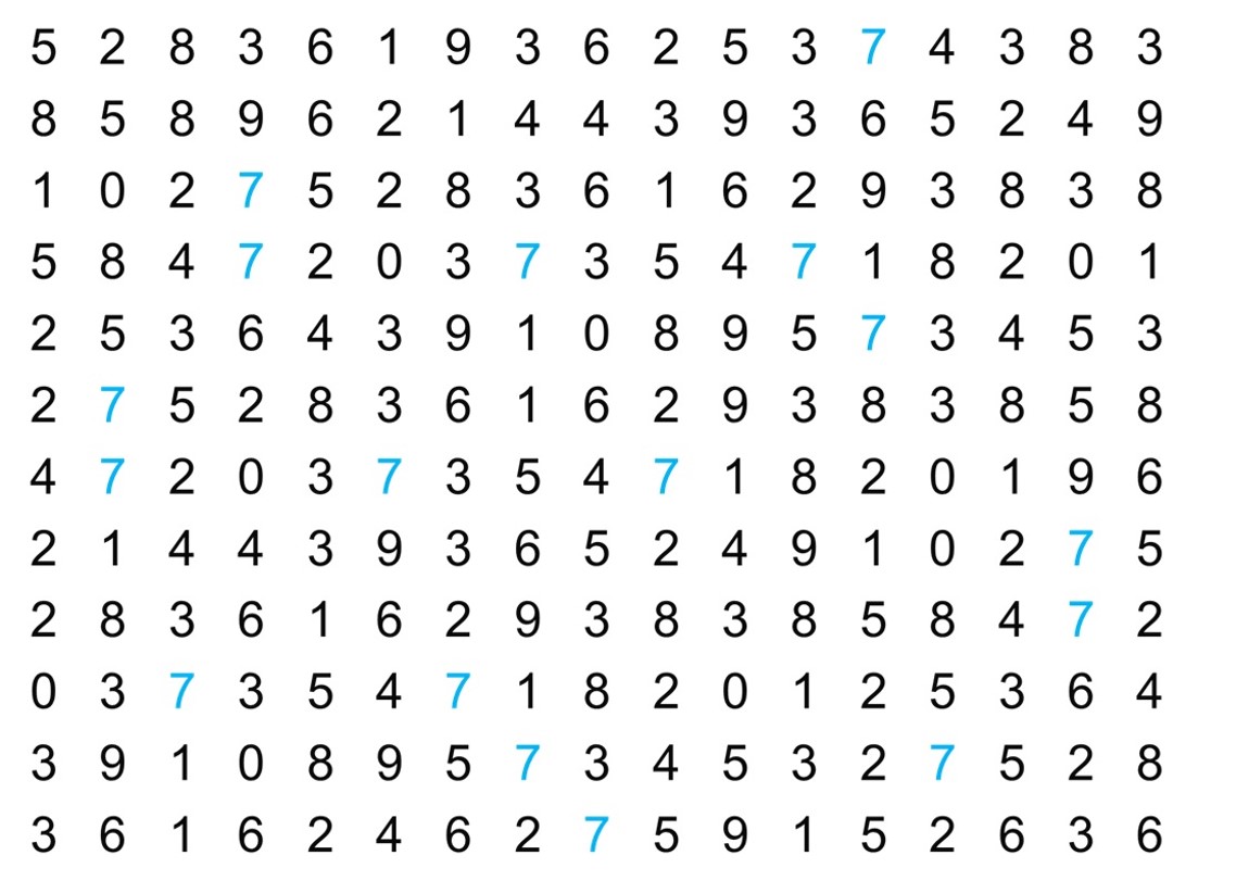
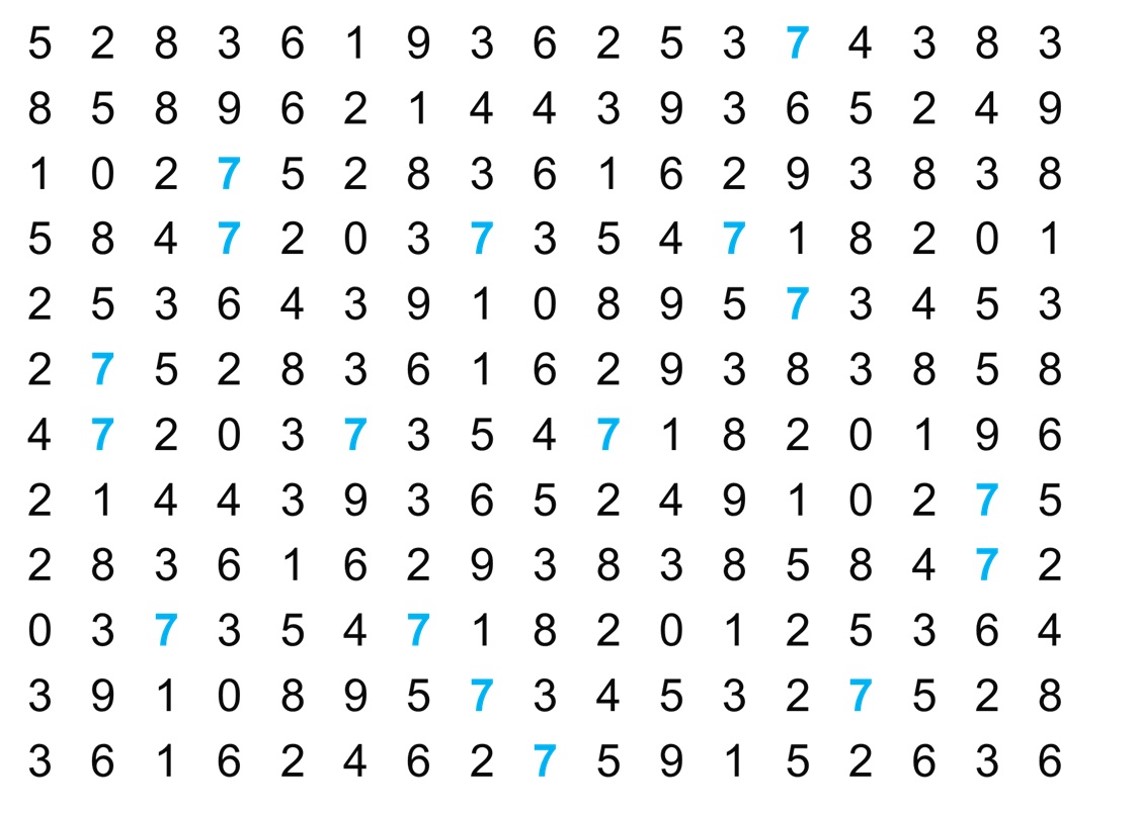
3.9 Let’s play a game, how many 7s can you count?
On the next slide you will see a square of numbers You have 15s to count the 7s
3.10 Let’s play a game, how many 7s can you count?
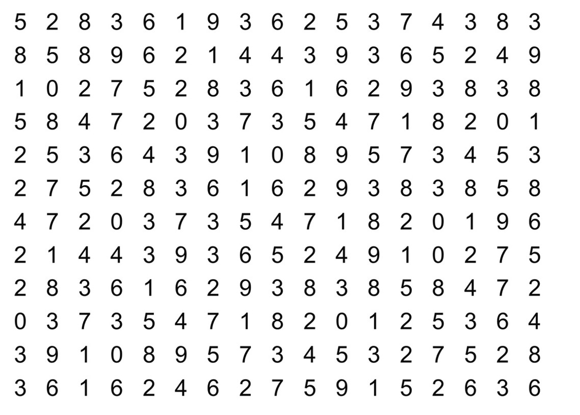
3.11 Let’s play a game, how many 7s can you count?
3.12 Let’s play a game, how many 7s can you count?
3.13 Visual perceptions
Our perception of data on a typical printed page is associated with several visual variables.
We call them aesthetics
3.14 Data visualisations
The use of data visualisations can improve:
- Ease of understanding
- Engagement and attention
- Efficient communication
- Enhanced memory retention
- Cross-Disciplinary Understanding
- Presentation flexibility
3.15 Data visualisations in Sport
Visualisations can be used to enhance:
- Performance Analysis
- In-Game Insights
- Player Tracking and Biometrics
- Fan Engagement
- Scouting and Recruitment
- Tactical Analysis
- Predictive Analytics
3.16 From data to visualisation
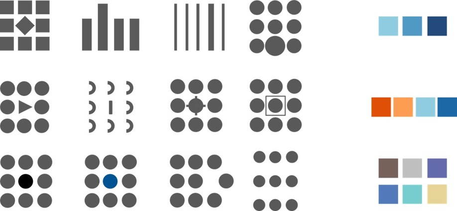
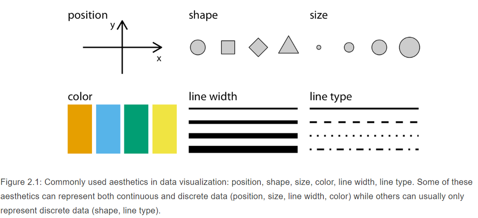
3.17 Aesthetics
- Aesthetics are quantifiable features within a graphic.
- Aesthetics can take different forms.
- The type of data we are working with will determine which aesthetic (or combination of aesthetics) we can best use.
3.18 Aesthetics
3.19 Task
- Map your variable onto a relevant aesthetic
3.20 Aesthetics
- Not all aesthetics can represent continues data
- E.g. shape and line type cannot be used for continues data
- Discrete data such as categorical data (ordered or unordered), text, or quantitative discrete variables (e.g. scale 1-5) can be represented by most aesthetics.
3.21 Using aesthetics
- Data should be mapped onto aesthetics
- Creating a scale
- When creating a scale each unique value needs to have a unique aesthetic value
- Reason why shape and line type cannot be used on continues data
- Often visualisations use three scales, however it is possible to have more than 3 scales in one visualisation
3.22 Task
Design an imaginary sport visualisation with 3 different scales. Can you make one with 4 different scales?
3.23 Coordinate systems and axes
- Visualising data requires position scales
- Most commonly used system is Cartesian coordinate system
- x and y coordinates
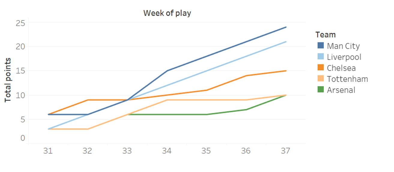
- Each grid spacing on the x- and y-axis refers to a step in the variable unit (e.g. 1 league point).
- X- and y-axis with different units don’t require same spacing.
- Stretch along y-axis to emphasis on y-axis change
- Stretch along x-axis to emphasis on x-axis change
- If x and y use same units, spacing should be equal to not distort your message.
3.24 Coordinate systems and axes
- Non-linear axis are not uncommon.
- Log-transformed – often used when variables have a very different magnitude.
- Square root – less often used but may be useful when your data contains 0’s.
- When using log-transformation ensure you are clear when plotting the data.
- Another commonly used coordinate system in sport data analytics is the polar system.
- X-axis is circular
3.25 Using colour
- Distinguish
- i.e. make difference between groups/ categorical data clear
3.26 Using colour
- Represent
i.e. use colour to show the value of continues variables
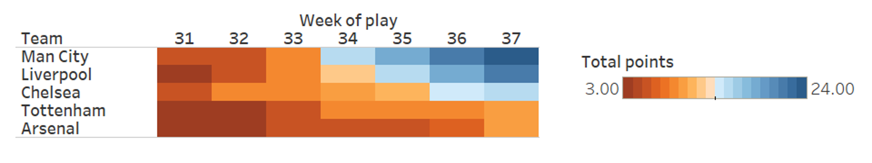
3.27 Using colour
- Highlight
i.e. focus on one specific group or element within your data
3.28 Types of visualisations
- Lots of different types of visualisations available.
- Which one to use depends on the data you are displaying
- Amounts
- Distribution
- Proportions
- Relationships
- Geospatial data
- Uncertainty
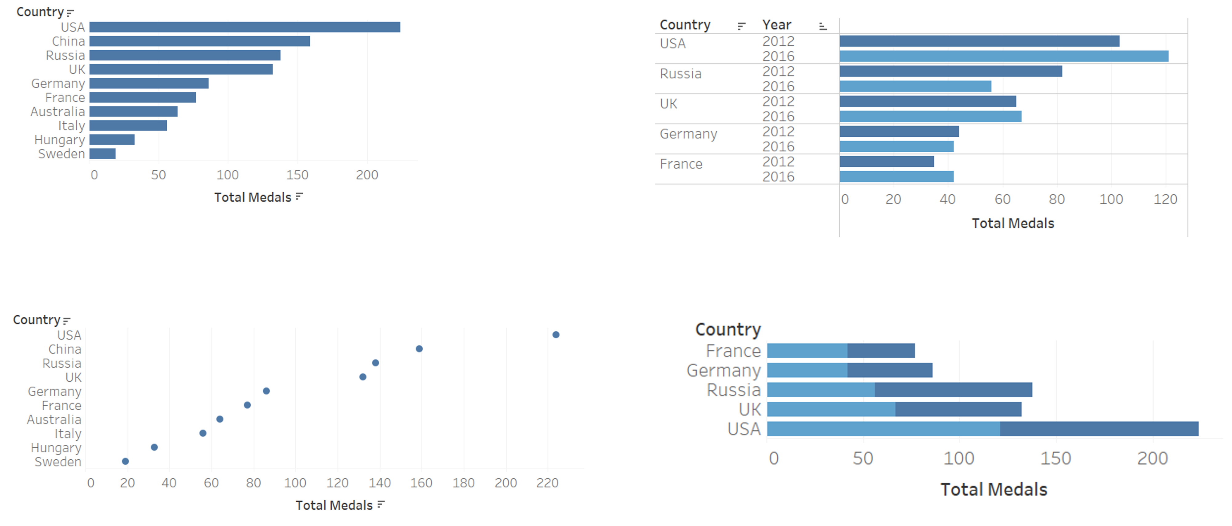
3.29 Visualising amounts
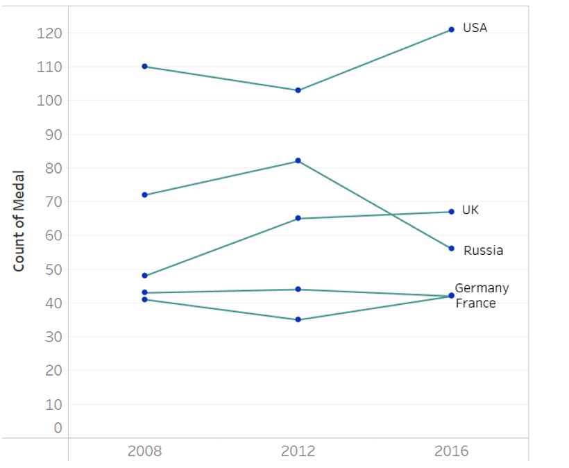
- Visualising amounts refers to visualising a value for a set of categories (e.g. Olympic medals per country)
- Bar plots most commonly used
- “Normal”, stacked, grouped
- Pay attention to labelling
- Ordering
- Dot plots and heatmaps are alternative options
3.30 Examples of amounts
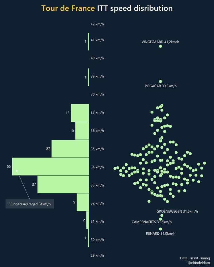
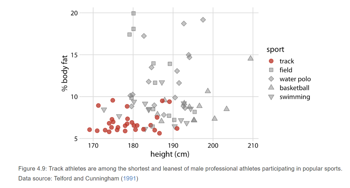
3.31 Visualising distributions
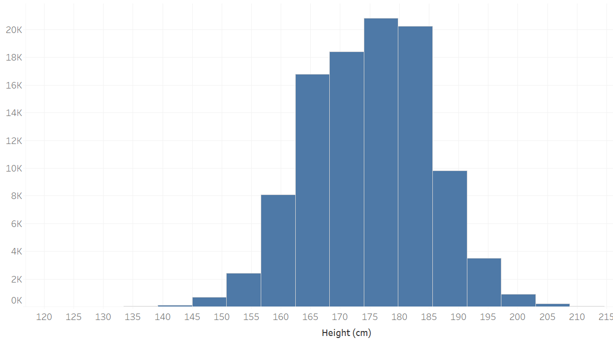
- Visualising distributions refers to visualising the relative proportions of different variables.
- Histogram and density plots most common
- You need to set bins (histogram) or bandwidth (density) – arbitrary.
- Note density plots can display data that does not exist, be aware of this
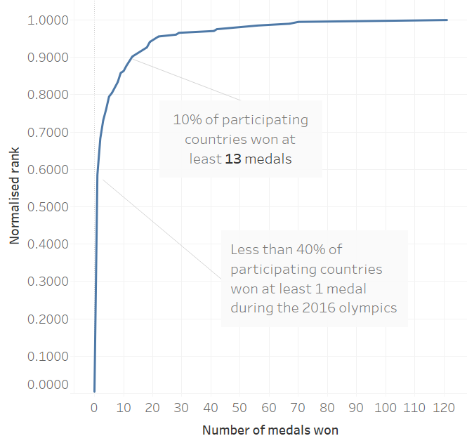
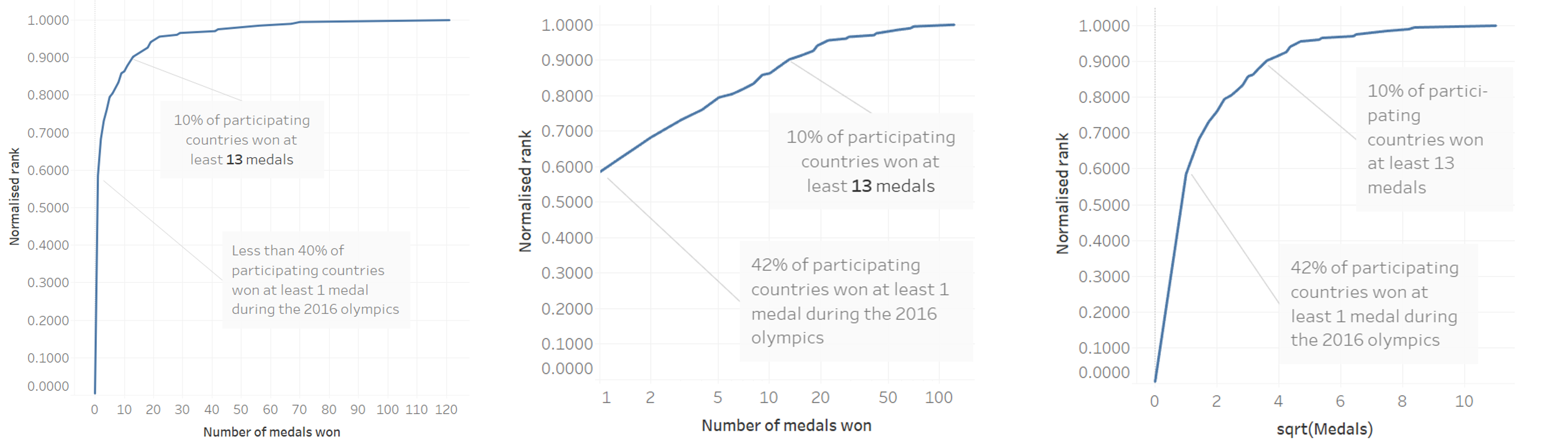
- Alternatives empirical cumulative distribution function (ecdf) and quantile-quantile plots (q-q plots)
3.32 Empirical cumulative distribution function
ECDF ranks all data points based on value from small to large (or vice versa).
To increase readability and information the y-axis is often normalized to the maximum rank so the maximum y-value equals 1.
3.33 Empirical cumulative distribution function
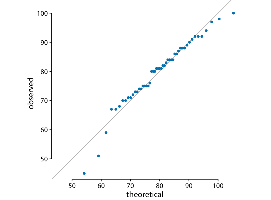
3.34 Quantile-quantile plots
q-q plots are a useful when we want to determine to what extent the observed data points follow a given distribution.
q-q plots use ranks to predict where a given data point should fall if the data were distributed according to a specified reference distribution (often a normal distribution).
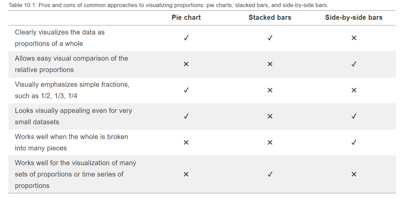
3.35 Visualising proportions
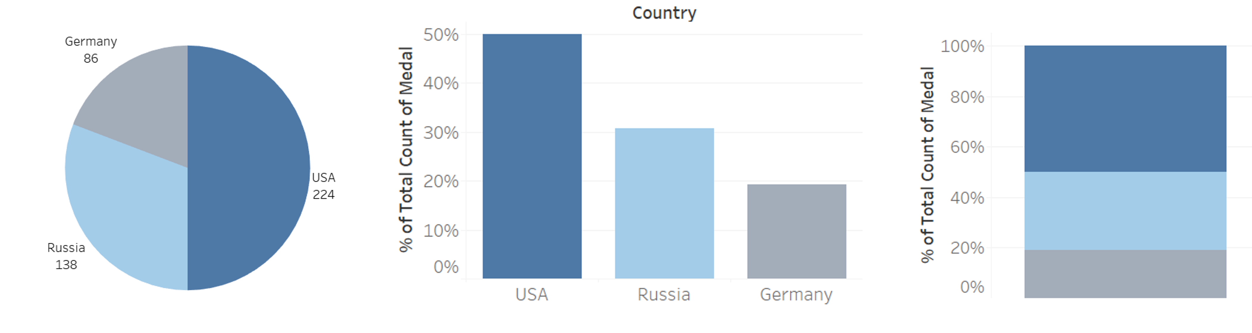
3.36 Visualising proportions
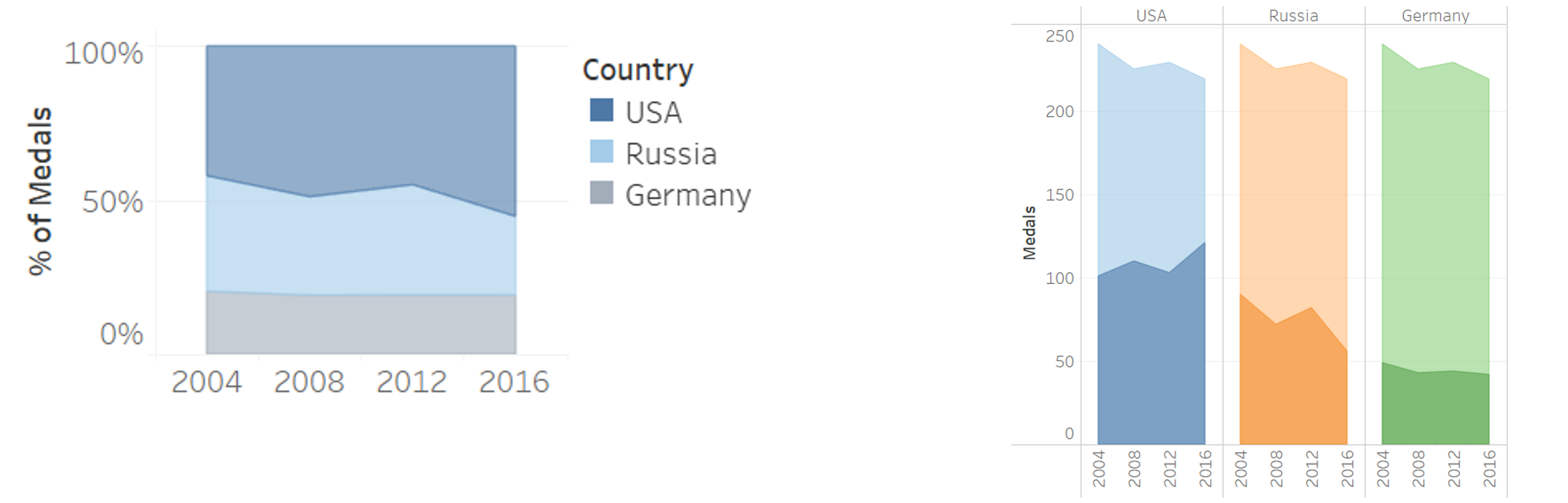
3.37 Visualising proportions
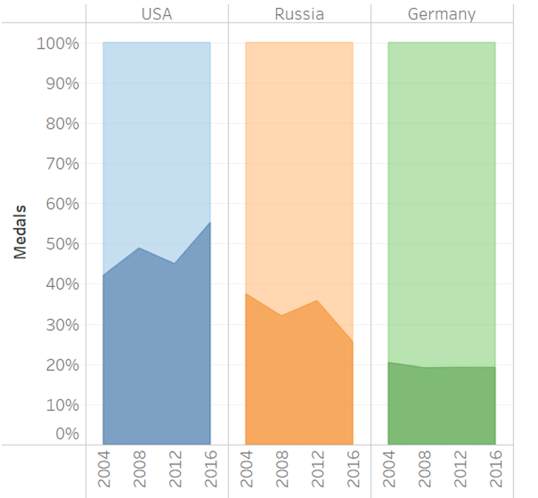
3.38 Visualising proportions
3.39 Visualising associations
- Scatter plots
- Correlation diagrams
- Slope graphs