4 Lecture 2 Handouts
Assessment 1 and Principles of Figure Design
4.1 Today’s Session
- Assessment 1
- Principles of figure design
- Telling a story
4.2 Today’s learning objectives
- Understand and recall assessment 1 criteria
- Understand the principles of figure design
- Understand the importance of telling a story
- Recall the steps when designing your visualisation
4.3 Assessment 1
4.3.1 Assessment 1 brief
- Assessment type: Visualisation critique (500 words)
- Deadline: Week 6
- Weighting: 20%
- Brief: You will be given a sport data visualisation and will be asked to outline the strengths and weaknesses of this visualisation. You will use published literature to support your critique.
4.3.2 Assessment 1 criteria (1)
Criteria 1: Critique for and against the use of specific data visualisation methods depending on the message the authors want to share and audience they target (85%).
Characteristic 1: Evaluate how well the data is represented in the visualization.
Characteristic 2: Provide constructive suggestions for enhancing the visualization to improve the user experience.
4.3.3 Assessment 1 criteria (2)
Criteria 2: Overall Presentation (15%)
Your report meets the word limit (500 words)
The content is logically organized and flows coherent
Your writing style is clear, professional and adheres to academic standards
You properly reference relevant sources to back up your statement using IEEE format
4.4 Principles of figure design
4.4.1 Principles of figure design
- Data to non-data ink ratio
- Tables
- Proportional ink
- Titles, axis, and legends
- Colour use
- Overlapping data
- Multiple panels
4.4.2 Data ink vs non-data ink
Edward Tufte:
Remove Chart Junk (unnecessary or confusing visual elements in charts and graphs)
Data-Ink Ratio (The non-erasable core of a graphic)
Data-Ink vs. Total Ink
4.4.3 Data ink vs non-data ink
Tufte’s Five rules of Data-Ink:
Above all else show the data
Maximize the data-ink ratio
Erase non-data-ink
Erase redundant data-ink
Revise and edit
4.4.4 Tables
- Tables are used frequently and can display detailed information efficiently
- Table formatting is often poor
- Creating a clear table is key for efficient information transfer
Top tips:
Do not use vertical lines
Do not use horizontal lines between rows
Use left align for text 4. Use right align for numbers
Use centre align for single characters
Column headers are aligned to their data
Title above table
4.4.5 Proportional ink
- Visualisations should ensure that the size of shaded areas is proportional to the data values
- Misleading visuals can result when graphs start at values other than 0 (IF shaded areas are used).
4.4.6 Proportional ink
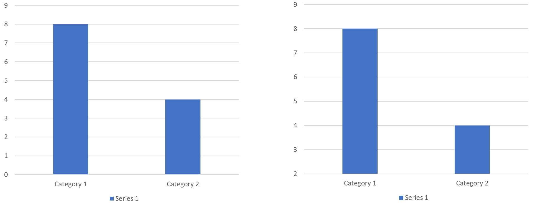
4.4.7 Proportional ink
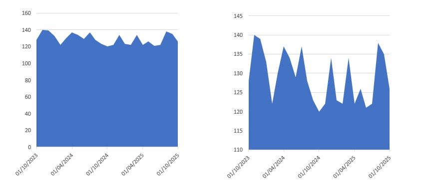
4.4.8 Proportional ink
Can we not show small fluctuations with bar or line graphs?
We can – show the difference compared to your benchmark.
Remember if you’re using shaded areas ensure the proportional ink is correct. If it is not or it’s better it’s not (when using log scales) consider using location instead of location and shading.
4.4.9 Proportional Ink – Pie charts and tree maps
- Should automatically adhere to the principle of proportional ink
- Think about how human perception works
- Distances are easier to interpreted than area!
4.4.10 Titles, axis, and legends
- We will need to use titles, axis labels and legends to provide context
- Title should accurately convey what the figure is about, what point does it make
4.4.11 Titles, axis, and legends
- Axis and legends explain what the displayed data values are and how they map to plot aesthetics
- Consider whether a legend title is required
- When using numerical variables do not forget to include the unit
- Make sure your audience doesn’t have to guess the meaning of the values/ categories displayed
- Ensure your legends and axis labels are readable
4.4.12 Colour use
- Spoken about the different functions of using colour
- Important use of colour is with purpose, what does it add?
- For categorical variables max 3-5 categories
4.4.13 Colour use – sequential/ diverging
- When using sequential / diverging colour coding ensure the difference between data points is reflected in difference by colour
- Make sure the changes in colour are monotonic
- i.e. no regions with very little change followed by drastic change

4.4.14 Colour use - sequential/ diverging
- Use diverging shades if there is a meaningful middle point (e.g. 50%, below or above mean/ median, benchmark)
- Use diverging shades to emphasise the extremes (both low and high), use sequential when emphasising one end of the spectrum
- Diverging shades will show more differences in the data
- Diverging scales take more mental capacity to take in (scales are not often as clear)
4.4.15 Colour use - classed vs unclassed
- Classed vs unclassed colour scale
- If data is classed (e.g. likert scale values) – ALWAYS classed
- Continues data can be classed (e.g. above and below a benchmark)
- Unclassed provides more nuance – does not interpreted data for audience
4.4.16 Overlapping points
- Plotting data from large data sets often results in plotting overlapping points
- Deal with this in several ways:
- Use transparency
- Use jittering
- Create 2-D histograms or use contour lines (we will not cover these in this class)
4.4.17 Multiple panels – small multiples
- Often data sets contain more information than can be shown in one figure
- Faceting (i.e. creating multiple mini plots in one figure) can address this
- Panels/mini plots should use the same axis and scalings
- Think about how you order your panels/mini plots
4.4.18 Multiple panels – compound panels
- Sometimes two (or more) completely different figures can be combined
- Use labeling to indicate the different figures (e.g. a); b); etc).
- While different figures, ensure formatting is similar (e.g. player position same colour in each figure).
- Check alignment
4.5 Telling a story
4.5.1 What is a story?
- Attract
- Engage
- Punchline
4.5.2 Telling a story
- Identify theme/ main message
- Know your audience
- Determine purpose
- Set the tone
- Keep it simple
- Walk audience through your story
- Make an impression and provide clear take home message
- Figures when telling a story
- Avoid complicated figures
- Create consistency between figures (similar to multi-panel discussed earlier)
- Ensure different analysis are displayed differently (e.g. progress over time with a line chart, differences between groups with a bar chart)
- Use highlighting to emphasize the main message
4.6 Back to the learning objectives
- Understand and recall assessment 1 criteria
- Critique of visualisation using all you just learned
- Understand the principles of figure design
- Figure styles, data-ink, proportional ink, labeling, color use, table formatting etc
- Understand the importance of telling a story
- Make it easy for the audience, keep them engaged
- Recall the steps when designing your visualisation
- Decide on type of visualisation, create, refine, think about what your story will be, combine visualisations, refine/simplify.