TidyData <- read.csv("C:/Users/wkb14101/OneDrive - University of Strathclyde/MSc SDA/B1703/Data for practicals/Tidy Data (World Cup 2018)_Migrated Data.csv")
ShotData <- read.csv("C:/Users/wkb14101/OneDrive - University of Strathclyde/MSc SDA/B1703/Data for practicals/Shot Timeline (World Cup 2018)_Migrated Data.csv")29 Practical 13: Building dashboards in R
In this practical we will look at how we can combine all the visualisations we learned to create over the last couple of weeks into an interactive dashboard. The practical will work through some of the steps we took to create the visualisations (extra practice for you) and then go into how to put them all together on a dashboard. We look at linking filters and different formatting options. To build a dashboard in R you will need the shinyand bslib packages. We will also use the DT package and as always tidyverse including ggplot2. Go ahead and install (if necessary) and load these.
29.1 Building a basic dashboard
29.1.1 Before starting to build your dashboard
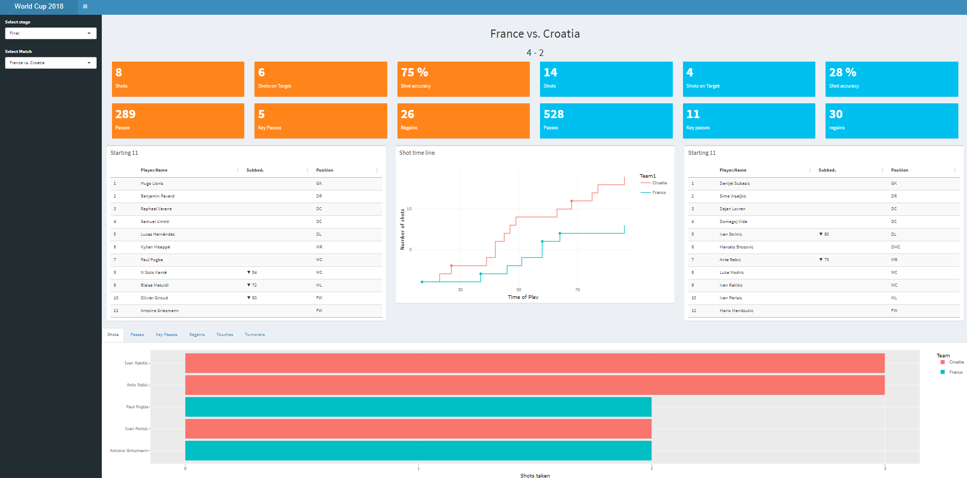
As R uses code to build the dashboard it is much harder to visualise what you are building (unlike using Tableau). Therefore, I will start by making a draft of what I want my dasboard to look like and then build my code to match my drawing. In our case we want to build something like the dashboard below:
29.1.2 The structure of an app
When building a shiny app it is useful to set up a brand new directory. The best way to do this is via New Project, and choosing Shiny Web Application. This will automatically create a basic structure for your shiny app.
Exercise 1: Create a new Shiny App project.
Show the answer
If you have created the Shiny App project correctly, the following code will have been created:
Define UI for application that draws a histogram
ui <- fluidPage(


# Application title
titlePanel("Old Faithful Geyser Data"),

# Sidebar with a slider input for number of bins
sidebarLayout(
    sidebarPanel(
        sliderInput("bins",
                    "Number of bins:",
                    min = 1,
                    max = 50,
                    value = 30)
    ),

    # Show a plot of the generated distribution
    mainPanel(
       plotOutput("distPlot")
    )
  )
)
Define server logic required to draw a histogram
server <- function(input, output) {


output$distPlot <- renderPlot({
    # generate bins based on input$bins from ui.R
    x    <- faithful[, 2]
    bins <- seq(min(x), max(x), length.out = input$bins + 1)

    # draw the histogram with the specified number of bins
    hist(x, breaks = bins, col = 'darkgray', border = 'white',
         xlab = 'Waiting time to next eruption (in mins)',
         main = 'Histogram of waiting times')
})

}
Run the application
shinyApp(ui = ui, server = server)When you run the code above you will have seen that R created a dummy app with a histogram and a slider which lets you change the bin size. We will first up change the UI as we will use the bslib package to create our dashboard.
Exercise 2: First let’s build our UI structure (just the structure no need to add any data). Create a UI which includes:
A title (“World Cup 2018”,)
Two filters called
StageandGamelocated in a sidebar,Match played (e.g. France vs. Croatia)
Match result
Two rows with 6 boxes which will display some of the match statistics
A row with the home and away starting eleven and a shot timeline
A tabulated sections with 5 tabs displaying: Shots, Passes, Key Passes, Regains, Turnovers
Use the image above as an example.
Show the answer
Define UI for application
ui<- page_fluid(

  # HEADER
  titlePanel(title="World Cup 2018"),

  # Sidebar
  # Sidebar, this is where we will store our filters
  layout_sidebar(
    sidebar=sidebar(
      title=("Interactive filters"),
      # first filter will let users select the stage in the tournament
      selectInput(
        inputId= "select_stage",
        label = "Select stage",
        choices= c("Final", "Semi-Final", "Quarters", "Group"), # later on we will create a table in the Global.R environment that provides the choices
        selected = "Final", # Final is automatically selected on opening the app
        multiple= FALSE),
      #selector for match, we will make this dynamic a little bit further on (i.e. only those matches relevant to the phase will show up)
      selectInput(
        inputId= "select_match",
        label = "Select Match",
        choices= c("France vs. Croatia", "Belgium vs. England"), # later we will create a table in the Global.R environment with all the matches
        selected = "France vs. Croatia",
        multiple= FALSE)
    ),

    #BODY
    layout_column_wrap(
      width=1,
      card(),
      card(),
    ),
    # this column wrap and it's child column wraps shows the value boxes in 6 columns and two rows (e.g. shots home team)
    layout_column_wrap(
      width=1/6,
      layout_column_wrap(
        width=1,
        card(),
        card()
      ),
      layout_column_wrap(
        width=1,
        card(),
        card()
      ),
      layout_column_wrap(
        width=1,
        card(),
        card()
      ),
      layout_column_wrap(
        width=1,
        card(),
        card()
      ),
      layout_column_wrap(
        width=1,
        card(),
        card()
      ),
      layout_column_wrap(
        width=1,
        card(),
        card()
      )),
    # this column wrap creates three columns with the line up and timeline of shots
    layout_column_wrap(
      width=1/3,
      card(),
      card(),
      card()
    ),
    # in this column wrap we embed a tabBox with tabPanels which show the players with the highest numbers of shots, passes etc on individual tabs.
    layout_column_wrap(
      width=1,
      tabBox(
      tabPanel(title="Shots"),
      tabPanel(title="Passes"),
      tabPanel(title="Key Passes"),
      tabPanel(title="Regains"),
      tabPanel(title="Turnovers")
    ))
  )
)


server <- function(input, output, session){}

shinyApp(ui, server)
29.2 Preparing the code running in the background
Now we have an idea of our UI layout we will need to ensure we load in our data and get the server working. All the code we will write from now on will be stored in a file called global.R. Our app.R file will now to call on global.R when it runs the functions within the app.
We will start with loading in the Tidy Data (World Cup 2018)_Migrated Data.csv and Shot Timeline (World Cup 2018)_Migrated Data.csv data files.
Exercise 3: Load in the these data files, which can be found here.
Show the answer
Looking at the TidyData data file we can see it has all the world cup matches listed and the actions (e.g. assists, arials won, etc) of each player in a team are listed per match (so a player has one row per match). The data also indicates who played at home and who played away, as well as whether the match was a group phase match our elimination phase. Some of the key variables you will use and their definitions are listed below:
Team = Team player plays for
Home = Home playing team
Subbed? = Minute in match sub happened and if player came in or out (only available for relevant players)
Sub? = True or False variable indicating if player came in as a Sub Player
Name = Players name
Position = Players position
Now lets see if we can start creating some charts. But unlike in previous practicals we will need to create these charts as functions which we can then use in our dashboard app.
29.2.1 Starting 11
The first step is to make sure we have our filter data set up. We will have a Stage and Match filter.
Exercise 4: Create a new dataframe which lists each match ones and the stage in which it was played and call it Match_list.
Show the answer
# First we want to create a dataframe which contains the unique matches and their relevant stage. This will help our filtering later on.
Match_list <- TidyData %>%
  group_by(Match, Stage) %>%
  reframe()
Next up we start looking at creating our functions for our plots. We will use the functions later on when we write the server code, it’s therefore important your functions have clear names!
Exercise 5: Create a function which list the starting 11 for the home and away teams.
Show the answer
# Remember in a function you add the input (in our case that is the data set we will use, and the two filter settings users of our dashboard will select)

lineup_home <- function(data, stage="Final", match="France vs. Croatia"){
# the next part of the function is your usual code for creating your visualisation. We first filter based on the stage, match and home team (note I also filter out an error entry called "Own G"). Then we give each position a number via mutate (this will help us order our table) and last we create a new dataset with just the Player.name, whether they were subbed and their position which we then list in a datatable.
  data <- data %>%
  filter(Stage == stage & Match == match & Team==Home & Sub.=="FALSE" & Player.Name!= "Own G") %>%
  mutate(P = ifelse(Position == "GK", 1, ifelse(Position == "DR",2,ifelse(Position == "DC",3, ifelse(Position == "DL",4,ifelse(Position == "DMR",5,
  ifelse(Position == "DMC",6, ifelse(Position == "DML",7, ifelse(Position == "MR",8, ifelse(Position == "MC",9, ifelse(Position == "ML",10,
  ifelse(Position == "AMR",11,ifelse(Position == "AMC",12, ifelse(Position == "AML",13, ifelse(Position == "FWR",14, ifelse(Position == "FW",15,
  ifelse(Position == "FWL",16, 17))))))))))))))))) %>%
  arrange(P)
  data <- (data[,c("Player.Name","Subbed.","Position")])
  datatable(data)
}


# do the same for the away team

lineup_away <- function(data, stage="Final", match="France vs. Croatia"){
  data <- data %>%
  filter(Stage==stage & Match==match & Team==Away1 & Sub.=="FALSE" & Player.Name!= "Own G") %>%
  mutate(P = ifelse(Position == "GK", 1, ifelse(Position == "DR",2,ifelse(Position == "DC",3, ifelse(Position == "DL",4,ifelse(Position == "DMR",5,
  ifelse(Position == "DMC",6, ifelse(Position == "DML",7, ifelse(Position == "MR",8, ifelse(Position == "MC",9, ifelse(Position == "ML",10,
  ifelse(Position == "AMR",11,ifelse(Position == "AMC",12, ifelse(Position == "AML",13, ifelse(Position == "FWR",14, ifelse(Position == "FW",15,
  ifelse(Position == "FWL",16, 17))))))))))))))))) %>%
  arrange(P)
  data <- data[,c("Player.Name","Subbed.","Position")]
  datatable(data)
}
29.2.2 Function for the match statistics
We would like to display the total number of Shots, Shots on Target, Shot Accuracy, Key Passes, Regains, and Turnovers. We will display these in text boxes but to do that we will need to create a dataframe which has each of the summary statistics in columns (so your function output should be a data frame of 1x6).
Exercise 6: Create two functions which out put the home and away summary statistics (use the TidyData data frame for this).
Show the answer
Functions for match stats
stats_home <- function(data, stage="Final", match="France vs. Croatia"){
  data <- data %>%
  filter(Stage==stage & Match==match & Team==Home) %>%
  reframe(Shots = sum(Shots,na.rm=TRUE),
          ShotsOnTarget = sum(Shots.OT,na.rm=TRUE),
          ShotAccuracy = as.integer((ShotsOnTarget/Shots)*100),
          Passes = sum(Passes,na.rm=TRUE),
          KeyPasses = sum(Key.Passes,na.rm=TRUE),
          Regains=sum(Interceptions,na.rm=TRUE)+sum(Total.Tackles,na.rm=TRUE))
}

 stats_away <- function(data, stage="Final", match="France vs. Croatia"){
    data <- data %>%
    filter(Stage==stage & Match==match & Team==Away1) %>%
    reframe(Shots = sum(Shots,na.rm=TRUE),
            ShotsOnTarget = sum(Shots.OT,na.rm=TRUE),
            ShotAccuracy = as.integer((ShotsOnTarget/Shots)*100),
            Passes = sum(Passes,na.rm=TRUE),
            KeyPasses = sum(Key.Passes,na.rm=TRUE),
            Regains=sum(Interceptions,na.rm=TRUE)+sum(Total.Tackles,na.rm=TRUE))

  text_results <- function(data, stage="Final", match="France vs. Croatia") {

  data <- data %>%
    filter(Stage==stage & Match==match & Team==Home) %>%
    reframe(goals=sum(Goal, na.rm=TRUE))
  goalshome <- as.data.frame(data$goals)

  data <- TidyData %>%
    filter(Stage==stage & Match==match & Team==Away1) %>%
    reframe(goals=sum(Goal, na.rm=TRUE))
    goalsaway <- as.data.frame(data$goals)

    results<-paste(goalshome, " - ", goalsaway)
}
 }
29.2.3 Function for shot timeline
Next up let’s create a function for the shot time line.
Exercise 7: Check the visualisation example at the start of this practical and see if you can create a similar shot time line written as a function. Make sure you filter for the selected stage and match as we did in the example above.
Show the answer
 plot_timeline <- function(data, stage="Final", match="France vs. Croatia") {
    data <- data %>%
     filter(Stage==stage & Match == match) %>%
     arrange(Time1, Goal)%>%
      group_by(Team1) %>%
      mutate(CS=cumsum(Number.of.Records),
             Goals=ifelse(Goal==1,CS, NA))

    ggplot(data,aes(Time1,CS, color= Team1, group = Team1))+
      geom_step()+ geom_point(aes(Time1,Goals, group=Team1))+theme_minimal()+
      labs(y="Number of shots", x="Time of Play")
 }
29.2.4 Function for shot plot
Exercise 8: Next up let’s create a function which displays the 5 players which have taken the largest number of shots for the relevant match.
Show the answer
plot_shots <- function(data, stage="Final", match="France vs. Croatia") {

  data <- TidyData %>%
    filter(Stage==stage & Match == match) %>%
    arrange(desc(Shots)) %>%
    slice_head(n=5)

  data %>%
  ggplot(aes(y=reorder(Player.Name, Shots), x=Shots, fill=Team))+
    geom_col()+
    labs(y="",x="Shots taken")
}
29.2.5 Functions for other top 5s
Exercise 9: Do the same as above but for passes, key passes, regains, touches and turnovers.
Show the answer
plot_passes <- function(data, stage="Final", match="France vs. Croatia") {

    data <- TidyData %>%
      filter(Stage==stage & Match == match) %>%
      arrange(desc(Passes)) %>%
      slice_head(n=5)

    data %>%
      ggplot(aes(y=reorder(Player.Name, Passes), x=Passes, fill=Team))+
      geom_col()+
      labs(y="",x="Shots taken")
}

plot_keypasses <- function(data, stage="Final", match="France vs. Croatia") {

    data <- TidyData %>%
      filter(Stage==stage & Match == match) %>%
      arrange(desc(Key.Passes)) %>%
      slice_head(n=5)

    data %>%
      ggplot(aes(y=reorder(Player.Name, Key.Passes), x=Key.Passes, fill=Team))+
      geom_col()+
      labs(y="",x="Passes")
}
plot_regains <- function(data, stage="Final", match="France vs. Croatia") {

    data <- TidyData %>%
      filter(Stage==stage & Match == match) %>%
      arrange(desc(Tackle...Interceptions)) %>%
      slice_head(n=5)

    data %>%
      ggplot(aes(y=reorder(Player.Name, Tackle...Interceptions), x=Tackle...Interceptions, fill=Team))+
      geom_col()+
      labs(y="",x="Regains")
}
plot_touches <- function(data, stage="Final", match="France vs. Croatia") {

    data <- TidyData %>%
      filter(Stage==stage & Match == match) %>%
      arrange(desc(Touches)) %>%
      slice_head(n=5)

    data %>%
      ggplot(aes(y=reorder(Player.Name, Touches), x=Touches, fill=Team))+
      geom_col()+
      labs(y="",x="Touches")
}
plot_turnovers <- function(data, stage="Final", match="France vs. Croatia") {

    data <- TidyData %>%
      filter(Stage==stage & Match == match) %>%
      arrange(desc(Turnovers)) %>%
      slice_head(n=5)

    data %>%
      ggplot(aes(y=reorder(Player.Name, Turnovers), x=Turnovers, fill=Team))+
      geom_col()+
      labs(y="",x="Turnovers")
}
29.3 Writing the server code
Now we have all figures and data tables we require for our dashboard we can add these to the server and create a working application. We had already written our UI interface but we will make a few more changes to this after we’ve written the server code. First though, let’s update the server code.
Exercise 10: Create a server code which creates outputs for the UI using the functions written in the global.R file. Also try to add the interactivity ensure the match list is updated after a stage has been selected (i.e. the final should only show one match)
Update the server
Show the code
server <- function(input, output, session){ # via the observe function below we can make sure that the second filter is based on the stage selection

  observe({
      new_choices <- Match_list %>%
        filter(Stage == input$select_stage) %>%
        pull(Match)

    new_choices <- c(new_choices)

    updateSelectInput(session, inputId = "select_match", #here R will update the select_match input with the newly filtered choices
                      choices = new_choices)

  })


# Next we create our outputs. Note the naming of the outputs is in line with how I named the outputs in the UI (e.g. dataTableOutput("Lineup_home) refers to output\$Lineup_home).


  output$title <- renderText(input$select_match)

      output$Result <- renderText(text_results(TidyData, input$select_stage, input$select_match))

      output$Lineup_home <- renderDataTable(lineup_home(TidyData, input$select_stage, input$select_match))

      output$TimeLinePlot <- renderPlotly(
        plot_timeline(ShotData, input$select_stage, input$select_match)
      )

      output$Lineup_away <- renderDataTable(lineup_away(TidyData, input$select_stage, input$select_match))

      output$ShotPlot <- renderPlotly(
        plot_shots(TidyData, input$select_stage, input$select_match))

      output$PassesPlot <- renderPlotly(
        plot_passes(TidyData, input$select_stage, input$select_match))

      output$KeyPassesPlot <- renderPlotly(
        plot_keypasses(TidyData, input$select_stage, input$select_match))

      output$RegainsPlot <- renderPlotly(
        plot_regains(TidyData, input$select_stage, input$select_match))

      output$TouchesPlot <- renderPlotly(
        plot_touches(TidyData, input$select_stage, input$select_match))

      output$TurnoversPlot <- renderPlotly(
        plot_turnovers(TidyData, input$select_stage, input$select_match))

      output$ShotsH <- renderValueBox({shots <- stats_home(TidyData, input$select_stage, input$select_match)$Shots
      valueBox(
        value = shots,
        subtitle = "Shots",
        color = "orange"
      )
      })

      output$ShotsTargetH <- renderValueBox({shots <- stats_home(TidyData, input$select_stage, input$select_match)$ShotsOnTarget
      valueBox(
        value = shots,
        subtitle = "Shots on Target",
        color = "orange"
      )
      })

      output$ShotsAccuracyH <- renderValueBox({shots <- paste(stats_home(TidyData, input$select_stage, input$select_match)$ShotAccuracy,"%")
      valueBox(
        value = shots,
        subtitle = "Shot accuracy",
        color = "orange"
      )
      })

      output$ShotsA <- renderValueBox({shots <- stats_away(TidyData, input$select_stage, input$select_match)$Shots
      valueBox(
        value = shots,
        subtitle = "Shots",
        color = "aqua"
      )
      })

      output$ShotsTargetA <- renderValueBox({shots <- stats_away(TidyData, input$select_stage, input$select_match)$ShotsOnTarget
      valueBox(
        value = shots,
        subtitle = "Shots on Target",
        color = "aqua"
      )
      })

      output$ShotsAccuracyA <- renderValueBox({shots <- paste(stats_away(TidyData, input$select_stage, input$select_match)$ShotAccuracy,"%")
      valueBox(
        value = shots,
        subtitle = "Shot accuracy",
        color = "aqua"
      )
      })

      output$PassesH <- renderValueBox({shots <- stats_home(TidyData, input$select_stage, input$select_match)$Passes
      valueBox(
        value = shots,
        subtitle = "Passes",
        color = "orange"
      )
      })

      output$KPassesH <- renderValueBox({shots <- stats_home(TidyData, input$select_stage, input$select_match)$KeyPasses
      valueBox(
        value = shots,
        subtitle = "Key Passes",
        color = "orange"
      )
      })

      output$RegainsH <- renderValueBox({shots <- stats_home(TidyData, input$select_stage, input$select_match)$Regains
      valueBox(
        value = shots,
        subtitle = "Regains",
        color = "orange"
      )
      })

      output$PassesA <- renderValueBox({shots <- stats_away(TidyData, input$select_stage, input$select_match)$Passes
      valueBox(
        value = shots,
        subtitle = "Passes",
        color = "aqua"
      )
      })

      output$KPassesA <- renderValueBox({shots <- stats_away(TidyData, input$select_stage, input$select_match)$KeyPasses
      valueBox(
        value = shots,
        subtitle = "Key passes",
        color = "aqua"
      )
      })

      output$RegainsA <- renderValueBox({shots <- stats_away(TidyData, input$select_stage, input$select_match)$Regains
      valueBox(
        value = shots,
        subtitle = "Regains",
        color = "aqua"
      )
      })

}
Now we know what outputs we have created we can add them to the user interface.
Define UI for application
Show the code
source('global.R', local = T) #This should be at the start of your app, so the app knows to call on the global.R file (stored in the same folder as your app.R file)

ui <- page_fluid(
  # Header (Here I added some formatting)
  titlePanel(title=div(
    style = "display: flex; justify-content: left; align-items: middle; font-weight: bold; font-size: 20px;",
    "World Cup 2018")
    ),

  # Sidebar, this is where we will store our filters (Again I added some formatting)
  layout_sidebar(
    sidebar=sidebar(
      title=div(style="font-weight: bold; font-size:20px",
                  "Interactive filters"),
      bg="#181818",
# I have updated the first filter by calling on the Match_list dataframe and the Stage column.
      selectInput(
        inputId= "select_stage",
        label = "Select stage",
        choices= Match_list$Stage, # all_stages is a table created in the Global.R environment
        selected = "Final", # Final is automatically selected on opening the app
        multiple= FALSE),
# I have updated the second filter by calling on the Match_list dataframe and the Match column.
      selectInput(
        inputId= "select_match",
        label = "Select Match",
        choices= Match_list$Match, # this is from a table created in the Global.R environment
        selected = "France vs. Croatia",
        multiple= FALSE)
      ),
  padding=0,

  # Body
  # first column wrap shows the title on one row (I have added some formatting options)
  layout_column_wrap(
    width=1,
    fill=FALSE,
    style="margin: 0; padding: 0; max-height: none; overflow: visible;border: none",
    gap="0rem",
    class="border-0",
    # The first card calls on the output called title - this displays the match played. The second card shows the result
    card(
      textOutput('title'),
      align="center",
      style = "font-weight: bold; font-size: 30px;margin:0; line-height: 1;border: none;",),
    card(
      textOutput('Result'),
      align="center",
      style = "font-weight: bold; font-size: 25px;margin:0; line-height: 1;border:none;",),
    ),
  # this column wrap and it's child column wraps shows the value boxes in 6 columns and two rows (e.g. shots home team)
  layout_column_wrap(
    width=1/6,
    fill=FALSE,
    min_height="10px",
    layout_column_wrap(
      width=1,
      card(
          valueBoxOutput('ShotsH', width="100%"),
          style = "background-color: #FFA500;",
          align = "center"),
      card(
        valueBoxOutput('PassesH', width="100%"),
        style = "background-color: #FFA500;",
        align = "center")
      ),
    layout_column_wrap(
      width=1,
      card(
        valueBoxOutput('ShotsTargetH', width="100%"),
        style = "background-color: #FFA500;",
        align = "center"),
      card(
        valueBoxOutput('KPassesH', width="100%"),
        style = "background-color: #FFA500;",
        align = "center")
      ),
    layout_column_wrap(
      width=1,
      card(
          valueBoxOutput('ShotsAccuracyH', width="100%"),
          style = "background-color: #FFA500;",
          align = "center"),
      card(
        valueBoxOutput('RegainsH', width="100%"),
         style = "background-color: #FFA500;",
         align = "center")
      ),
    layout_column_wrap(
      width=1,
      card(
        valueBoxOutput('ShotsA', width="100%"),
        style = "background-color: #ADD8E6;",
        align = "center"),
      card(valueBoxOutput('PassesA', width="100%"),
        style = "background-color: #ADD8E6;",
        align = "center")
      ),
    layout_column_wrap(
      width=1,
      card(
        valueBoxOutput('ShotsTargetA', width="100%"),
        style = "background-color: #ADD8E6;",
        align = "center"),
      card(
        valueBoxOutput('KPassesA', width="100%"),
        style = "background-color: #ADD8E6;",
        align = "center")
      ),
    layout_column_wrap(
      width=1,
      card(
        valueBoxOutput('ShotsAccuracyA', width="100%"),
        style = "background-color: #ADD8E6;",
        align = "center"),
      card(
        valueBoxOutput('RegainsA', width="100%"),
        style = "background-color: #ADD8E6;",
        align = "center")
      ))
      ,
  # this column wrap creates three columns with the line up and timeline of shots
  layout_column_wrap(
    width=1/3,
    height = "550px",
    card(
      title= "Starting 11",
      width= 4,
      full_screen=TRUE,
      dataTableOutput("Lineup_home")),
    card(
      title= "Shot time line",
      width = 4,
      plotlyOutput("TimeLinePlot"),
      align="center"),
    card(
      title= "Starting 11",
      width=4,
      full_screen=TRUE,
      dataTableOutput("Lineup_away",height= "auto"))
    ),
  # in this column wrap we embed a tabBox with tabPanels which show the players with the highest numbers of shots, passes etc on individual tabs.
  layout_column_wrap(
    width=1,
    tabBox(
      width=12,
      tabPanel(
        "Shots",
        plotlyOutput("ShotPlot")),
      tabPanel(
        "Passes",
        plotlyOutput("PassesPlot")),
      tabPanel(
        "Key Passes",
        plotlyOutput("KeyPassesPlot")),
      tabPanel(
        "Regains",
        plotlyOutput("RegainsPlot")),
      tabPanel(
        "Touches",
        plotlyOutput("TouchesPlot")),
      tabPanel(
        "Turnovers",
        plotlyOutput("TurnoversPlot"))
      )
    )
  )
)
Now to add the very last line of code to run your app.
Run the app
Show the code
shinyApp(ui, server) And there you have it you’ve written an app/ dashboard in R. What we have done today is only a minor part of what is possible within R. If you want to develop your skills further I recommend you practice and play around with it. It is also very helpful to look at other dashboards and their code, many are available online.
To find the final app.R and global.R files as they should be click here