library(tidyverse)
load("C:/Users/wkb14101/OneDrive - University of Strathclyde/MSc SDA/R Projects/B1703/Data/P5_F1Data.RData")16 Practical 7a: Basic plots in R
During this practical we will continue working with the F1 data set used in Practical 5. We will create several different plots shown during Lecture 5 and we will see how we can improve them.
16.1 Getting your data
Exercise 1: Open P5_F1Data.RData which can be found here.
Show the answer
16.2 Creating histograms
Up until now we have been interested championship titles and wins, but I would like to start looking at the athlete characteristics a bit more. First I would like to know if their age is normally distributed.
Let’s create a histogram which shows the distribution of the athletes ages. First we want to ensure we are not double counting drivers. We already created a variable with the average age of each driver per year we can just use the distinct() function within our histogram pipeline. Distinct only keeps the rows which are distinct based on the variables you identify.
Show the answer
# create a histogram using geom_histogram. In this example I build some data processing steps into the pipeline before creating the histogram.
Histogram<- DriversRacesDF%>%
  distinct(driverId, RaceYear, .keep_all=TRUE)%>%
  ggplot(aes())+
  geom_histogram(aes(x=AverageAge))
Histogram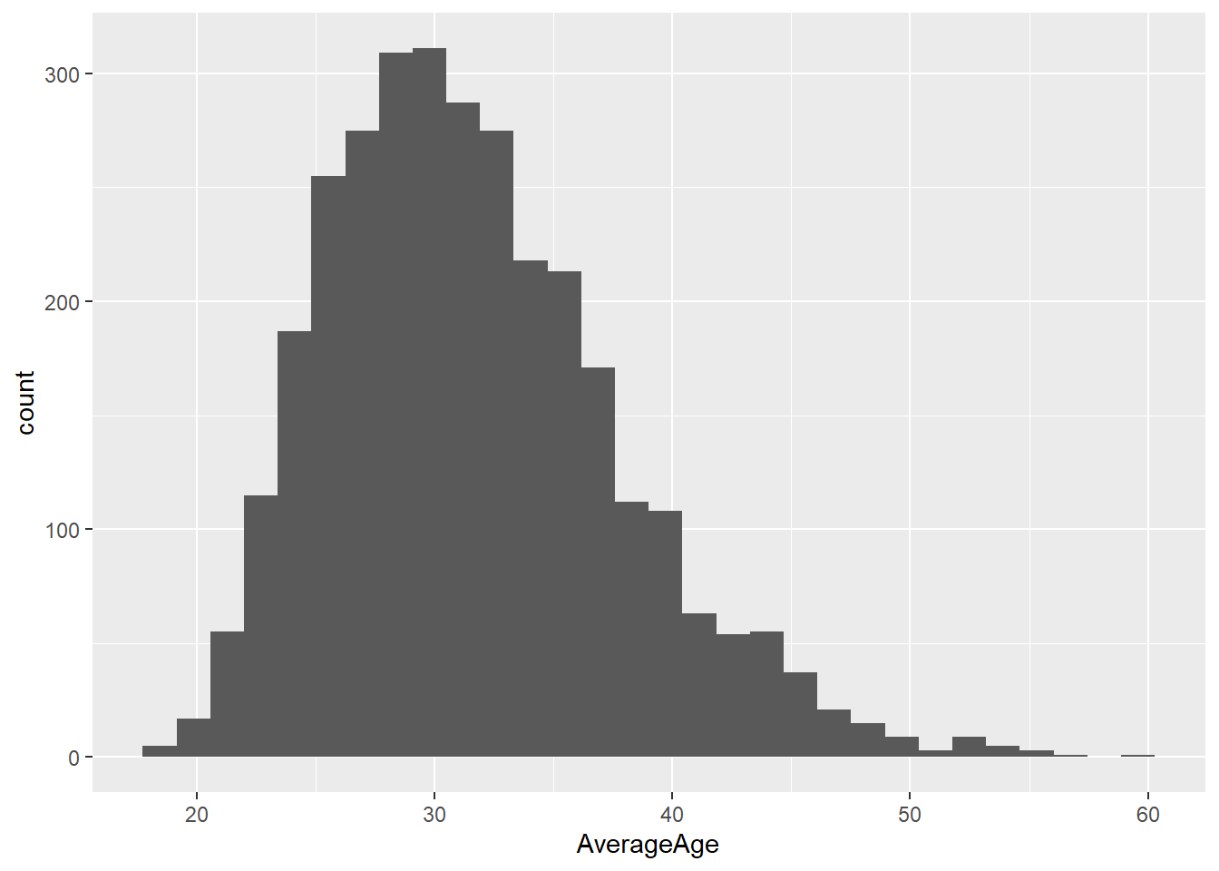
From the plot above we can see quite a wide spread of ages across the population of drivers. I wonder if the distribution of this differs pre 1990 and post 1990. Let’s create two histograms which shows the distribution of the drivers age in pre and post 1990. Try to create just one plot when doing so.
Show a hint
Use facet_wrap() on age
Show the answer
# Create a pre/post variable
DriversRacesDF<- DriversRacesDF %>%
  mutate(prepost1990 = ifelse(RaceYear<1990, "Pre", "Post"))

#assign the grouping colours. We will use this when creating the figure
colors <- c("orange", "steelblue")

# First I create a Histogram based on the pre 1990 data.Note how I choose to use density instead of the standard count to ensure fair comparison between the two (there may be more drivers pre or post 1990 so using count would have resulted in a unfair comparison). The after_stat() function ensures the density is calculated after the original count data for the histogram is calculated.
OverlapHisto <- DriversRacesDF%>%
  distinct(driverId, RaceYear, .keep_all=TRUE)%>%
  filter(prepost1990=="Pre") %>%
  ggplot(aes())+
  geom_histogram(aes(y=after_stat(density),x=AverageAge, fill="Pre"), alpha=0.7)

# Create a post 1990 dataframe
PostdataDF<-DriversRacesDF%>%
  distinct(driverId, RaceYear, .keep_all=TRUE)%>%
  filter(prepost1990=="Post")

# Add the post 1990 histogram to the pre 1990 histogram
OverlapHisto<- OverlapHisto +
  geom_histogram(data=PostdataDF,aes(y=after_stat(density),x=AverageAge,fill="Post"), alpha=0.6)+
# Via scale_fill_manual I tell R which color belongs to which group (using the colors variable created earlier)
  scale_fill_manual(values = setNames(colors, levels(DriversRacesDF$prepost1990)), name = "time period")


OverlapHisto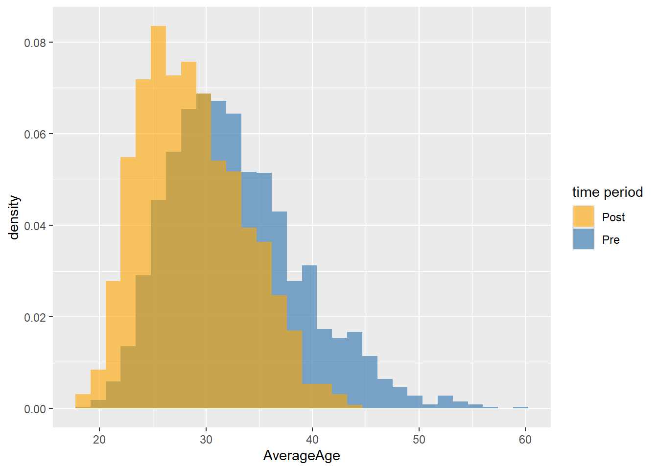
# use facetwrap to show two graphs within one visualisation. First we plot the histogram as normal (overlapping), then we specify the variable to use the facets with.
FacetHisto <- DriversRacesDF%>%
  distinct(driverId, RaceYear, .keep_all=TRUE)%>%
  ggplot(aes())+
  geom_histogram(aes(y=after_stat(density),x=AverageAge, fill=prepost1990))+
  facet_wrap(~prepost1990) +
  scale_fill_manual(name="time period",values=setNames(colors, levels(DriversRacesDF$prepost1990)))
FacetHisto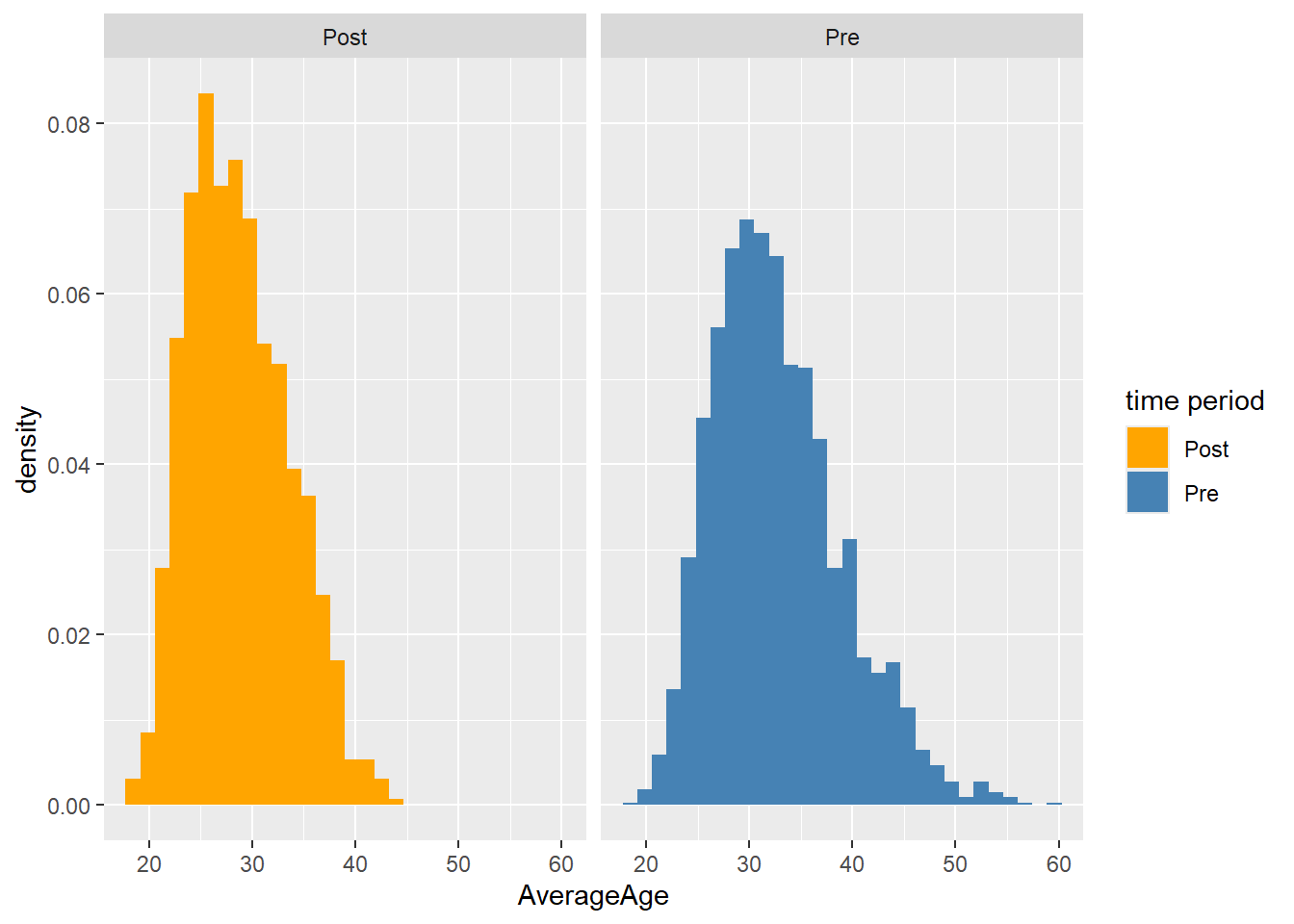
The two graphs above tell us a little bit about the difference between the timeperiods, but it would be even better if we could directly compare the histograms against the total population. To do so we will plot a third histogram but this histogram will be plotted in the already existing facets.
Show the code
#first we will need to create a dataset without the prepost variable, this is to ensure this variable can't be used for grouping.
DriversRacesDF2 <- DriversRacesDF %>%
  select(-prepost1990)

# plot a new histogram over the facet histograms.
Histo2 <- FacetHisto +
  geom_histogram(data=DriversRacesDF2, aes(y=after_stat(density),x=AverageAge), alpha=0.5)
Histo2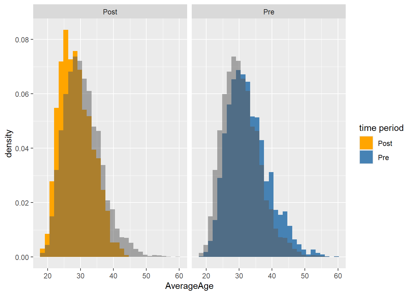
Looking at the histogram we can see quite a wide spread of ages across the population of athletes but it’s fairly normally distributed.
16.3 Creating Boxplots
Next up let’s have a look at box-plots. Let’s see if the average fastest lap per year has changed over the years (we want the average per race, as per year would give us only 1 value).
Show the code
# First filter data according to requirements (e..g fastest lap >= 78 and race year >= 2004), then calculate median of the group so we can add a reference line.
MediandataDF<-DriversRacesDF%>%
  filter(FastestLapTimeSec>=78 & RaceYear>=2004)%>%
  group_by(raceId)%>%
  summarise(FastestLapTimeSec=min(FastestLapTimeSec))
Mediantest<-median(MediandataDF$FastestLapTimeSec,na.rm=TRUE)

#I drop all rows which have missing fastest lap time data (drop_na) to ensure my plot doesn't show the years without this data.
#as.factor() ensures Year is treated as categorical and not numerical (not using as.factor would result in just one boxplot)
#geom_hline lets me add a horizontal line to compare against (in our case the median)
Boxplot <- DriversRacesDF%>%
  filter(FastestLapTimeSec>=78 & RaceYear>=2004)%>%
  drop_na(FastestLapTimeSec)%>%
  group_by(RaceYear,raceId)%>%
  summarise(FastestLapTimeSec=min(FastestLapTimeSec),
            RaceYear=unique(RaceYear))%>%
  ggplot(aes(y = FastestLapTimeSec, x = as.factor(RaceYear), fill = RaceYear)) +
  geom_boxplot() +
  theme(legend.position = "none")+
# Add the median line to the plot
  geom_hline(aes(yintercept=Mediantest, colour="red"))+
  ylab("Fastest lap time")+ xlab("Year")

Boxplot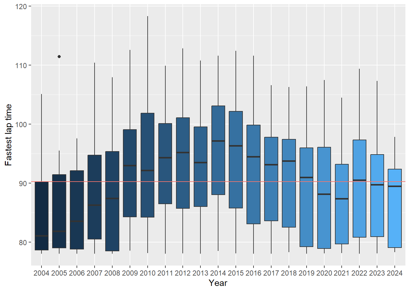
16.4 Creating bar charts and lollipop charts
Next up we will look at creating bar charts. We will start by displaying the top 10 riders with the highest number of overall championship wins.
Show the code
# First up we will filter for those that have been a champion and then we will create a total championship wins variable and a total race wins variable, these will be used in the bar chart.
ChampionsDF <- DriversRacesDF %>%
  filter(DriversFinalPosition==1)%>%
  group_by(DriverName)%>%
  summarise(TotalChampWins=sum(DriversFinalPosition, na.rm=TRUE),
            TotalDriverWins=sum(DriverWins, na.rm=TRUE))%>%
  arrange(desc(TotalChampWins))

# Create the bar chart and only display the first 10 drivers. Within geom_bar we need to use stat="identity" to ensure the actual values are plotted, geom_bar's default setting is stat="count".
Barchart <- ChampionsDF[1:10,]%>%
  ggplot(aes(x=DriverName, y=TotalChampWins))+
  geom_bar(stat="identity", aes(fill=DriverName))

Barchart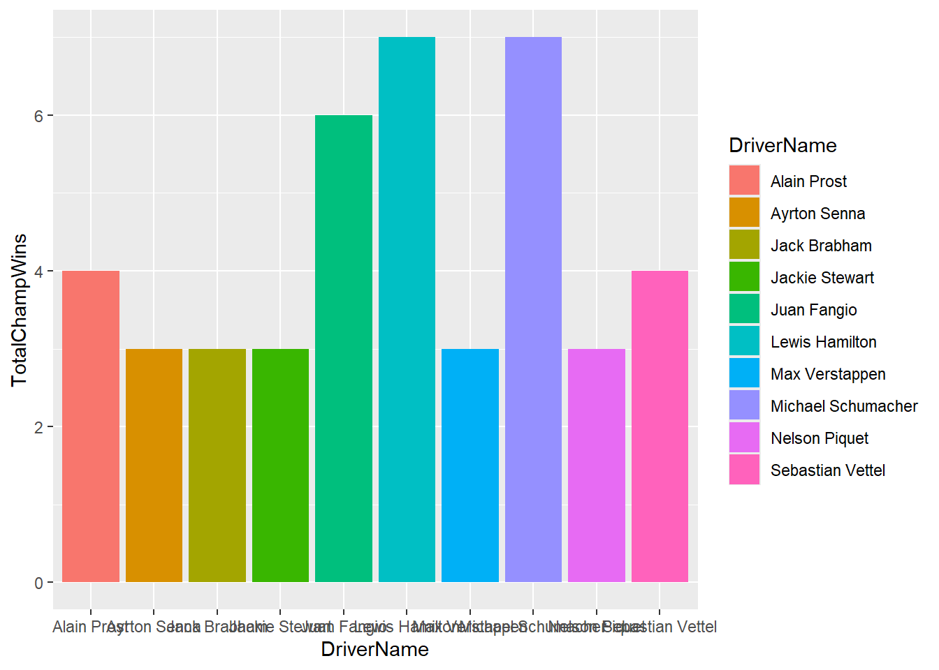
As you can see from the above there is a lot to improve from this graph. Let’s make some changes to make it better.
Show the answer
# We will improve the graph by flipping the x and y-axis using coord_flip(), we apply a minimal theme (this is just one example, experiment with different themes available) and rename the x and y-axis. We also set the y-axis scale to run from 0-7 with a 1 step increase (note the y-axis shows up as the x-axis due to coord_flip but for coding purposes it remains the y-axis)
Barchart <-ChampionsDF[1:10,] %>%
ggplot(aes(x=reorder(DriverName,TotalChampWins), y=TotalChampWins, fill=TotalDriverWins)) +
  geom_bar(stat="identity") + coord_flip()+
  theme_minimal() +
  labs(x="", y="Total Number of Championships") +
  theme(panel.grid.minor= element_blank(),panel.grid.major.y = element_blank())+
  scale_y_continuous(breaks = seq(0, 7, by = 1))
Barchart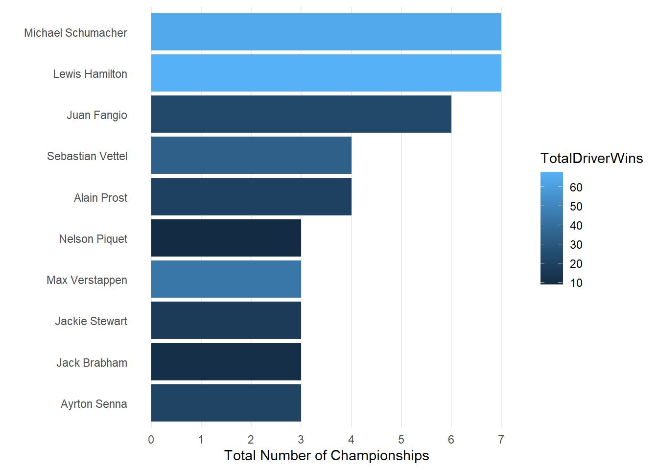
We now have quite a nice looking graph but you could decide to enhance it even further creating a lollipop chart.
Show the code
# To create a lolliepop chart we will need to work with geom_segment (to draw the lines) and geom_point. Within the code below we also adjust the theme to remove minor grid lines for both the x and y-axis as well as major grid lines from the y-axis.
Lollieplot <- ChampionsDF[1:10,] %>%
  ggplot(aes(x=TotalChampWins, y=reorder(DriverName,TotalChampWins), fill=TotalDriverWins)) +
  geom_segment(aes(xend=0,yend=DriverName, color=TotalDriverWins), size=1) +
  geom_point(size=2,aes(color=TotalDriverWins))+theme_minimal() +
  labs(x= "", y="Total Number of Championships") +
  theme(panel.grid.minor= element_blank(),panel.grid.major.y = element_blank())

Lollieplot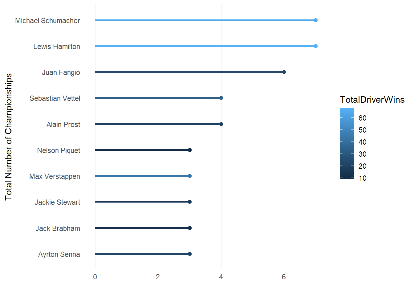
From the code above you will have seen that all we had to do to make it a lollipop chart is remove the geom_bar() section and replace it with a geom_segment() and geom_point() section. The geom_segment() function is used to draw segments. In this case, it is drawing vertical segments from the x-axis (0) to the respective total number of medals for each country. The color is set to “lightblue”. The geom_point is used to add points to the plot. Each point represents a country’s total number of medals. The size is set to 2, and the color is “steelblue”.
Last let’s look at overlapping bar charts. Let’s plot the top 10 champions number of championships and number of total race wins on one barchart. We will use the previous bar chart as a base and add the championship wins.
Show the answer
# Below I use geom_bar two times, ones with the championship wins and ones with the total driver wins. Ggplot will overlap the two bar charts but this does mean I will need to adjust the opacity using alpha().

Barchart <-ChampionsDF[1:10,] %>%
ggplot(aes(x=reorder(DriverName,TotalChampWins))) +
  geom_bar(aes(y=TotalChampWins), stat="identity",   alpha=0.8,fill="grey") +
  geom_bar(aes(y=TotalDriverWins), stat="identity",  alpha=0.3,fill="darkblue") +
  coord_flip()+
  theme_minimal() +
  labs(x="", y="Total Number of Championships") +
  theme(panel.grid.minor= element_blank(),panel.grid.major.y = element_blank())
Barchart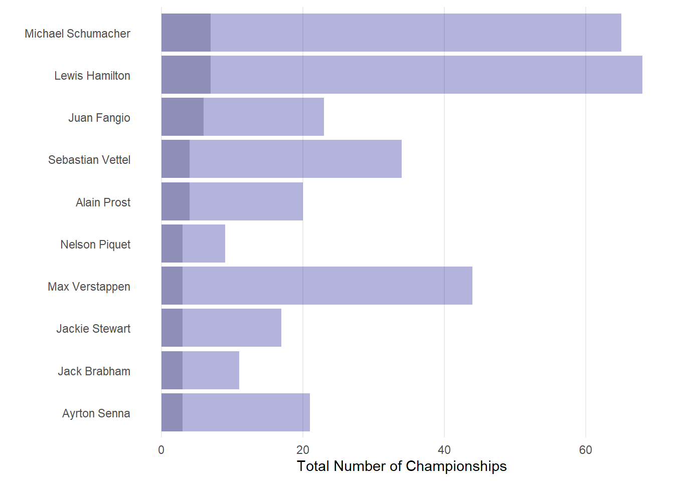
16.5 Creating tree maps, and word clouds
We can also choose to display the data above in either a tree map, bubble chart, or word cloud. For this we will need to load the treemapify and ggwordcloud packages.
Show the Treemap code
#Creating a treemap using the treemapify package
library(treemapify)
Treemap <- ChampionsDF[1:10,]%>%
  ggplot(aes(area=TotalChampWins,fill=TotalDriverWins, label=DriverName)) +
  geom_treemap()+
  geom_treemap_text(aes(label = paste(DriverName, "\nWins:", TotalDriverWins)),
                    color = "white",
                    place = "topleft",
                    size= 12)
Treemap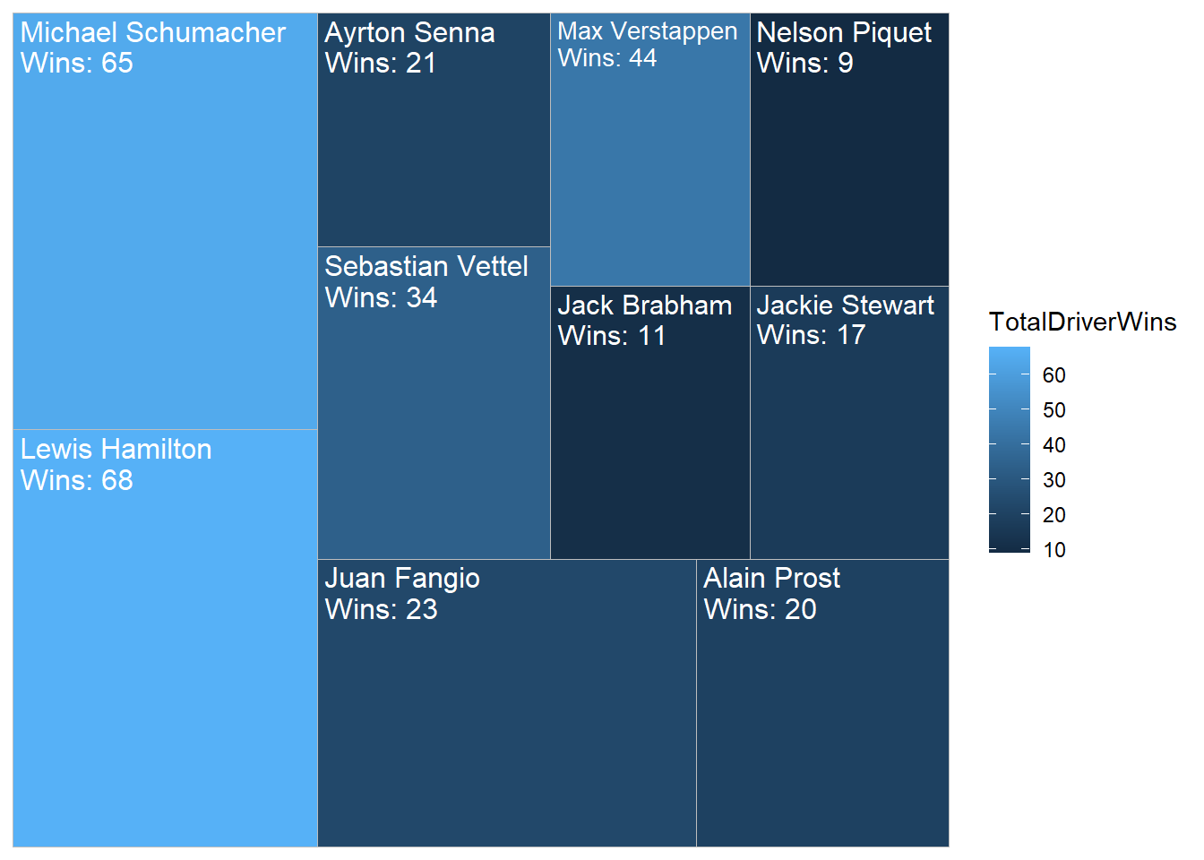
Show the word cloud code
library(ggwordcloud)
# Creating a wordcloud using the package ggwordcloud
#install.packages("ggwordcloud")
Wordcloud <- ChampionsDF[1:10,]%>%
  ggplot(aes(label=DriverName,size=TotalChampWins, color=TotalDriverWins)) +
  geom_text_wordcloud()+theme_minimal()+scale_size(range = c(4, 12))
Wordcloud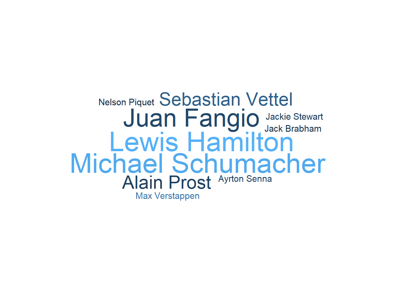
save(DriversDF, DriversRacesDF, ConstructorsDF, ConstructorsDF,RacesDF, file="P7_F1Data.RData")