library(tidyverse)
load("C:/Users/wkb14101/OneDrive - University of Strathclyde/MSc SDA/R Projects/B1703/Data/P7_F1Data.RData")20 Practical 9a: Advanced plots in R
Up until this point we have mainly worked visualising one variable at a time. But more often then not you will have multiple variables you may want to display in a visualisation (e.g. player position and goal scoring ability). We will look at this during this practical. First up we will demonstrate this with F1 data and then you will be work through practical 9b exercises using an ice hockey data set which includes the top 100 players who played in the NHL.
20.1 Getting your data
Open P7_F1Data.RData which can be found here.
Show the code
20.2 Creating scatter plots
First up we would like to create a scatter plot between fastest lap speed and race time in minutes.
Show the code
# filter to ensure data is valid and then use geom_point to plot the scatter plot.
Scatterplot <- DriversRacesDF %>%
  filter(FastestLapTimeSec>=78& !is.na(racetimeMin)) %>%
  group_by(raceId) %>%
  summarize(fastestLapSpeed = max(fastestLapSpeed, na.rm = TRUE),
            racetimeMin = mean(racetimeMin, na.rm = TRUE),
            FastestLapTimeSec=min(FastestLapTimeSec),
            RaceCountry=unique(RaceCountry)) %>%
  ggplot(aes(x=fastestLapSpeed, y=racetimeMin))+
  geom_point()
Scatterplot 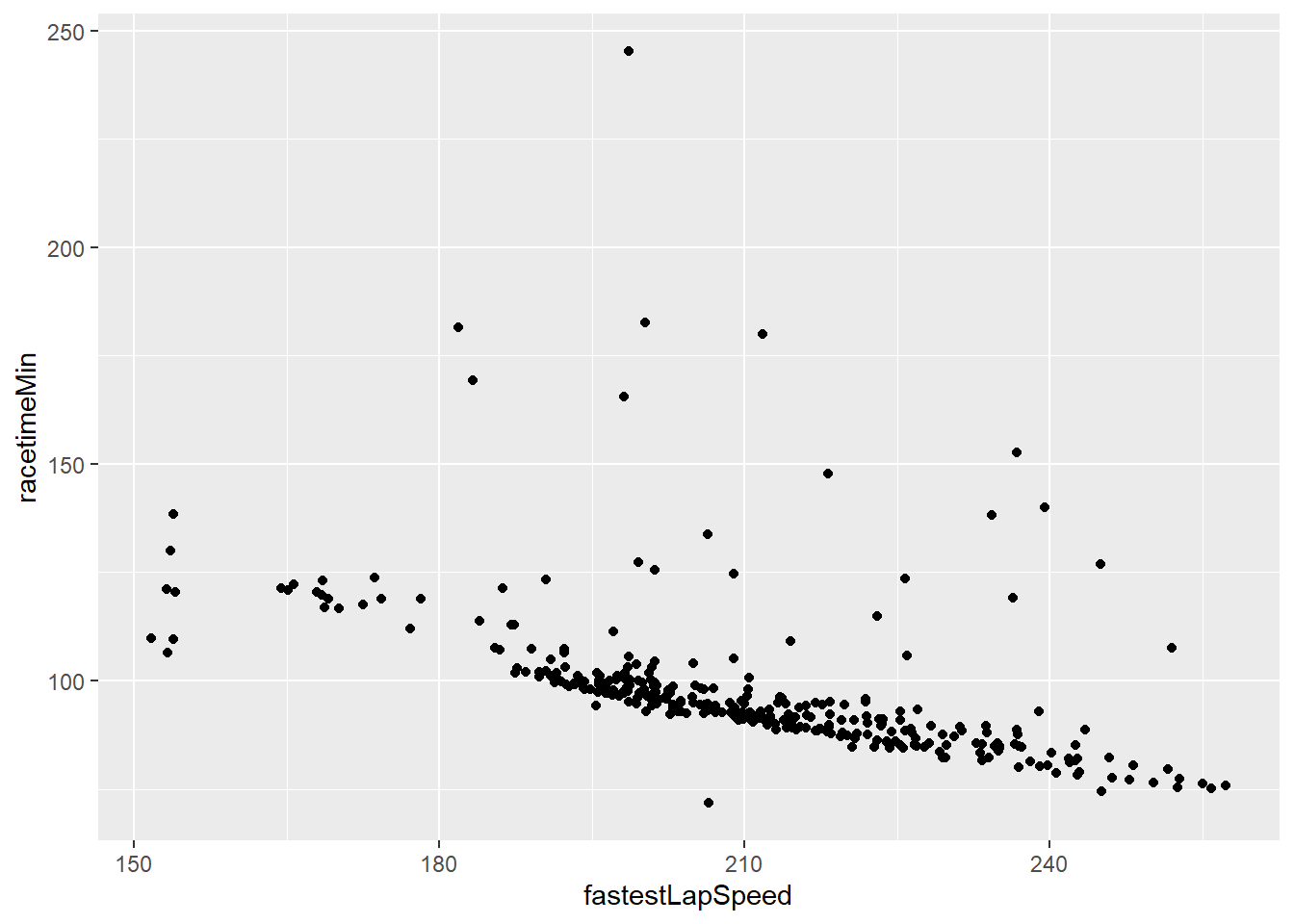
What can we see from this?
Next up we would like to adjust the plot to include one extra variables with colour being added for fastest lap time.
Show the code
# add colour in the aes (using the data loaded in in step above)
Scatterplot <- Scatterplot +
  geom_point(aes(colour= FastestLapTimeSec))
Scatterplot 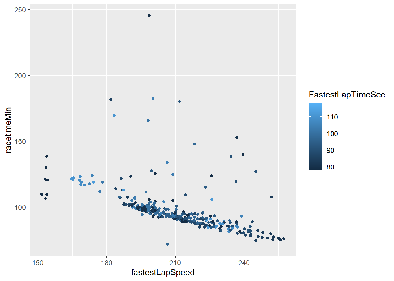
Change the colour scheme for fastest lap time so it uses a diverging colour scheme (red-green).
Show the code
#scale_color_gradient2 let's you assign a gradient color scheme to your data.
Scatterplot <- Scatterplot +
 scale_color_gradient2(low = "darkgreen", mid="darkorange", high = "darkred", midpoint=100)
Scatterplot 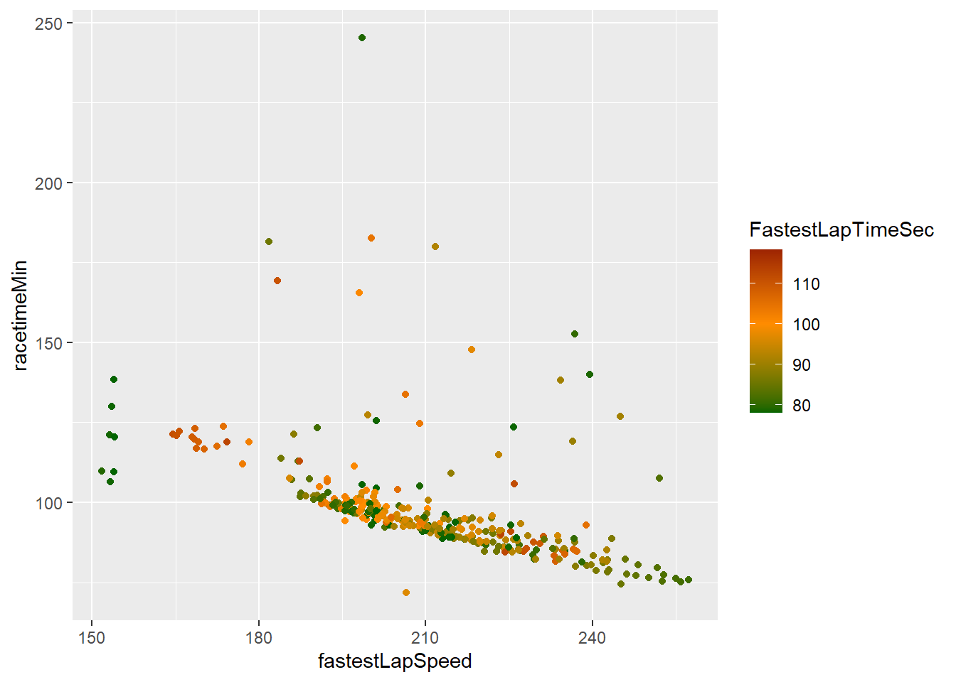
The graph we created now shows us a lot of information by using just one visualisation. However, it would be good to know which races are plotted. Let’s create a label which shows the country names.
Show the code
#geom_text can be used to plot labels.
Scatterplot2 <- Scatterplot +
  geom_text(aes(label = RaceCountry))
Scatterplot2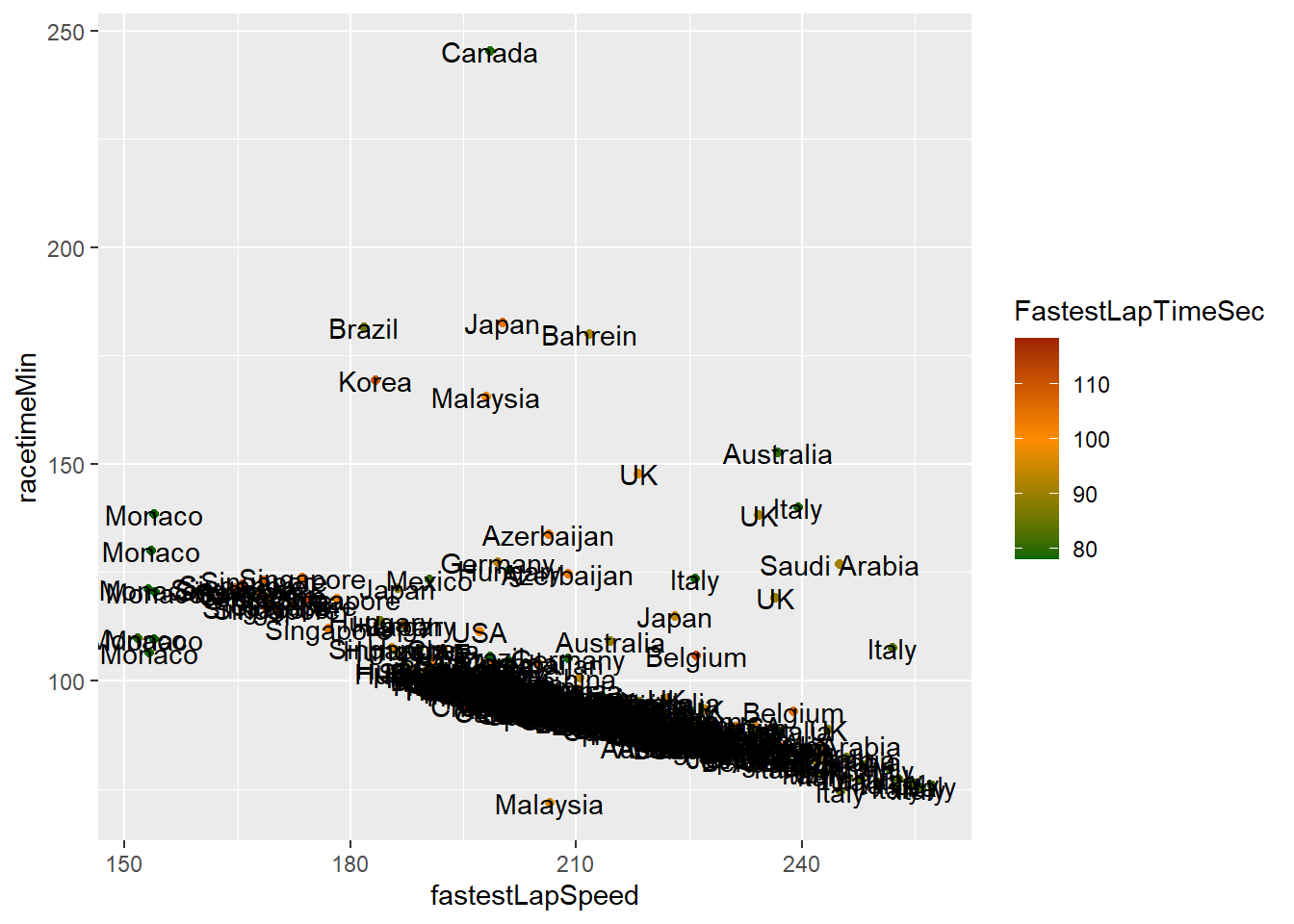
As you can see this makes your graph useless. Later we will look at how we can add interactivity so names only show when we ask for them, however, for now we can ask R to just display the driver with the fastest lap speed. To do this you need to create a new dataframe which includes the fastest lap speed driver (you could also choose to do the top 5 or a random selection for example).
Show the code
FastestLapCountry <- DriversRacesDF %>%
  slice_max(fastestLapSpeed)
Now update the previous Scatterplot to include the name of the driver with the fastest time.
Show the code
# Adjust vjust and hjust for vertical and horizontal positioning
Scatterplot <- Scatterplot +
  geom_text(data=FastestLapCountry, aes(label = paste("Fastest Lap Country:", RaceCountry)), vjust = 1.5, hjust=0.9)
Scatterplot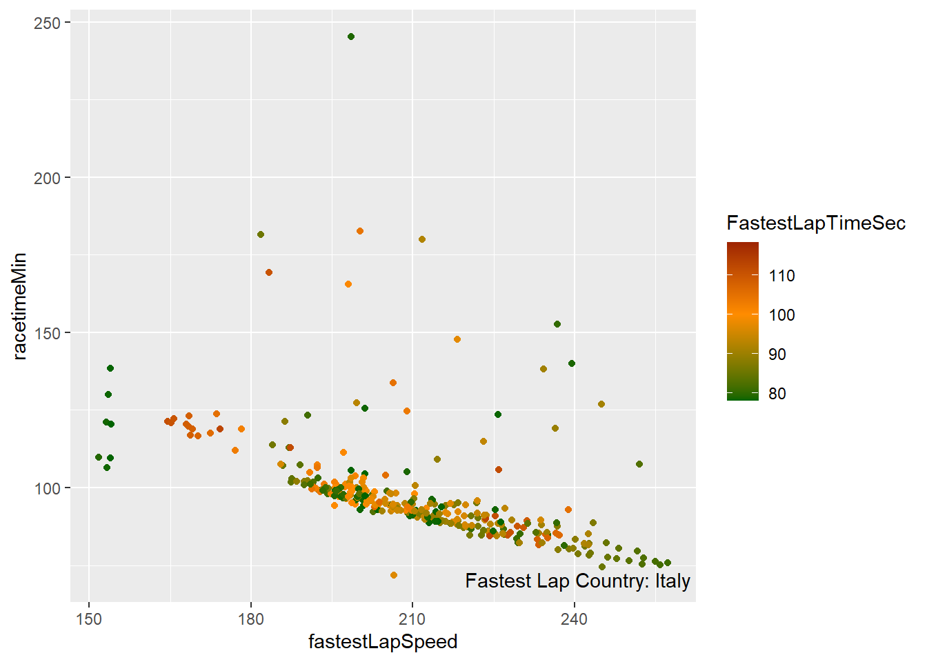
Last, lets the x and y-axis labels as well as the legend names.
Show the code
Scatterplot <- Scatterplot +
  labs(x= "Lap Speed",
         y= "Race Time (min)",
         color= "Lap Time")
Scatterplot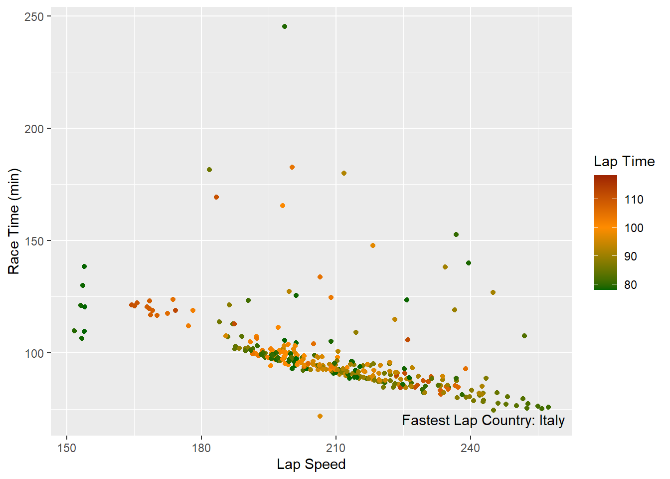
20.3 Regression/associations plots
Next up we will look at how we can plot the strength of an association between variables. We will look at the average fastest lap time of drivers and their average finishing position. I.e. does a fastest lap guarantee a good finishing position.
Show the code
# first create a scatterplot again.
DataforCorr<- DriversRacesDF %>%
  filter(FastestLapTimeSec>=78)%>%
  group_by(driverId) %>%
  mutate(avgFastLapTime=mean(FastestLapTimeSec,na.rm=TRUE),
         avgPosition=mean(positionOrder,na.rm=TRUE)) %>%
  distinct(driverId, avgFastLapTime,.keep_all=TRUE)

Corr <- DataforCorr %>%
  ggplot(aes(avgFastLapTime,avgPosition))+
  geom_point()+
  labs(y="Position", x="Avg. fastest lap time")

Corr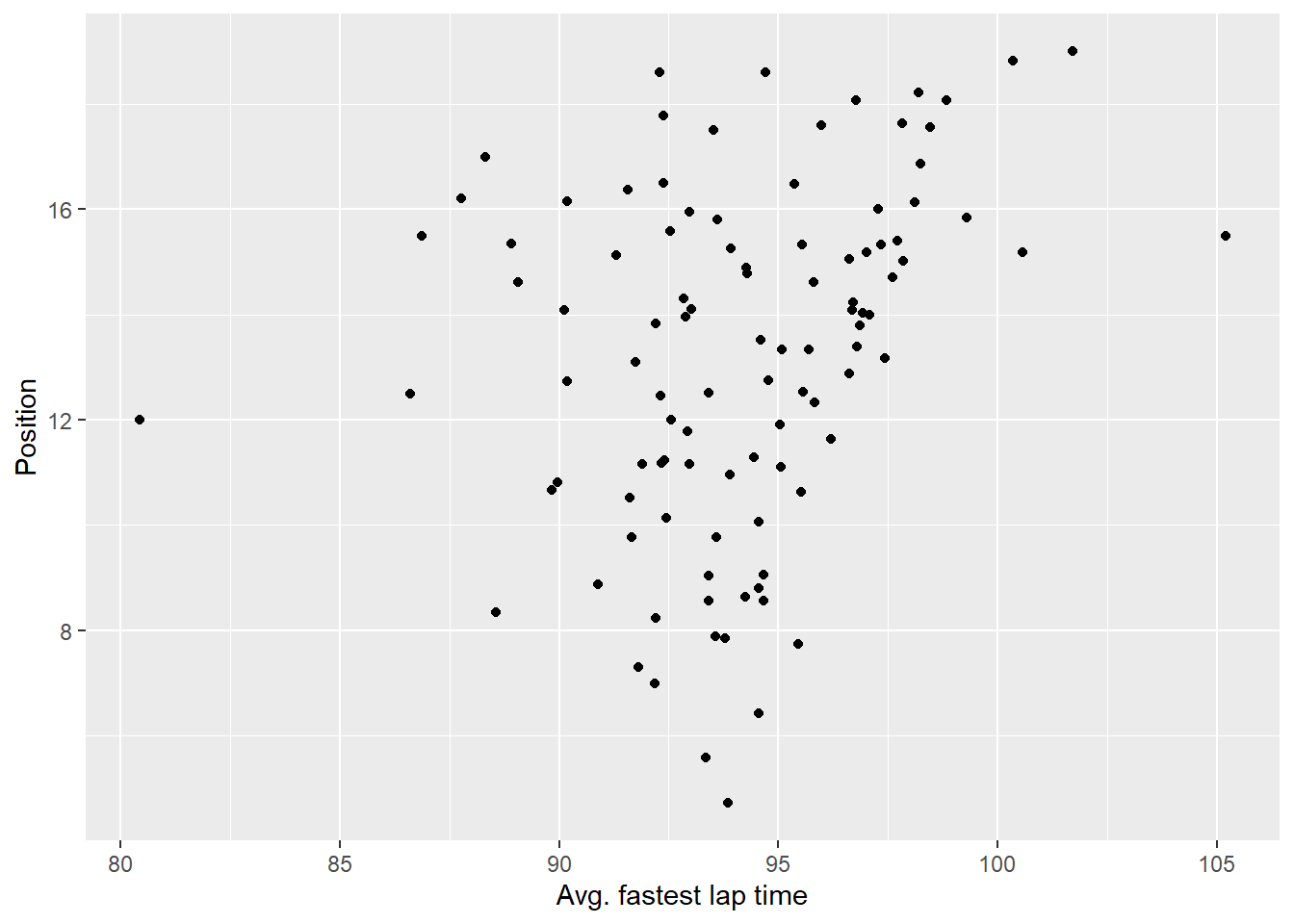
From the graph above we can see there appears to be not much of a correlation between the average fastest lap and the average finishing position of a rider but let’s check this by adding a regression line anyway.
Show the code
# calculate the regression using lm() - we do this so we can plot the regression statistics later, if you don't want to plot those you can just use stat_smooth() within ggplot
RegForPlot<-lm(avgPosition ~ avgFastLapTime, data=DataforCorr)

# I use annotate instead of geom_text here as the values I'm plotting do not belong to a specific data point.
CorrReg <- Corr+
    stat_smooth(method = "lm") +
    annotate("text", x = 100, y = 5, label = paste("R2 = ", round(summary(RegForPlot)$r.squared, 2), "\n",
                                        "Slope = ", round(summary(RegForPlot)$coef[[2]],2)))+
    xlim(77,110)
CorrReg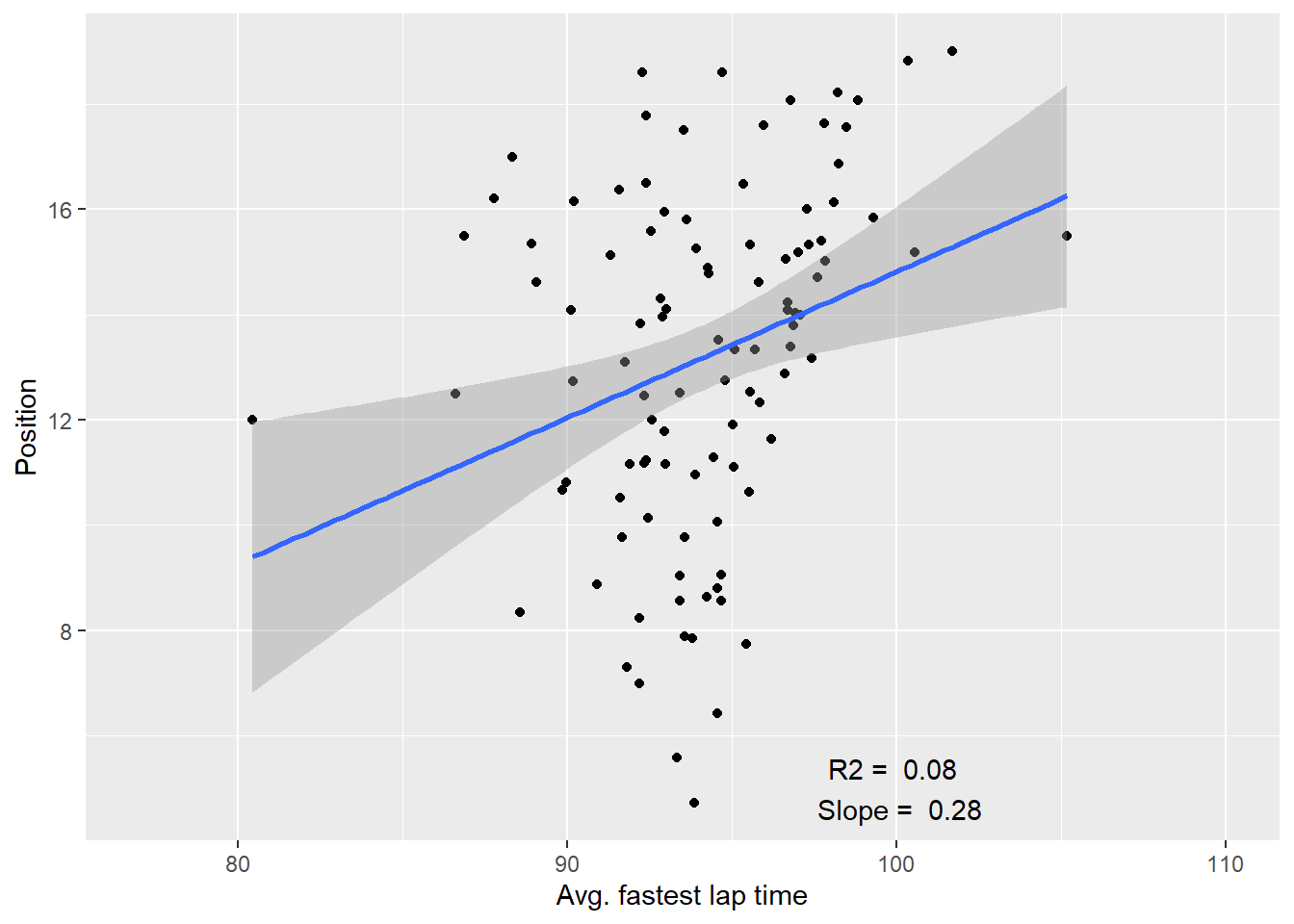
20.4 Quadrants
In some cases it may help visually to create quadrants on a plot, this for example separates those which have fast average times and place well from those which have slow average times and don’t place well.
Doing this in R is not very difficult. We will use our previous scatter plot as a base and add a horizontal and vertical reference line.
Show the code
#geom_hline and geom_vline allow you to plot horizontal and vertical reference lines.
Corrquad <- Corr +
  geom_hline(yintercept=mean(DataforCorr$avgPosition, na.rm=TRUE), linetype="dashed",size=1, color="grey")+
    geom_vline(xintercept=mean(DataforCorr$avgFastLapTime, na.rm=TRUE),linetype="dashed",size=1, color="grey")
Corrquad
20.5 Date data
Next up we will focus on using date data. We will look at the avg fastest lap time per year during the british grandprix and whether we can explain some of the fluctuations.
First create a line chart for the british grandprix.
Show the code
LineChartBGP <- DriversRacesDF %>%
  filter(name=="British Grand Prix" & RaceYear>=2004) %>%
  group_by(RaceYear)%>%
  summarise(avgFastestLapTimeSec=mean(FastestLapTimeSec,na.rm=TRUE),
            avgfastestSpeedPerYear=mean(fastestLapSpeed,na.rm=TRUE))%>%
  ggplot(aes(x=RaceYear))+
  geom_line(aes(y=avgFastestLapTimeSec), colour="darkblue")

LineChartBGP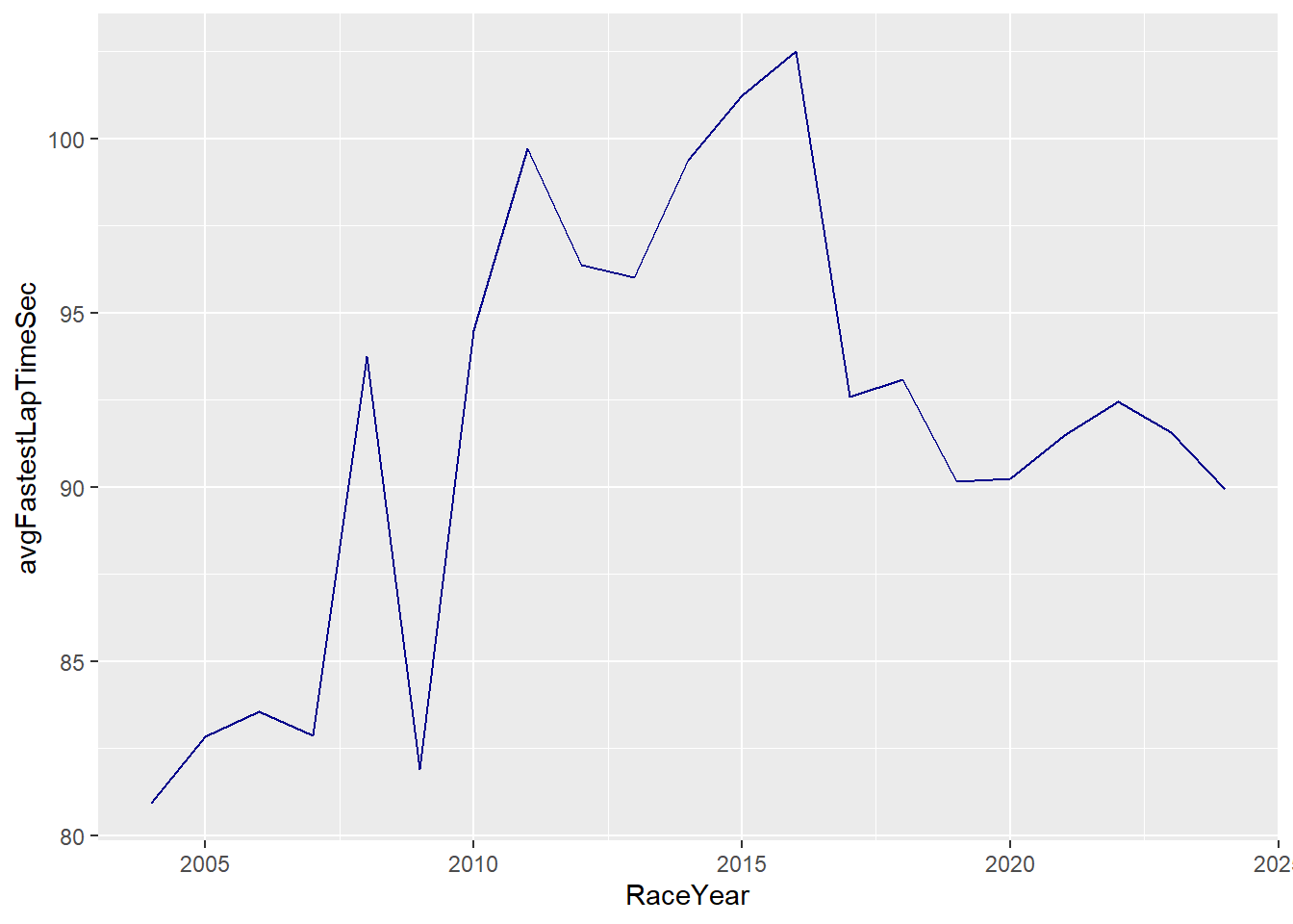
Some of the fluctuations can be explained by the introduction of new regulations. IN 2010 a refuelling ban was introduced, in 2014 hybrid engines were introduced and in 2017 regulations to make the car faster were introduced. Let’s add some reference lines to highlight these points in time.
Show the code
# here I use geom_vline again to create three reference lines.
LineChartBGP <- LineChartBGP +
  geom_vline(xintercept=2010,linetype="dashed",size=1, color="darkorange" )+
  geom_vline(xintercept=2014,linetype="dashed",size=1, color="darkorange" )+
  geom_vline(xintercept=2017,linetype="dashed",size=1, color="darkgreen" )
LineChartBGP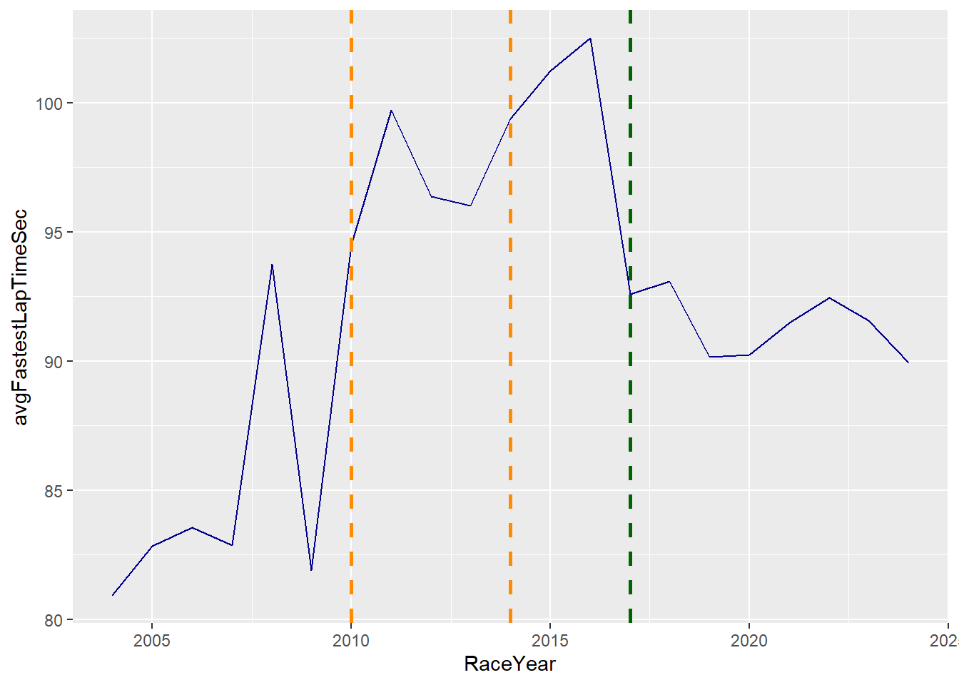
You can enhance this graph further by adding geom_text to create labels for the reference lines.
Show the code
# annotate and play around with vjust and hjust to position text where you want it.
LineChartBGP <- LineChartBGP +
  annotate("text", x = 2010, y = 81, label = "Introduction refuelling ban", vjust = 0, hjust = 1)+
  annotate("text",x = 2014, y = 105, label = "Introduction Hybrid Engines", vjust = 0, hjust = 0.5)+
  annotate("text", x = 2017, y = 81, label = "New regs to make cars faster", vjust = 0, hjust = 0)
LineChartBGP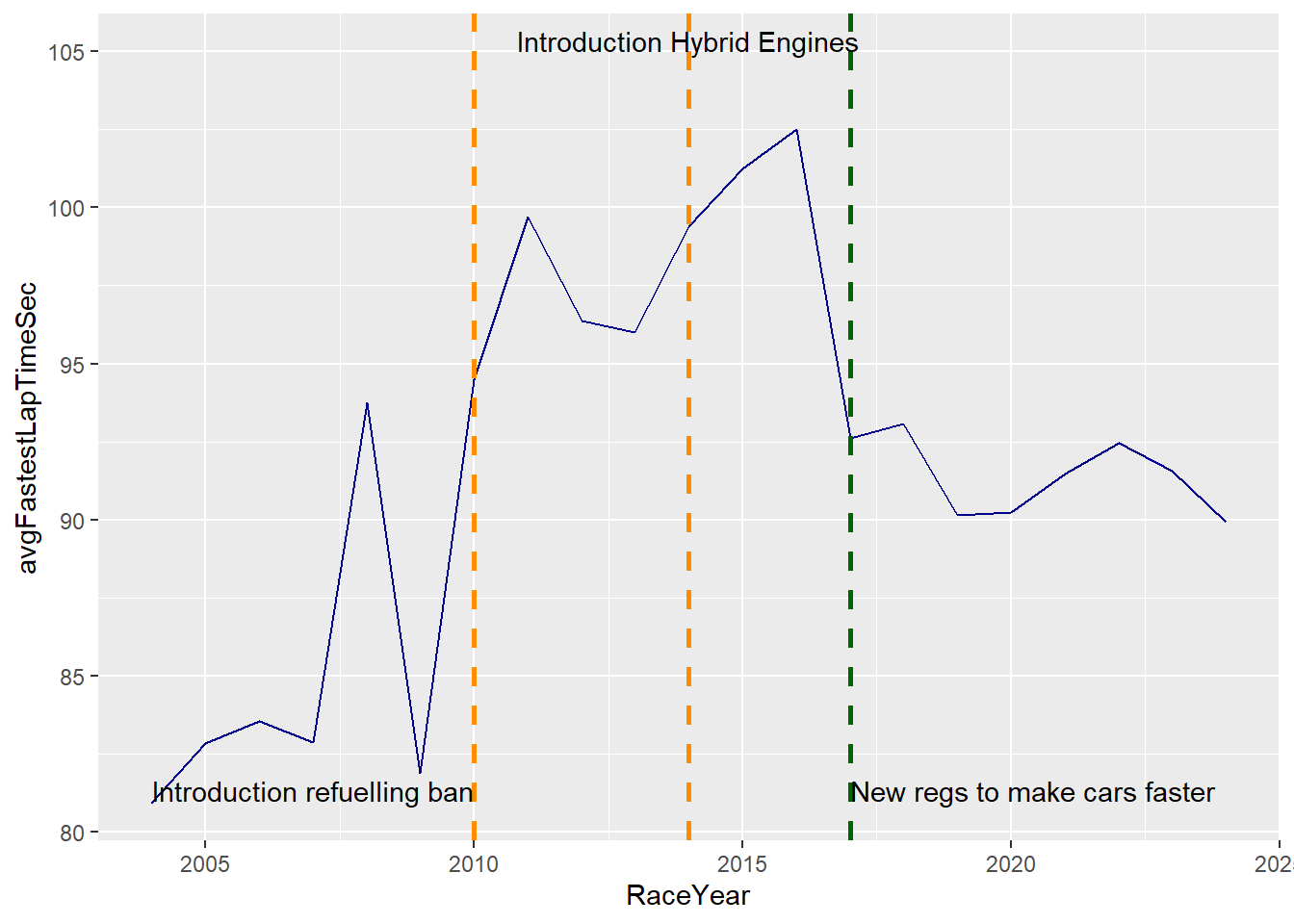
Next let’s focus on showcasing the top drivers 10 of last year (2023) and look at how they progressed in the last 10 years.
Show the code
# first I identify the top 10 drivers for 2023
Top10Drivers <- DriversRacesDF %>%
  filter(RaceYear==2023 & DriversFinalPosition<11) %>%
  distinct(driverId)

# Use the identified drivers to filter the data and only include data of these drivers
DataTop10 <- DriversRacesDF %>%
  filter(driverId %in% Top10Drivers$driverId & RaceYear >=2014 & !is.na(DriversFinalPosition))

# Identify the last year they raced in the championship
DataTop10_last <- DataTop10 %>%
  group_by(LastName) %>%
  filter(RaceYear == max(RaceYear))

LineChartTop10 <- DataTop10 %>%
ggplot(aes(x = RaceYear, y = DriversTotalPosition, group = as.factor(LastName))) +
  geom_line(aes(y = DriversTotalPosition))+
  geom_point(aes(color=as.factor(LastName))) +
  scale_y_reverse()+
  geom_text(data=DataTop10_last,aes(label = LastName, color = as.factor(LastName),
             hjust = -0.3)) +
  guides(color = "none", fill = "none") +
  xlim(2014,2025)+
  ylab("Final Position")+
  xlab("Year")


LineChartTop10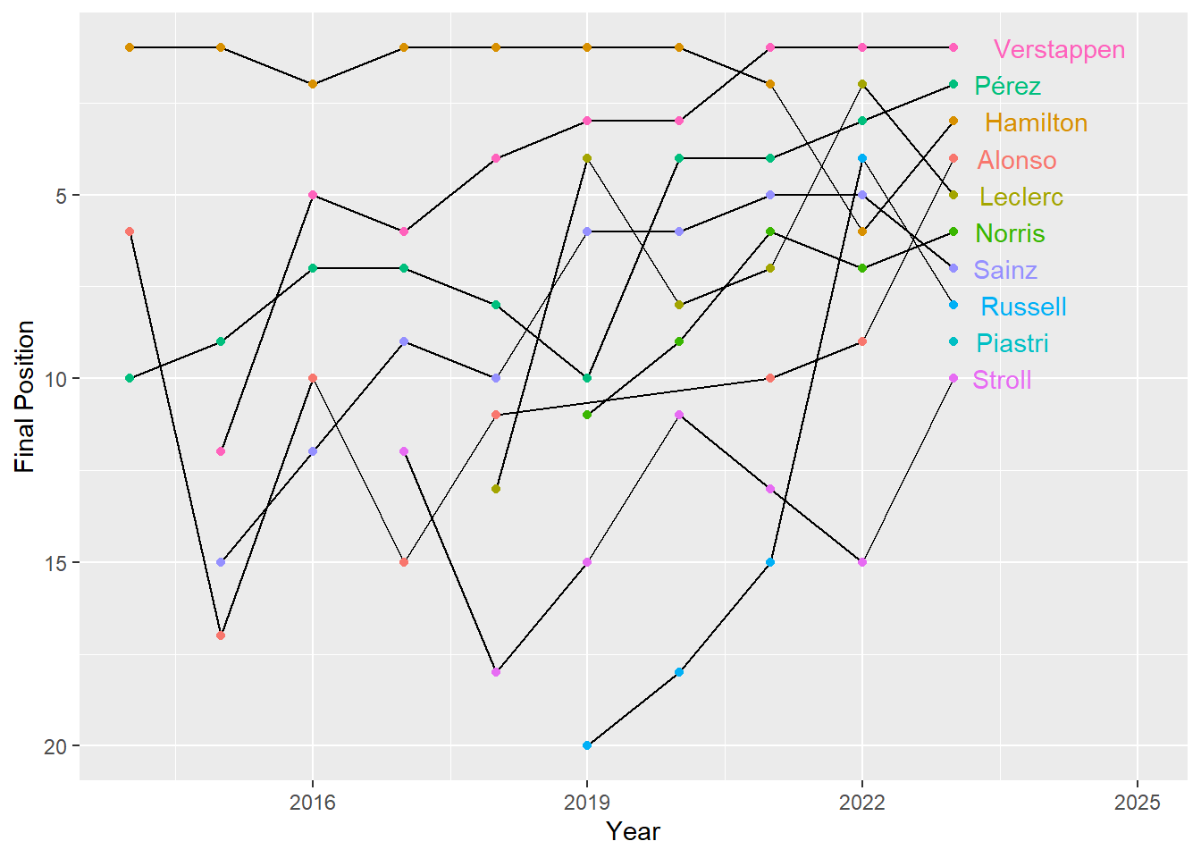
Show the code
ConstructorsRacesDF <- merge(ConstructorsDF, RacesDF,  by = c("raceId"))

ConstructorsRacesDF<-ConstructorsRacesDF %>%
  group_by(RaceYear) %>%
  mutate(ConstructorFinalPosition= if_else(RaceRound==max(RaceRound),ConstructorsPosition,if_else(ConstructorsTotalPoints==max(ConstructorsTotalPoints),1,NA)))%>%
  ungroup()

Top10Constructors <- ConstructorsRacesDF %>%
  filter(RaceYear==2023 & ConstructorFinalPosition<11) %>%
  distinct(constructorId)

DataTop10constructors <- ConstructorsRacesDF %>%
  filter(constructorId %in% Top10Constructors$constructorId & RaceYear >=2014 & RaceYear <=2023 & !is.na(ConstructorFinalPosition))

DataTop10_lastconstructor <- DataTop10constructors %>%
  group_by(TeamName) %>%
  filter(RaceYear == max(RaceYear))

# in the line chart below I first plot the data, then assign TeamName to color (via geom_point(), and then label the end of the lines using geom_text). Lastly I use geom_label to add the constructors
LineChartTop10Constructors <- DataTop10constructors %>%
ggplot(aes(x = RaceYear, y = ConstructorsPosition, group = as.factor(TeamName))) +
  geom_line(aes(y = ConstructorsPosition))+
  geom_point(aes(color=as.factor(TeamName))) +
  scale_y_reverse()+
  geom_text(data=DataTop10_lastconstructor,aes(label = TeamName, color = as.factor(TeamName),
             hjust = -0.3)) +
  guides(color = "none", fill = "none") +
  xlim(2014,2025)+
  ylab("Final Position")+
  xlab("Year")+
  geom_label(aes(label = ConstructorsPosition, fill=as.factor(TeamName)),
             color= "black",
             size = 3,
             label.size = 0,
             label.padding = unit(0.15, "lines"))


LineChartTop10Constructors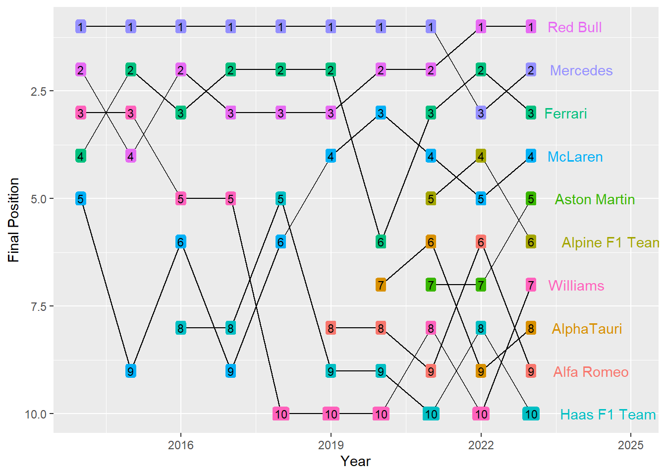
20.6 Positional data
One of the most common outputs of video data is positional data. Many of you may be working with this kind of data in the future so it’s important to understand how you can visualise this well and what you should be thinking off. First up we need to think about the canvas we will plot this data onto. This can be a football pitch, tennis pitch, ice hockey ring etc. In our example we will work with football data but the principles used apply to any kind of video data.
So let’s start with looking at how we create our sport specific canvas. To do this we need to understand our data, we need to know the max and minimum coordinates used and ideally the coordinates of all the field markings (e.g. the box, where the goal is etc).
In our case as we will be using statsbomb data we are lucky as the statsbomb guidance provides all the coordinates for the important field markings (see image below).
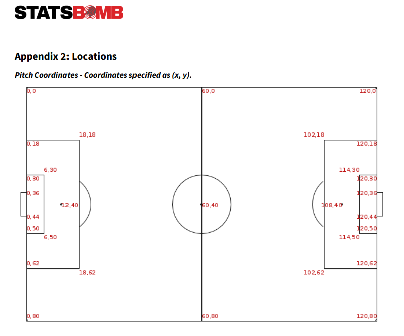
With the information listed in the image above, we can make a start creating our pitch using ggplot.
Show the code
PitchExample<-ggplot() +
  #this creates the outer borders of the field
  geom_rect(aes(xmin = 0, xmax = 120, ymin = 0, ymax = 80), fill = "white", colour = "#000000", size = 1) +
  # this creates the center line
  geom_segment(aes(x=60,y=0,xend=60,yend=80), fill = NA, colour = "#000000", size = 1) +
  #this creates the left hand 16m box
  geom_rect(aes(xmin = 0, xmax = 18, ymin = 18, ymax = 62), fill = NA, colour = "#000000", size = 1) +
  #this creates the right hand 16m box
  geom_rect(aes(xmin = 102, xmax = 120, ymin = 18, ymax = 62), fill = NA, colour = "#000000", size = 1) +
  # this creates the left hand little box
  geom_rect(aes(xmin = 0, xmax = 6, ymin = 30, ymax = 50), fill = NA, colour = "#000000", size = 1) +
  # this creates the right hand little box
  geom_rect(aes(xmin = 114, xmax = 120, ymin = 30, ymax = 50), fill = NA, colour = "#000000", size = 1) +
  # this creates the left hand goal
  geom_segment(aes(x=0,y=36,xend=0,yend=44), linewidth=2)+
  #this creates the right hand goal
  geom_segment(aes(x=120,y=36,xend=120,yend=44), linewidth=2)+
  #this ensure we don't show any axis or axis text.
  theme(rect = element_blank(),
        line = element_blank(),
        text = element_blank()
        )

PitchExample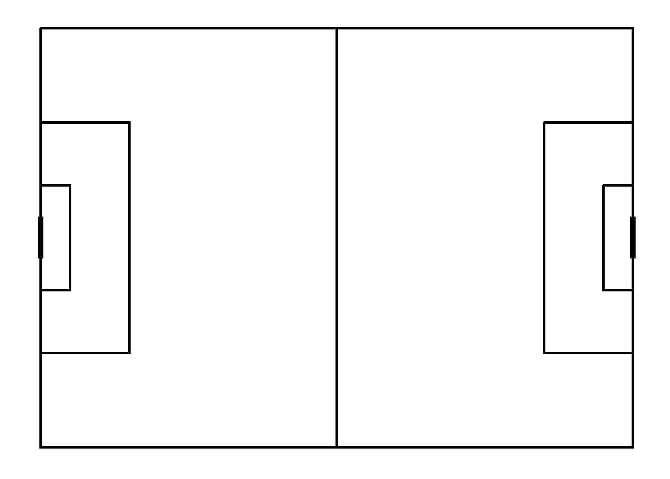
As you can see above, as long as you have the coordinates of your pitch, it is not very difficult to create your own. However, moving forward we will use the SBPitch package, as it saves us some coding and is set-up to work with StatsBomb data.
So next up let’s load in some data and start plotting.
Show code
#Comp<-FreeCompetitions()
#WC_DF <- Comp %>%
  #filter(competition_gender=="male" & season_name==2018 & competition_international==TRUE)

#MatchesDF <- (FreeMatches(WC_DF))
#WCDataDF <- free_allevents(MatchesDF)
#WCDataDF <- as.tibble(allclean(WCDataDF))
# The data I load is scraped via the code above

load("C:/Users/wkb14101/OneDrive - University of Strathclyde/MSc SDA/R Projects/B1703/MatchesDF.RData")
MatchesDF<-subset(MatchesDF,select=-c(home_team.managers, away_team.managers))
load("C:/Users/wkb14101/OneDrive - University of Strathclyde/MSc SDA/R Projects/B1703/WCDataDF2.RData")

matchId <- MatchesDF$match_id[MatchesDF$competition_stage.name=="Final"]
home_team <- MatchesDF$home_team.home_team_name[MatchesDF$competition_stage.name=="Final"]
away_team <- MatchesDF$away_team.away_team_name[MatchesDF$competition_stage.name=="Final"]

# Filter for relevant match (note the remove_empty comment is from the janitor package)
DataforPlot <- WCDataDF %>%
  filter(match_id==matchId & (type.name=="Shot" | type.name== "Own Goal Against")) %>%
  remove_empty("cols")

# Assign some variables which we will use later
home_color = "#FFA500"
away_color = "#ADD8E6"
line_color = '#c7d5cc'
pitch_color = '#444444'
pitch_length_x = 120
pitch_width_y = 80

# Adjust locations to both sides of field (left for home team, right for away team)
DataforPlot <- DataforPlot%>%
  mutate(location.x=if_else(team.name==home_team, 120-location.x,location.x),
         shot.end_location.x=if_else(team.name==home_team, 120-shot.end_location.x,shot.end_location.x),
         team_color = if_else(team.name == home_team, home_color, away_color),
         shot.outcome.name=if_else(shot.outcome.name=="Wayward" | shot.outcome.name=="Off T", "Off target", shot.outcome.name),
         shot.outcome.name= if_else(type.name=="Own Goal Against", "Goal", shot.outcome.name))

#DatatoSave <- DataforPlot %>%
 # select(-c(9,10,20,25,26,28,29,42))
#write.csv(DatatoSave, "C:/Users/wkb14101/OneDrive - University of Strathclyde/MSc SDA/R Projects/B1703/shotplot.csv")

# We assign the above colors to the correct country, this will help us when plotting later on.
colorvector<-setNames(c(home_color, away_color), c(home_team, away_team))
So now we have our data, we will start plotting. Remember we will use the SBpitch package for our pitch.
Note
#Create plot
library(SBpitch)

Pitch<-create_Pitch() +
  geom_point(data=DataforPlot, aes(
    x=location.x,
    y = location.y,
    shape=shot.outcome.name,
    colour = team.name))


Pitch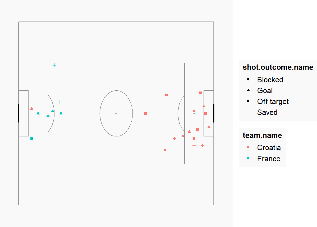
So looking at the above we clearly have a lot we can improve, so let’s focus on our formatting next. We will create a dark grey pitch, with light grey lines. Note also that the colors don’t match our assigned colors yet.
Show the code
#Create plot
Pitch<-create_Pitch(grass_colour=pitch_color, line_colour=line_color, background_colour = pitch_color) +
  geom_point(data=DataforPlot, aes(
    x=location.x,
    y = location.y,
    shape=shot.outcome.name,
    colour = team.name),
    # I add size to ensure my datapoints are big enoug. If you want the size to depend on a variable (e.g. xG), it should be defined inside the aes()
    size = 4)  +
  #this will assign the correct colors to the plot.
  scale_colour_manual(values = colorvector)+
  # This will deal with our legend. It will place them inside the pitch using the x y coordinates related to the pitch.
  theme(legend.position = "inside",
        legend.position.inside = c(0.07,0.1),
        legend.justification = c("left", "bottom"),
        legend.title = element_blank(),
        legend.key = element_rect(fill = "transparent", color = NA),
        legend.background = element_rect(fill = "transparent", color = NA),
        legend.text = element_text(color = line_color, size=10),
        legend.spacing = unit(3, "pt"),
        legend.key.height = unit(6, "pt")
      ) +
  # This bit lets us remove the color legend and overrides some of the aesthetics for the shot outcome legend.
  guides(
    shape = guide_legend(title = "Shot Outcome",
    override.aes = list(size=2, colour = line_color)),
    colour = "none"
  )

Pitch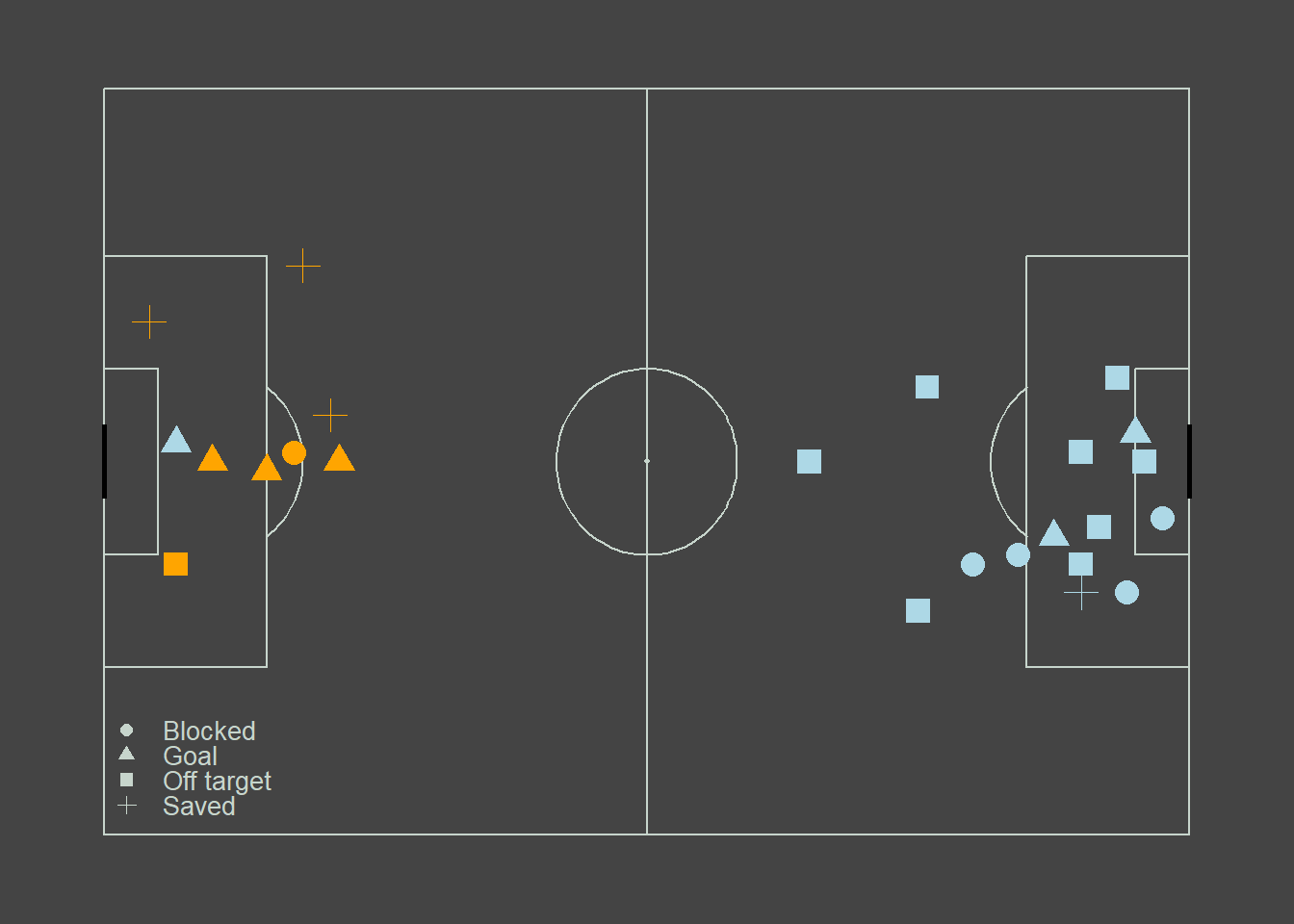
We just created a fairly simple positional data plot. We could enhance this further by adding a size as an aesthetic or as we will do now transform it into an interactive plot using ggplotly. This will enable us to hover over the datapoints and see who took the shot and what the xG was of that particular shot.
Show the code
Pitch<- create_Pitch(grass_colour=pitch_color, line_colour=line_color, background_colour = pitch_color) +
  geom_point(data=DataforPlot, aes(
    x=location.x,
    y = location.y,
    shape=shot.outcome.name,
    colour = team.name,
    text=paste('</br> Player: ', player.name,
               '</br> Outcome: ', shot.outcome.name,
               '</br> xG: ', shot.statsbomb_xg)),
    # I add size to ensure my datapoints are big enoug. If you want the size to depend on a variable (e.g. xG), it should be defined inside the aes()
    size = 4)  +
  #this will assign the correct colors to the plot.
  scale_colour_manual(values = colorvector)+
  # This will deal with our legend. It will place them inside the pitch using the x y coordinates related to the pitch.
  theme(legend.position = "inside",
        legend.position.inside = c(0.07,0.1),
        legend.justification = c("left", "bottom"),
        legend.title = element_blank(),
        legend.key = element_rect(fill = "transparent", color = NA),
        legend.background = element_rect(fill = "transparent", color = NA),
        legend.text = element_text(color = line_color, size=10),
        legend.spacing = unit(3, "pt"),
        legend.key.height = unit(6, "pt")
      ) +
  # This bit lets us remove the color legend and overrides some of the aesthetics for the shot outcome legend.
  guides(
    shape = guide_legend(title = "Shot Outcome",
    override.aes = list(size=2, colour = line_color)),
    colour = "none"
  )

ggplotly(Pitch, tooltip="text")
If our aim is to visualise the direction of the shots we can do this too using segments instead of points. Let’s have a look at plotting the trajectory of the shots.
Show the code
Pitch2<- create_Pitch(grass_colour=pitch_color, line_colour=line_color, background_colour = pitch_color) +
  geom_point(data=DataforPlot, aes(
    x=location.x,
    y = location.y,
    #shape=shot.outcome.name,
    colour = team.name,
    text=paste('</br> Player: ', player.name,
               '</br> Outcome: ', shot.outcome.name,
               '</br> xG: ', shot.statsbomb_xg)),
    # I add size to ensure my datapoints are big enoug. If you want the size to depend on a variable (e.g. xG), it should be defined inside the aes()
    size = 1, shape=16)  +
  geom_point(data=DataforPlot, aes(
    x=shot.end_location.x,
    y = shot.end_location.y,
    #shape=shot.outcome.name,
    colour = team.name,
    text=paste('</br> Player: ', player.name,
               '</br> Outcome: ', shot.outcome.name,
               '</br> xG: ', shot.statsbomb_xg)),
    # I add size to ensure my datapoints are big enoug. If you want the size to depend on a variable (e.g. xG), it should be defined inside the aes()
    size = 1, shape=17)+
  #this will assign the correct colors to the plot.
  geom_segment(data=DataforPlot, aes(x=location.x, y=location.y, xend=shot.end_location.x, yend=shot.end_location.y, colour=team.name)) +
  scale_colour_manual(values = colorvector)+
  # This will deal with our legend. It will place them inside the pitch using the x y coordinates related to the pitch.
  theme(legend.position = "inside",
        legend.position.inside = c(0.07,0.1),
        legend.justification = c("left", "bottom"),
        legend.title = element_blank(),
        legend.key = element_rect(fill = "transparent", color = NA),
        legend.background = element_rect(fill = "transparent", color = NA),
        legend.text = element_text(color = line_color, size=10),
        legend.spacing = unit(3, "pt"),
        legend.key.height = unit(6, "pt")
      ) +
  # This bit lets us remove the color legend and overrides some of the aesthetics for the shot outcome legend.
  guides(
    shape = guide_legend(title = "Shot Outcome",
    override.aes = list(size=2, colour = line_color)),
    colour = "none"
  )
Pitch2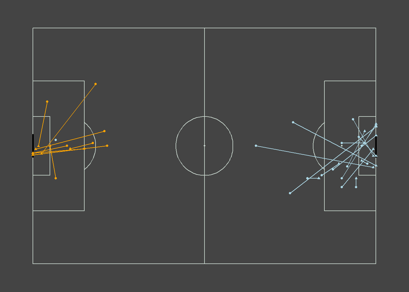
ggplotly(Pitch2, tooltip="text")Save the data and visuals.
save.image(file="C:/Users/wkb14101/OneDrive - University of Strathclyde/MSc SDA/R Projects/B1703/data/P9a_F1.RData")