library(tidyverse)
library(readxl)
NHL <- read_xlsx("C:/Users/wkb14101/OneDrive - University of Strathclyde/MSc SDA/B1703/Data for practicals/NHL data.xlsx")21 Practical 9b: Advanced plots in R
Up until this point we have mainly worked visualising one variable at a time. But more often then not you will have multiple variables you may want to display in a visualisation (e.g. player position and goal scoring ability). We will look at this during this practical. We will be working with an ice hockey data set which includes the top 100 players who played in the NHL.
21.1 Getting your data
Exercise 1: Load in NHL data.xlsx which can be found here and name the dataframe NHL. Remember, to read an .xlsx file, we will need to use the readxl package.
Show the answer
21.2 Creating scatter plots
You will see the variables are not named very self-explanatory. I have listed the meaning of the relevant variables (the ones we will use in this practical) below:
POS - Centre, Right Wing, Defense, Left wing
GP - Games Played
G - Goals
A - Assists
P - Goals + Assists
+/- a team’s goal differential while a particular player is on the ice
PIM - Penalty minutes Shots
Total number of Shots
First up we are interested in the correlation between goals and assists.
Exercise 2: Create a scatter dot plot which displays the Goals on the x-axis and the Assists on the y-axis.
Show the answer
Correlationplot <- NHL %>%
  ggplot(aes(x=G, y=A))+
  geom_point()
Correlationplot 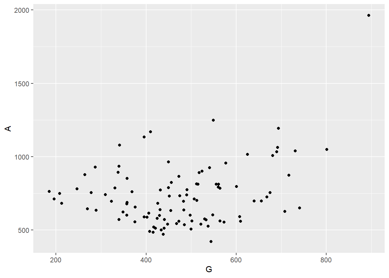
Exercise 3: We will discuss adding trend lines in a little bit but what can you already see from this graph?
Show the answer
- There is a large cloud of points not really indicating a correlation
- There is one extreme outlier with one player scoring almost 2000 assists and 900 goals
- The majority of players record more assists than goals
We now have a very simple scatter dot but what if we want to compare players on different variables? We can do this by adding more aesthetics. Let’s use size for total points and colour for total number of games played.
Exercise 4: Adjust your first plot to include these two extra variables with size being total points and colour representing total number of games played.
Show the answer
Correlationplot <- Correlationplot +
  geom_point(aes(colour=GP, size=P))
Correlationplot 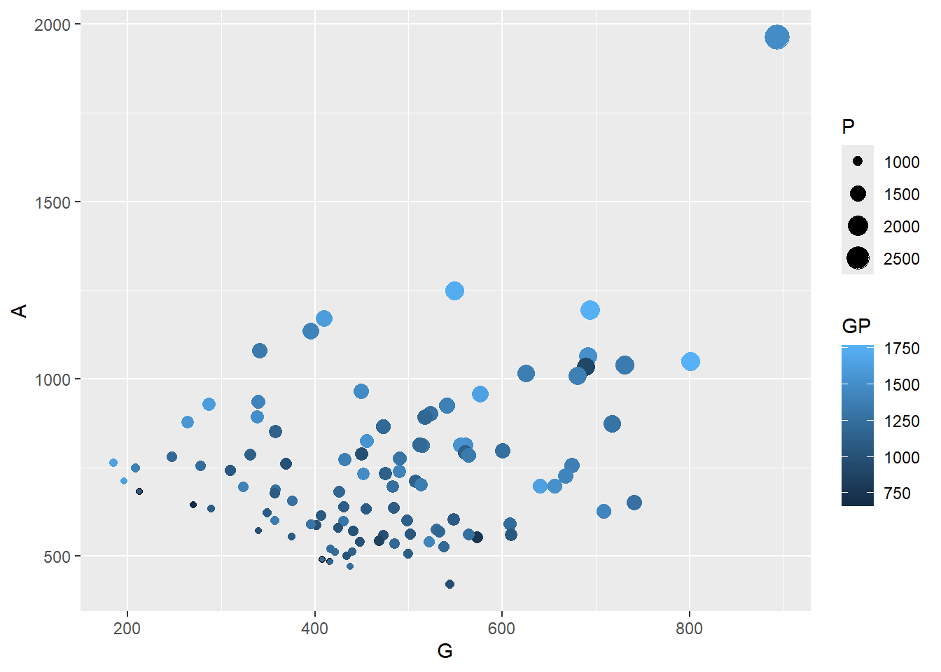
Consider the importance of the information displayed on the x and y-axes when choosing which variable to assign to each aesthetic. In this case, we have selected assists and goals for the x and y-axes, respectively. The size and color aesthetics are then utilized to represent additional variables. By prioritizing the primary information on the x and y-axes, the graph is designed to convey the most critical details at a glance.
When displaying multiple variables in one visualisation it is important we ensure our aesthetics are formatted correctly. In the graph above, the colour and size differences are hard to read. By adjusting the colour scheme we can improve this.
Exercise 5: Can you change the colour scheme so it uses a diverging colour scheme (I will use orange-white-blue but you can choose whatever you like). Tip you can use scale_color_gradient2 for this.
Show the answer
Correlationplot <- Correlationplot +
 scale_color_gradient2(low = "darkblue", mid = "white", high = "orange", midpoint = 1250)
Correlationplot 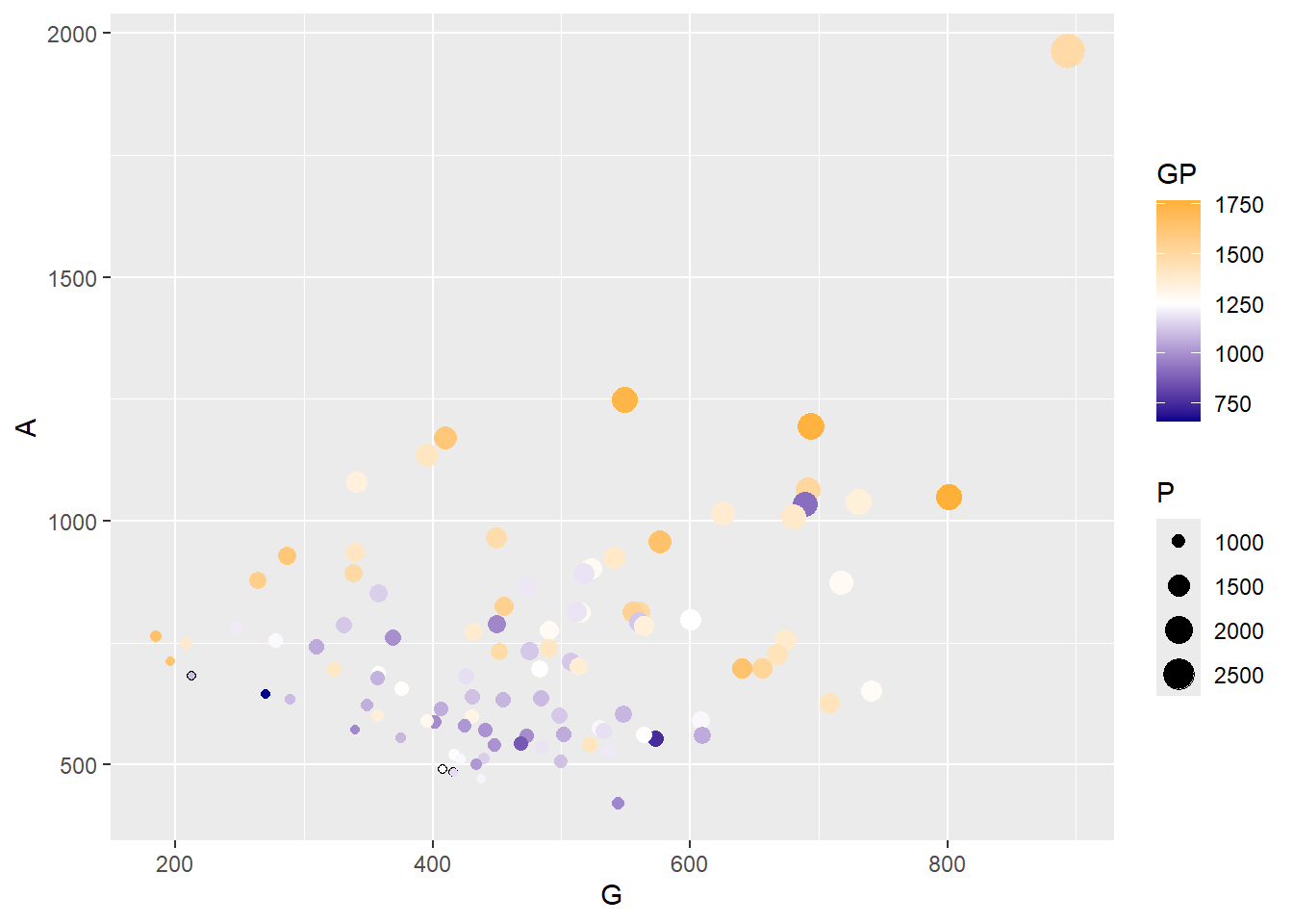
This graph shows us a lot of information by using just one visualisation. However, it would be good to know who the players actually are, who for example is the outlier?
Exercise 6: Can you add player names as labels to the plot above and name the frame Correlationplot2.
Show the answer
Correlationplot2 <- Correlationplot +
  geom_text(aes(label = Player))
Correlationplot2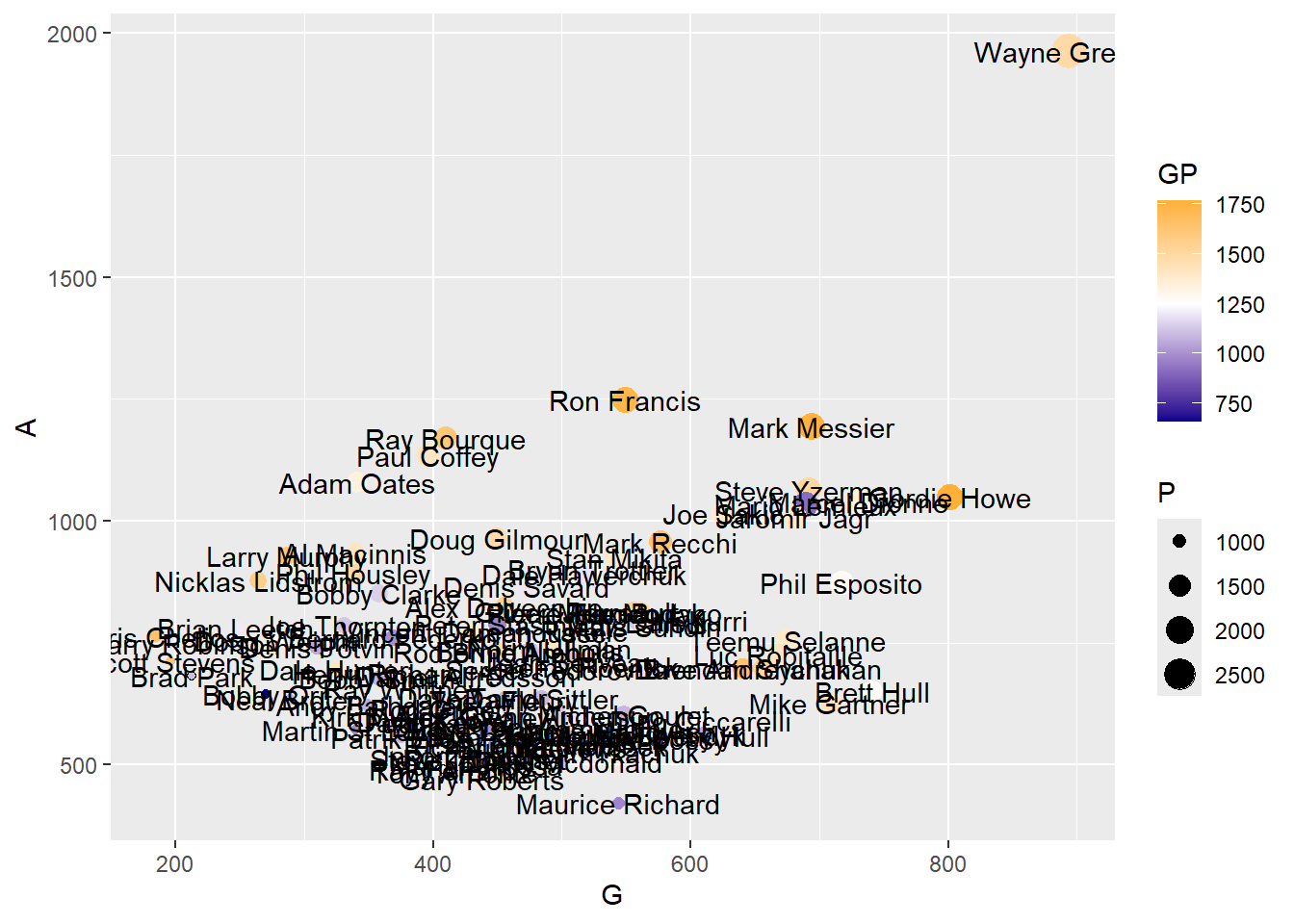
As you can see this makes your graph useless. Later we will look at how we can add interactivity so names only show when we ask for them, however, for now we can ask R to just display the top performing players name (or a selection of names). To do this you need to create a new dataframe which includes the top performing player (you could also choose to do the top 5 or a random selection for example).
Exercise 7: Create a new dataframe with the top performing player based on assists. Name the dataframe TopPlayer.
Show the code
TopPlayer <- NHL %>%
  slice_max(A)
Exercise 8: Now update the previous CorrelationPlot to include the name of the top player.
Show the answer
# Adjust vjust and hjust for vertical and horizontal positioning
Correlationplot <- Correlationplot +
  geom_text(data=TopPlayer, aes(label = Player), vjust = 0.2, hjust=1.1)
Correlationplot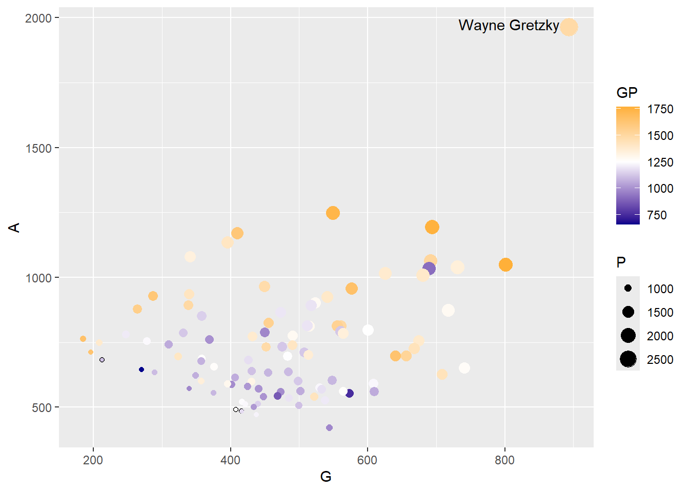
Okay so we are getting to a pretty decent graph. Last thing we would like to change is the x and y-axis labels as well as the legend names.
Exercise 9 Rename these as Assists, Goals, Games Played, and Points.
Show the answer
Correlationplot <- Correlationplot +
  labs(x= "Goals",
         y= "Assists",
         size = "Points",
         color= "Games Played")
Correlationplot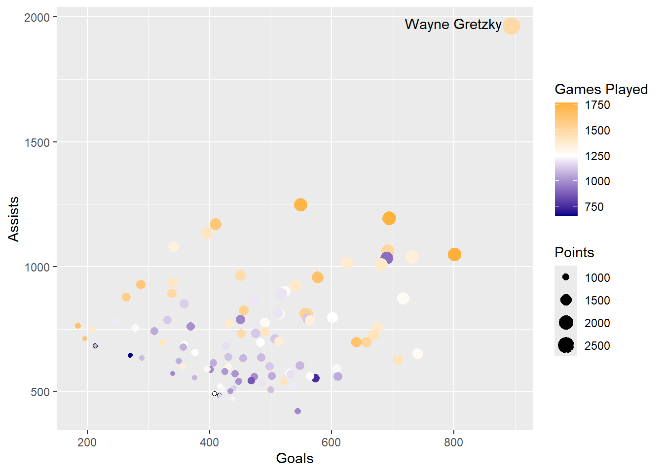
21.3 Creating stacked bar charts
Scatterplots are not the only way to show multiple quantities. Another visualization type we can use is the stacked bar chart.
We will stick with the NHL dataset but we are going to look at the per game rates. For this we will need to first calculate the goals, assists and points per game.
Exercise 10: Calculate the assists, goals, and points per game for each player, add them to the NHL dataset, and name the variables APG, GPG, and PPG.
Show the answer
NHL <- NHL %>%
  mutate(APG = A/GP,
         GPG = G/GP,
         PPG = P/GP)
Now we have our per game variables we can plot APG and GPG as a stacked bar chart. However, before we can do that we will need to pivot our data so they are seen as one variable with two categories (i.e. APG and GPG)
Exercise 11: Create a new dataframe called NHL_Pivot by pivoting the data on Player.
Show the answer
NHL_Pivot <- NHL %>%
  pivot_longer(19:20, names_to="Variable", values_to="PerGameRatio")
Now our data is pivoted we can create a stacked bar chart. We don’t want all 100 players plotted as bars so we will focus on the top 20 by overall points per game.
Exercise 12: Create a subsample of the top 20 based on points per game. Create a stacked bar chart with GPG and APG as variables on the x-axis and players on the y-axis.
Show the answer
# Remember each player has 2 entries so to get the top 20 players we will need to select the first 40 rows.
NHL_Pivot_Sub <- NHL_Pivot %>%
  arrange(desc(PPG)) %>%
  slice_head(n=40)

StackedBar <- NHL_Pivot_Sub %>%
  ggplot(aes(y=reorder(Player,PPG), x=PerGameRatio, fill=Variable),position='fill')+
  geom_col()+
  labs(y="",x="Per Game Ratio")
StackedBar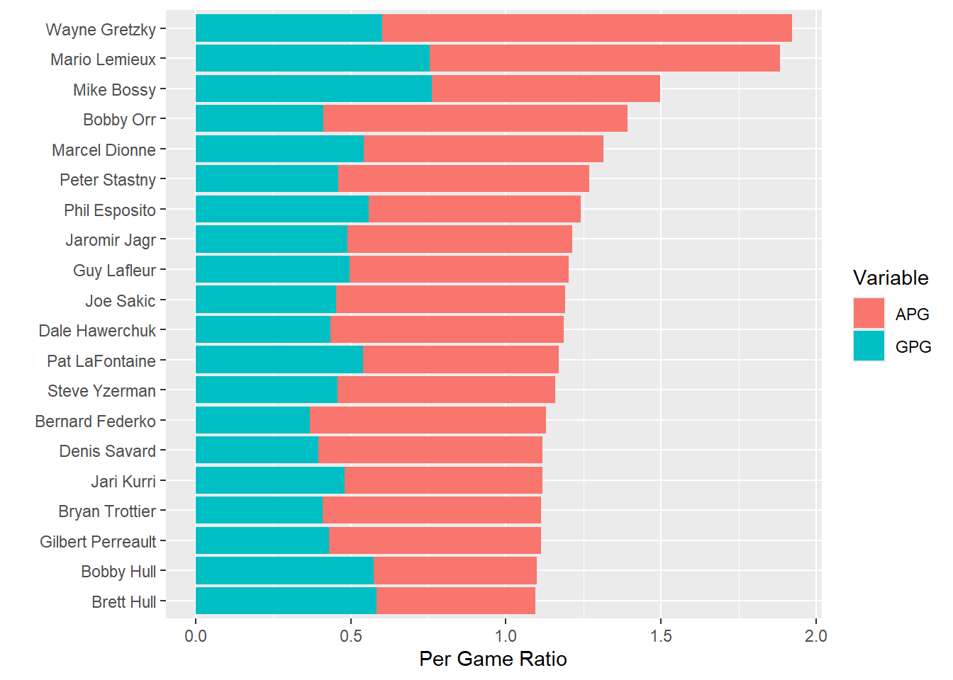
From the visualisation above we can see that Gretzky, who at first seemed to be exceptional, now has company at the top of this list.Lemieux seems very close to Gretzky when it comes to points per game but Bossy also scored more goals per game than either of them.
What is also noticable from this graph is that it is aa little more difficult to compare their Assists per Game rates. This is one drawback of the stacked bar chart: it’s easy to compare the lengths of the first bars and the overall lengths of the bars, but the bars without a common baseline are much more difficult to compare.
If the comparison of the Assists per game was more important than the total points, then we would be better using two individual data points in the same chart (we can do this as the unit is the same (i.e. per game value)). Doing this enables us to see both the goals and the assists and compare players on each of those.
Exercise 13: Using the same subsample as in exercise 12, create a chart with the assists on the left and the goals on the right (each having a different color).
Show the answer
Pointchart <- NHL_Pivot_Sub %>%
  ggplot(aes(y=reorder(Player,PPG), x=PerGameRatio, color=Variable))+
  geom_point()+
  labs(y="",x="Per Game Ratio")
Pointchart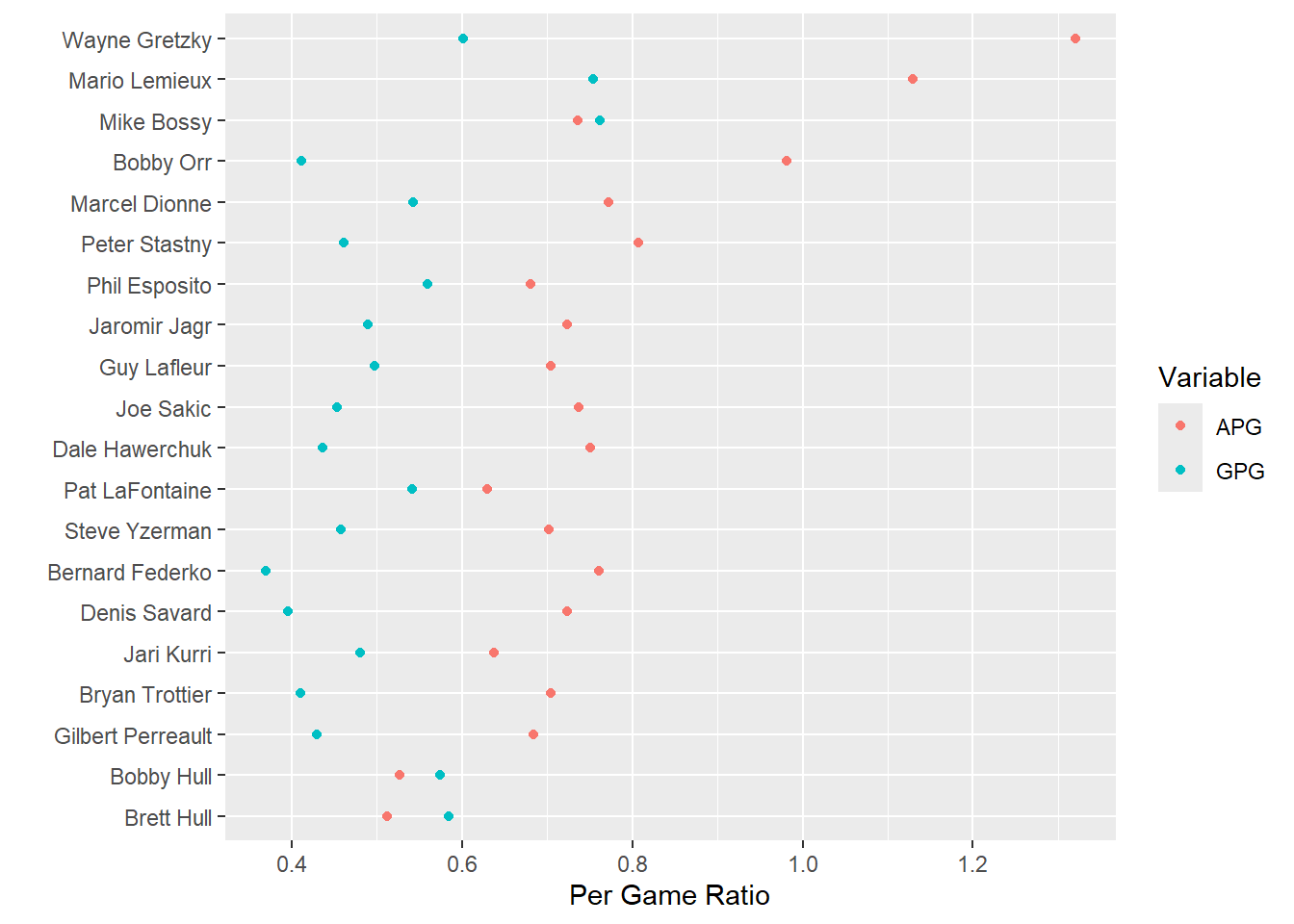
21.4 Regression/ association plots
Next up we will look at how we can plot the strength of an association between variables. We will have a look at shots and goals. Do note shots result in goals but goals do not result in shots, therefore the shots will become our predictor/independent variable (normally placed on the x-axis) and the goals our dependent/outcome variable (normally placed on the y-axis).
Exercise 14: First up let’s create a scatter plot which shows the association between shots and goals and let’s color our points by position (defenders may take less shots and score less than center, right wing, or left wing players).
Show the answer
Corr <- NHL %>%
  ggplot(aes(Shots,G,color=Pos))+
  geom_point()+
  labs(y="Goals")+
  scale_color_discrete(name = "Position", labels = c("Center", "Defense", "Left Wing", "Right Wing"))+
  expand_limits(x=c(0,8000),y=c(0,1000))

Corr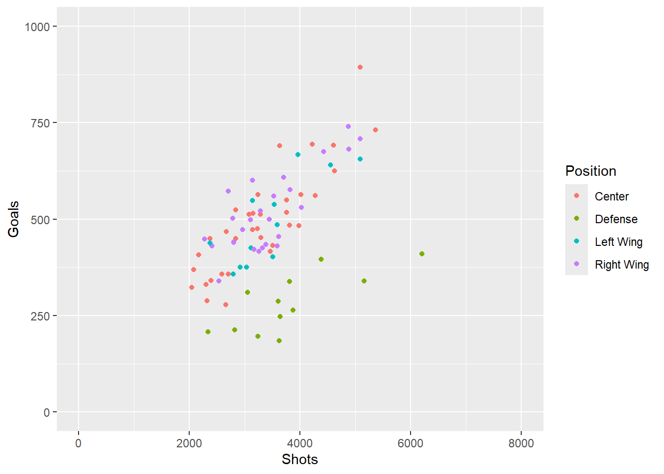
From the graph above we can see there may be a bit of a correlation between number of shots taken and number of goals. We can also see that the strength of the correlation may be different between positions of play.
Exercise 15: Let’s check the different correlations by adding regression lines for each individual category. Can you ensure the line crosses 0 (i.e. 0 shots will always result in 0 goals).
Show the answer
CorrReg <- Corr+
    geom_smooth(method = "lm", formula= y ~ 0+x, se = FALSE)
CorrReg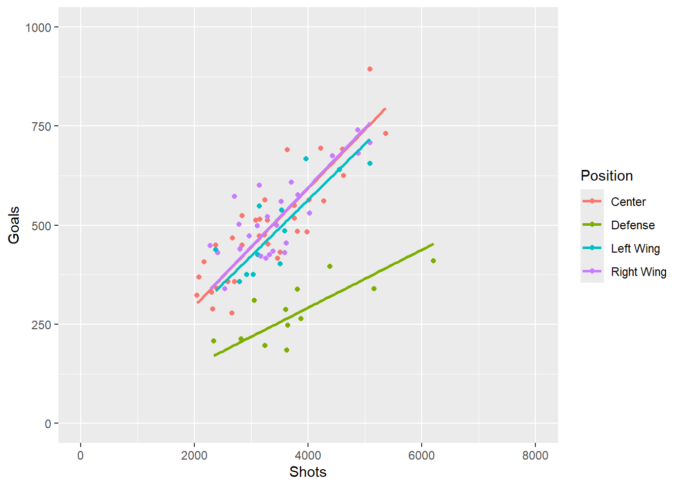
From the graph above we can see the correlation between shots and goals is fairly similar for Center and Wing players but quite different for Defense players. We could choose to simplify the graph by only showing the two regressions (i.e. combined Center and Wingers vs Defense).
21.5 Quadrants
The last way to look at this data is to divide the graph into quadrants. We can look at those who took a low number of shots and scored little (left bottom corner), those who took a low number of shots but scored quite a lot (left top corner), those who took a high number of shots but scored little (right bottom corner), and last those who took a lot of shots and score a lot (top right corner). We can do this by adding reference lines to our original Corr plot.
Exercise 16: Create a scatter plot of goals vs shots and using a colour aesthetic on position. Then add reference lines based on the mean goals and shots, and annotate the four corners with “high accuracy” (top left), “High accuracy and efficiency” (top right), “High efficiency” (bottom right), “Low accuracy and efficiency” (bottom left).
Show the answer
Corrquad <- Corr+
    geom_hline(yintercept=mean(NHL$G, na.rm=TRUE), linetype="dashed",color="grey")+
    geom_vline(xintercept=mean(NHL$Shots, na.rm=TRUE),linetype="dashed",color="grey")+
    annotate("text", x=c(1000,6500, 6500, 1000), y=c(900,900, 100, 100), label= c("High accuracy","High accuracy
             and efficiency", "High efficiency", "Low accuracy
             and efficiency"), colour="darkblue")
Corrquad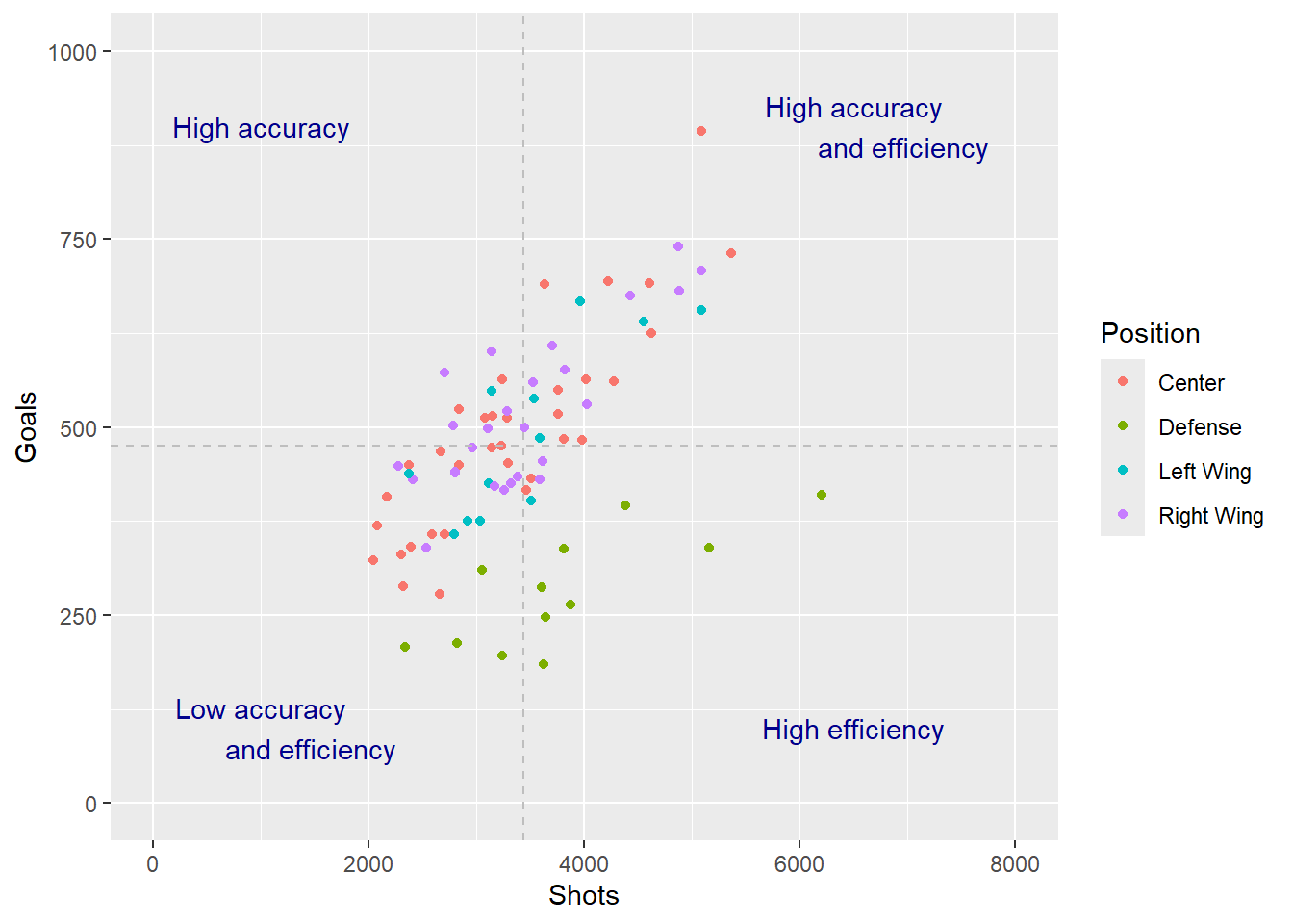
21.6 Positional data
When working with video data many of you will be working with positional data. You may need to highlight a athletes movement on a pitch, or perhaps show shot positions or highlight the position in which a tennis player hits most winners. We will therefore look into how we would work with positional data.
21.7 Date data
The last part of this practical will focus on using date data. The olympic dataset used in the first few practicals contained historical date based data, however we did not tap into this as much as we could. In this section we will start looking at creating time lines and using multiple plots to explain findings.
Exercise 17: Load in TenK.xlsx, which can be found here and name the dataframes TenK.
Show the answer
TenK <- read_xlsx("C:/Users/wkb14101/OneDrive - University of Strathclyde/MSc SDA/B1703/Data for practicals/TenK.xlsx")As you can see this data consists of all the winning times for the olympic 10K race since 1912. It also includes the total number of competitors, countries and weather details for the day of the final.
21.8 Creating line charts
Let’s start with looking at how the winning 10K time has changed over the years.
Exercise 18: Create a line graph with year of the Olympics on the x-axis and 10K time on the y-axis and name it TimePlot (think about your formatting).
Show the answer
TenK$Year <-  as.numeric(str_sub(TenK$Olympics, start=-4)) #I want to extract the year from the string variable `Olympics` first.

TimePlot <- TenK %>%
  ggplot(aes(Year, Men))+
  geom_line(colour="darkblue")+
  xlim(1912,2020)+
  scale_x_continuous(breaks=seq(1912,2020,16), minor_breaks = waiver())+
  labs(x="Olympic Year", y="Winning Time (minutes)")+
  theme_minimal()
TimePlot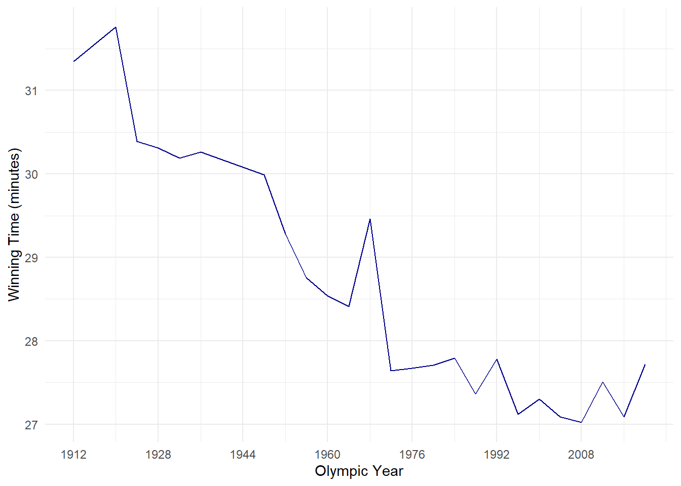
Exercise 19: Let’s also add a trendline to this graph and save it as a new plot named TimePlot2.
Note
TimePlot2 <- TimePlot +
   stat_smooth(method = "lm",
              formula = y ~ x,
              geom = "smooth",
              se=FALSE,
              colour="black",
              linetype=2)
TimePlot2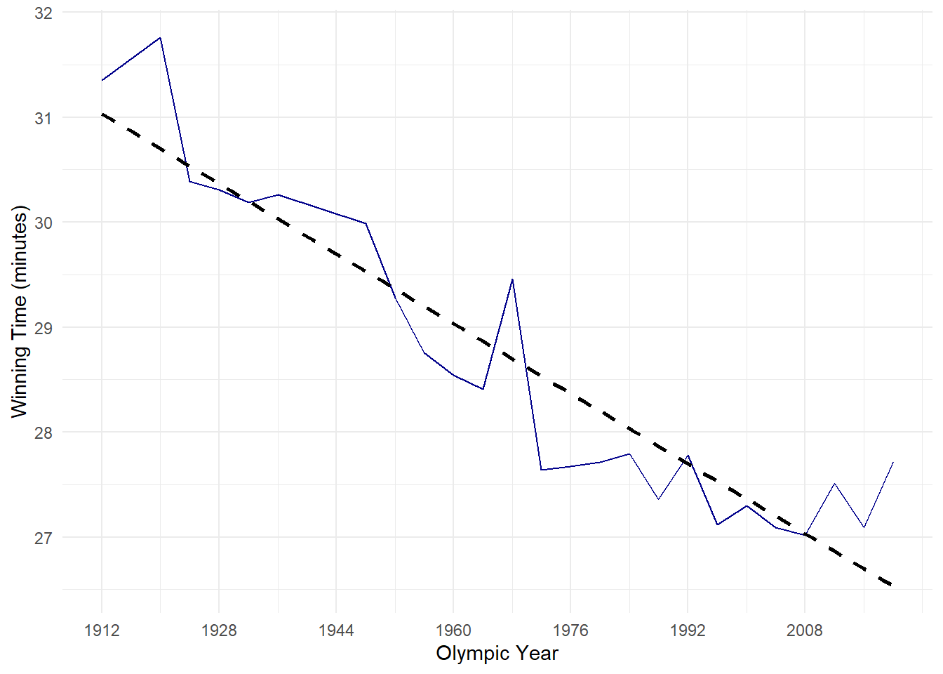
Exercise 20: What would you take away from this graph immediately?
Show the answer
- There is a downward trend in finishing times (i.e. athletes are getting faster)
- 1968 (Mexico City) very clear outlier
- 2012 and 2020 also seem to break the trend
As a data analyst I would like to know why Mexico city appears to be such an outlier. Given we have weather data and altitude data and knowing humidity as well as altitude play a big role in performance we will start with this.
We could decide to create another graph like the one above but with Altitude on the y-axis and plot the two side by side (the patchwork package is good for this)
Exercise 21: Create a second plot with Altitude on the y-axis named AltitudePlot and plot this side by side with the TimePlot
Note
AltitudePlot <- TenK %>%
  ggplot(aes(Year, Altitude))+
  geom_line(colour="darkblue")+
  xlim(1912,2020)+
  scale_x_continuous(breaks=seq(1912,2020,16), minor_breaks = waiver())+
  labs(x="Olympic Year", y="Altitude")+
  theme_minimal()
AltitudePlot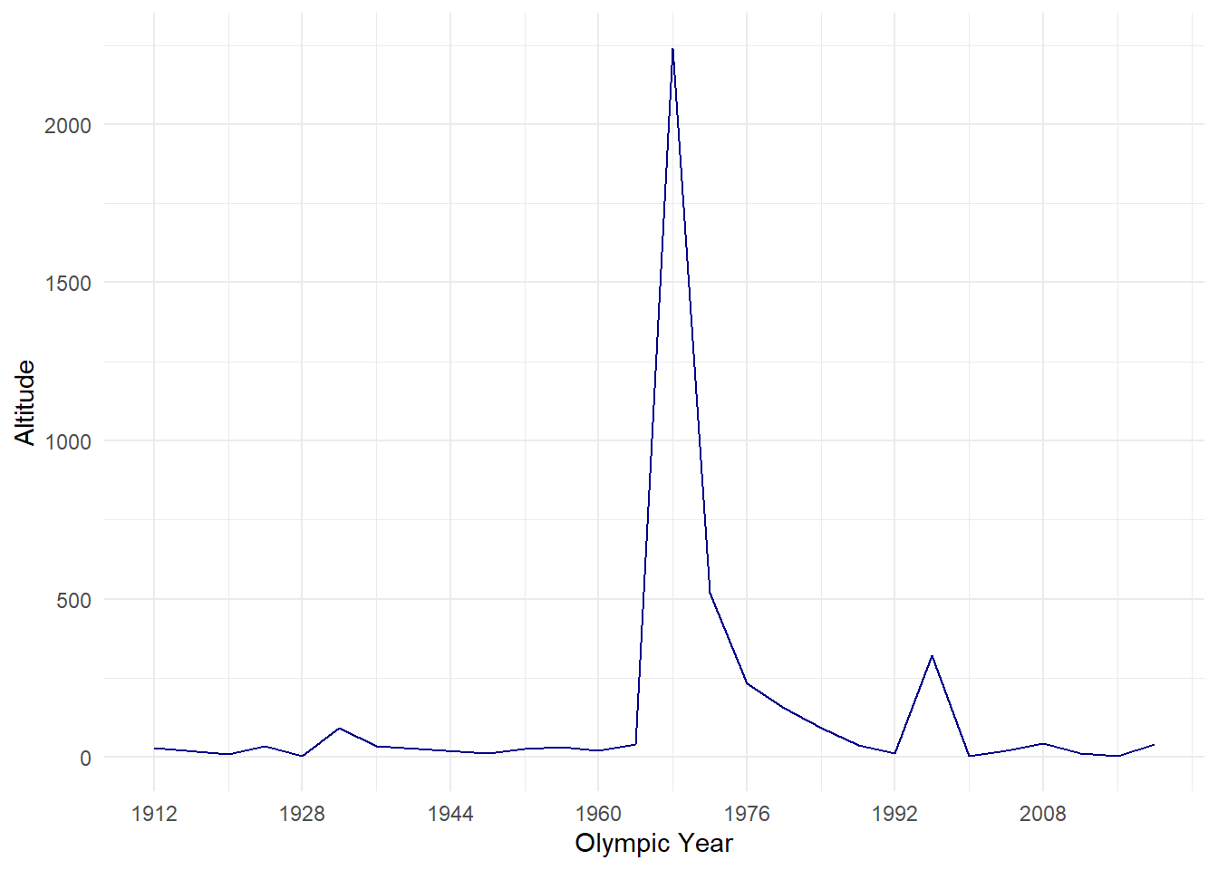
library(patchwork)
TimePlot + AltitudePlot #this will only work if you have patchwork installed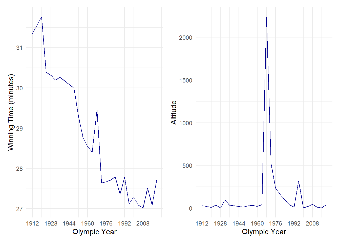
From the graphs above we can see that Mexico City is a huge outlier in regards to altitude, it’s the only high altitude city which has hosted the Olympics. However, it is not always this clear and sometimes it may be easier to overlap two graphs.
Warning
Overlapping graphs with the same axis scale is okay but be careful when overlapping graphs with different access scales (as we do in the next exercise!).
Exercise 22: Create two graphs 1) display race time and temperature over the years, and 2) display altitude and temperature over the years. Can you create a label which indicates the altitude of Mexico City. Note: this is an advanced exercise, do not try if you are still trying to get to grasp with traditional ggplots.
Show the answer
# we first need to create a coefficient to scale the values to the same axis (if we don't do this we will lose all detail in the Race time graph)
coeff<-max(TenK$Altitude)/(max(TenK$Men)-min(TenK$Men))

CombinedPlot <- TenK %>%
  ggplot(aes(Year))+
  geom_line(aes(y=Men),colour="darkblue")+
  geom_line(aes(y=(Altitude/coeff)+min(Men)),colour="orange")+ # I divide the altitude value by the coefficient and add the fastest race time to the division. This ensures our altitude values fall between 27 and 31.
  xlim(1912,2020)+
  scale_x_continuous(breaks=seq(1912,2020,16), minor_breaks = waiver())+
    scale_y_continuous(name = "Winning race time (minutes)",
        sec.axis = sec_axis(~((.-min(TenK$Men))*coeff),name="Altitude (meters)"))+    # Here I add the second axis and ensure we show the actual altitude values not the adjusted ones. I do this by reversing the previous calculation (i.e. (the adjusted value - the fastest time) * coefficient)
  theme_minimal()+
      theme(
    axis.title.y = element_text(color = "darkblue", size=13),
    axis.title.y.right = element_text(color = "orange", size=13)
      )+geom_label(data = TenK,aes(x=1980, y =(max(Altitude)/coeff)+min(Men)), label = paste("Altitude: ",max(TenK$Altitude),"M"))

CombinedPlot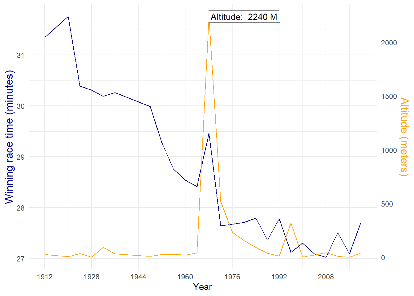
The graph above shows us, without much effort, that the high altitude correlates with the unexpected slow time during the Mexico City Olympics. Note the peak in 1996 does not appear to have an impact on the times, this is because even though Atlanta is located higher than most Olympic cities, it’s not classed as a high altitude city. Also note how I changed the colour of the y-axis, this helps clarify which line belongs to which axis.