library(tidyverse)
load("C:/Users/wkb14101/OneDrive - University of Strathclyde/MSc SDA/R Projects/B1703/Data/Practical5b.RData")17 Practical 7b: Basic plots in R
During this practical we will continue working with the Olympics data set used in Practical 5. We will create several different plots shown during Lecture 5 and we will see how we can improve them.
17.1 Getting your data
Exercise 1: Open Practical5.RData which can be found here.
Show the answer
17.2 Creating bar charts and lollipop charts
Now we have four data frames we can use to create some visualisations. First lets see if we can visualise the top 5 men and women in the overall medal count.
Exercise 2: Create a bar chart which displays the top 15 countries for medal count in 2016 and gives each country a different color. Name the chart Barchart.
Show the answer
Countries2016DF <- CountryDatawithPopDF %>%
  filter(Year=="2016")%>%
  arrange(desc(TotalMedals))

Barchart <- Countries2016DF[1:15,]%>%
  ggplot(aes(x=Country.x, y=TotalMedals))+
  geom_bar(stat="identity", aes(fill=Country.x))

Barchart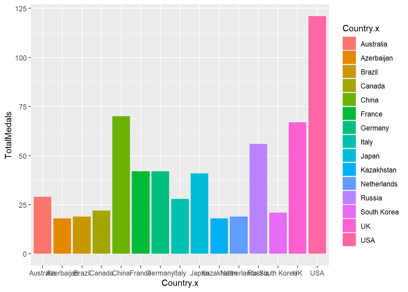
As you can see from the above there is a lot to improve from this graph.
Exercise 3: Can you list the aspects you would like to improve in this graph.
Show the answer
Things you may want to improve are:
- Change x and y axis around
- Remove the colour from country this has no added benefit
- Sort the data on number of medals
- Remove the grey background
- Remove y-axis grid lines and x-axis minor grid lines
- Rename the axis
Exercise 4: See if you can make as many of the above changes as possible. If you are not sure how to do something, try and look it up, using ggplot2 guidance online. Once you finish, plot both a static and interactive version (use the plotly package for the latter).
Show the answer
Barchart <-Countries2016DF[1:15,] %>%
ggplot(aes(x=reorder(Country.x,TotalMedals), y=TotalMedals)) +
  geom_bar(stat="identity", fill="steelblue")+coord_flip() +
  theme_minimal() +
  labs(x= "Country", y="Total Number of Medals in 2016") +
  theme(panel.grid.minor= element_blank(),panel.grid.major.y = element_blank())

Barchart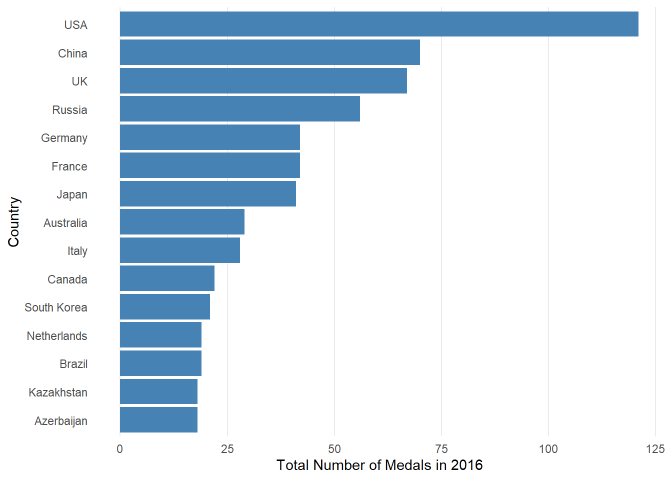
#ggplotly(Barchart, tooltip="Total")In the code above Countries2016DF[1:15,] selects the top 15 rows from the data frame Countries2016DF. aes(x=reorder(Country.x,TotalMedals), y=TotalMedals) specifies the aesthetics of the plot. It uses the reorder() function to order the countries based on the total number of medals (TotalMedals). The x-axis represents the countries, and the y-axis represents the total number of medals.
geom_bar is used to create a bar plot. The stat="identity" argument indicates that the y values are the actual heights of the bars. The bars are filled with the color "steelblue".
coord_flip is used to flip the coordinates, making it a horizontal bar plot.The labs argument is used to set the axis lables. The x-axis is labaled as “Country” and the y-axis is labeled as “Total Number of Medals in 2016” (remember because we used coord_flip the labels actually appear on the opposite axis). theme() allows us to refine our graph even further. In this case it removes grid lines from the plot. It sets minor vertical grid lines and minor and major horizontal grid lines to be blank.
We now have quite a nice looking graph but you could decide to enhance it even further creating a lollipop chart.
Show the answer
Lollieplot <- Countries2016DF[1:15,]%>%
  ggplot(aes(x=reorder(Country.x,TotalMedals), y=TotalMedals)) +
  geom_segment(aes(xend=Country.x,yend=0),color="lightblue") +
  geom_point(size=2,color="steelblue")+coord_flip()+theme_minimal() +
  labs(x= "Country", y="Total Number of Medals in 2016") +
  theme(panel.grid.minor= element_blank(),panel.grid.major.y = element_blank())

Lollieplot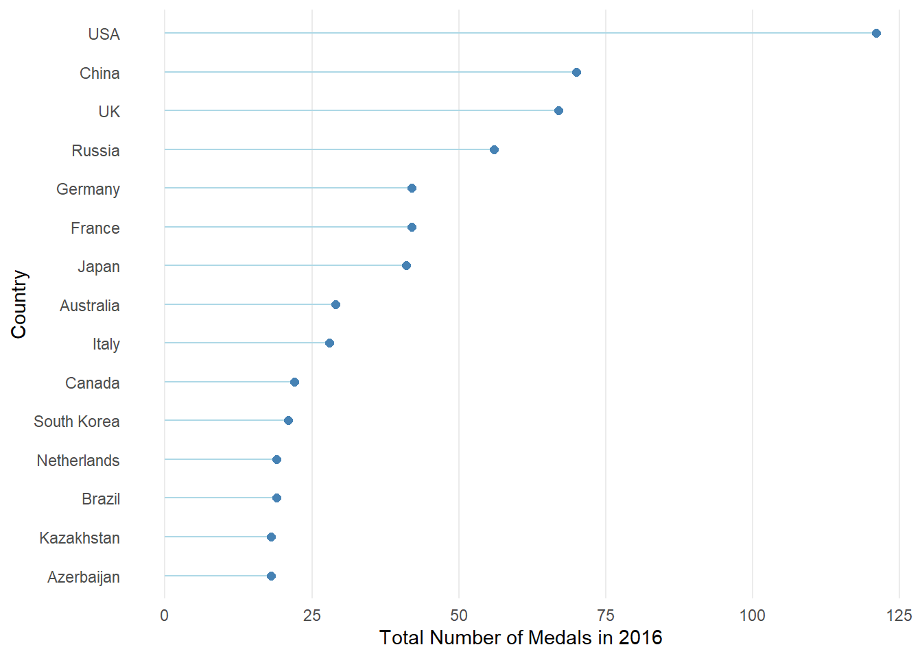
From the code above you will have seen that all we had to do to make it a lollipop chart is remove the geom_bar() section and replace it with a geom_segment() and geom_point() section. The geom_segment() function is used to draw segments. In this case, it is drawing vertical segments from the x-axis (0) to the respective total number of medals for each country. The color is set to “lightblue”. The geom_point is used to add points to the plot. Each point represents a country’s total number of medals. The size is set to 2, and the color is “steelblue”.
17.3 Creating tree maps, bubble charts, and word clouds
We can also choose to display the data above in either a tree map, bubble chart, or word cloud.
Exercise 5: Can you create the three charts mentioned above displaying the number of medals in 2016 for the top 10 countries. You will need to install and load the treemapify and ggwordcloud packages for this.
Show the Treemap answer
#Creating a treemap using the treemapify package
library(treemapify)
Treemap <- Countries2016DF[1:10,]%>%
  ggplot(aes(area=TotalMedals,fill=Country.x, label=Country.x)) +
  geom_treemap()+
  geom_treemap_text()
Treemap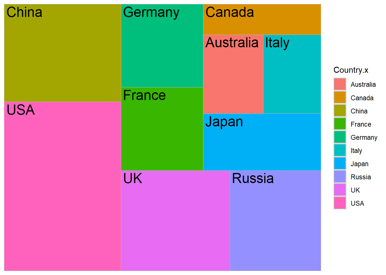
Show the bubble chart answer
# Creating a bubble chart (but not really a bubble chart)
BubbleChart <- Countries2016DF[1:10,]%>%
  ggplot(aes(x=Country.x,y=TotalMedals, size=TotalMedals)) +
  geom_point(alpha=0.5, colour="orange")+theme_minimal()
BubbleChart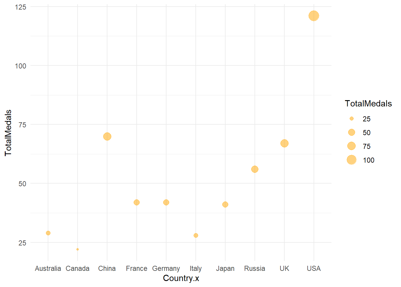
Show the word cloud answer
library(ggwordcloud)
# Creating a wordcloud using the package ggwordcloud
#install.packages("ggwordcloud")
Wordcloud <- Countries2016DF[1:10,]%>%
  ggplot(aes(label=Country.x,size=TotalMedals, color=Country.x)) +
  geom_text_wordcloud()+theme_minimal()
Wordcloud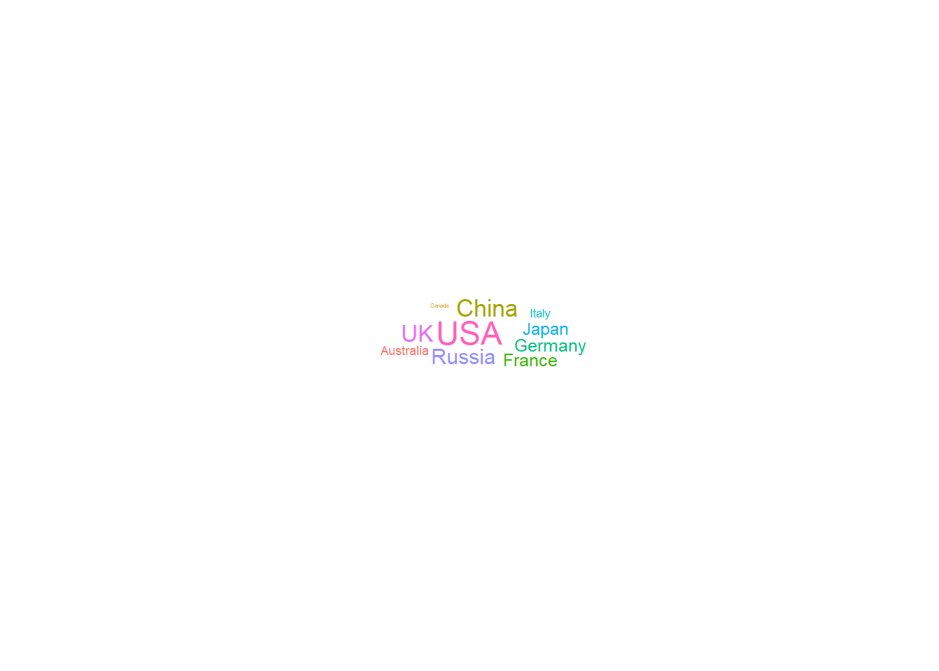
You will see from the plots above that the bubble charts created in R are perhaps more appropriate when you have more than two variables. We will look into this in the next practical. You can create a bubble chart similar to what you created in the Tableau practical, however, this requires the packcircles package. If you are interested to know how to do this see code below.
Show the packed circles code
library(packcircles)
# Creating a bubble chart without axis using the packcircles and ggplot2 packages

Top10Countries <- subset(Countries2016DF[1:10,])
packing <- circleProgressiveLayout(Top10Countries$TotalMedals, sizetype='area')
data <- cbind(Top10Countries, packing)

dat.gg <- circleLayoutVertices(packing, npoints=50)

BubbleChart2 <- ggplot() +
  geom_polygon(data=dat.gg, aes(x,y, group = id, fill = as.factor(id)), colour = "blue", alpha=0.6) +
  geom_text(data=data, aes(x, y, size=TotalMedals, label=Country.x))+
  scale_size_continuous(range=c(1,4)) +
  theme_void()+
  theme(legend.position="none")+
  coord_equal()
BubbleChart2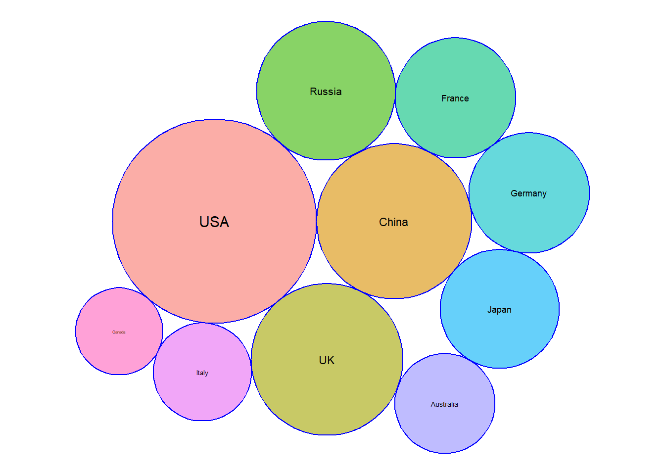
17.4 Creating pie charts
Now imagine we want to examine the percentage of medals won based on population numbers. We decide we will split our sample up into 3 groups, high population, mid population and low population based on 2016 population data.
Exercise 6: Create a new variable named PopLevel which assigns a 1, 2 or 3 to high, mid and low population countries respectively.
Show the answer
Tert <- quantile(Countries2016DF$Population, probs=seq(0,1,1/3),na.rm=TRUE)

Countries2016DF <- Countries2016DF %>%
  mutate(PopLevel= ifelse(Population>Tert[3], 1, ifelse(Population>Tert[2],2,3)))
Exercise 7: Create a pie chart using our newly created variable PopLevel as grouping variable.
Show the answer
Tert <- quantile(Countries2016DF$Population, probs=seq(0,1,1/3),na.rm=TRUE)

Countries2016DF <- Countries2016DF %>%
  mutate(PopLevel= ifelse(Population>Tert[3], 1, ifelse(Population>Tert[2],2,3)))

Countries2016DF <- Countries2016DF %>%
  arrange(desc(PopLevel)) %>%
  mutate(prop = TotalMedals / sum(Countries2016DF$TotalMedals) *100) %>%
  mutate(ypos = cumsum(prop)- 0.5*prop )

Pie<-na.omit(Countries2016DF) %>%
  group_by(PopLevel) %>%
  reframe(TotalMed=sum(TotalMedals))%>%
  ggplot(aes("", TotalMed, fill=as.factor(PopLevel))) +
  geom_bar(stat="identity", width=1, color="white")+
  coord_polar("y",start=0)+
  theme_void()+
  theme(legend.position="none") +
  geom_text(aes(y = c(450,140,15), label = c("High","Mid","Low")), color = "white", size=6) +
  scale_fill_manual(values = c("steelblue", "lightblue","blue"))+
  ggtitle("Proportion of 2016 medals by population level")

Pie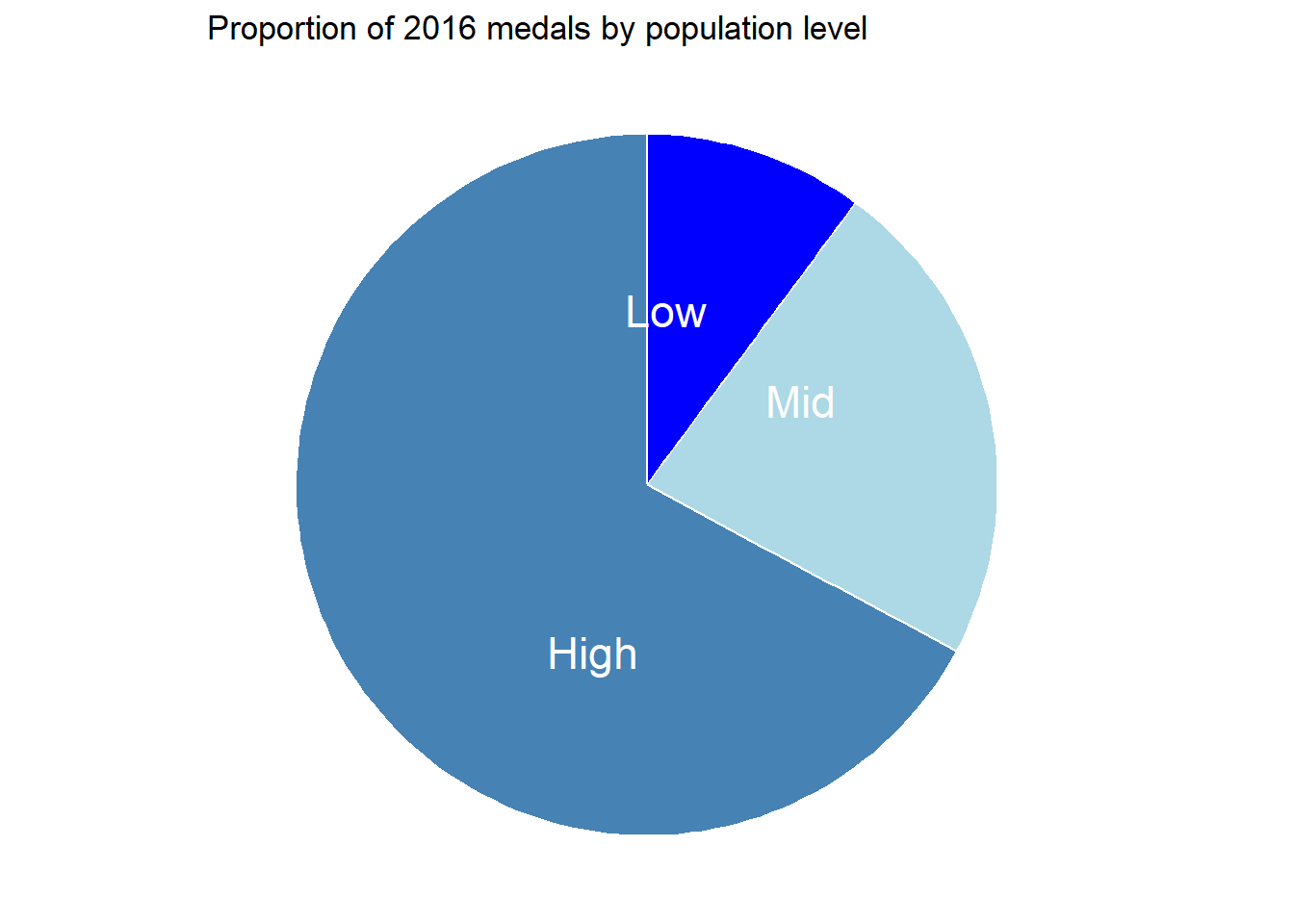
17.5 Creating histograms and boxplots
Up until now we have been interested in medal counts, but I would like to start looking at the athlete characteristics a bit more. First I would like to know if their height is normally distributed.
Exercise 8: Create a histogram which shows the distribution of the athletes height in 2016.
Show the answer
AthletesDataDF <- DatabyAthletePerYearDF %>%
  filter(Year=="2016")%>%
  arrange(desc(Height))

Histogram <- AthletesDataDF%>%
  ggplot(aes())+
  geom_histogram(aes(x=Height))
Histogram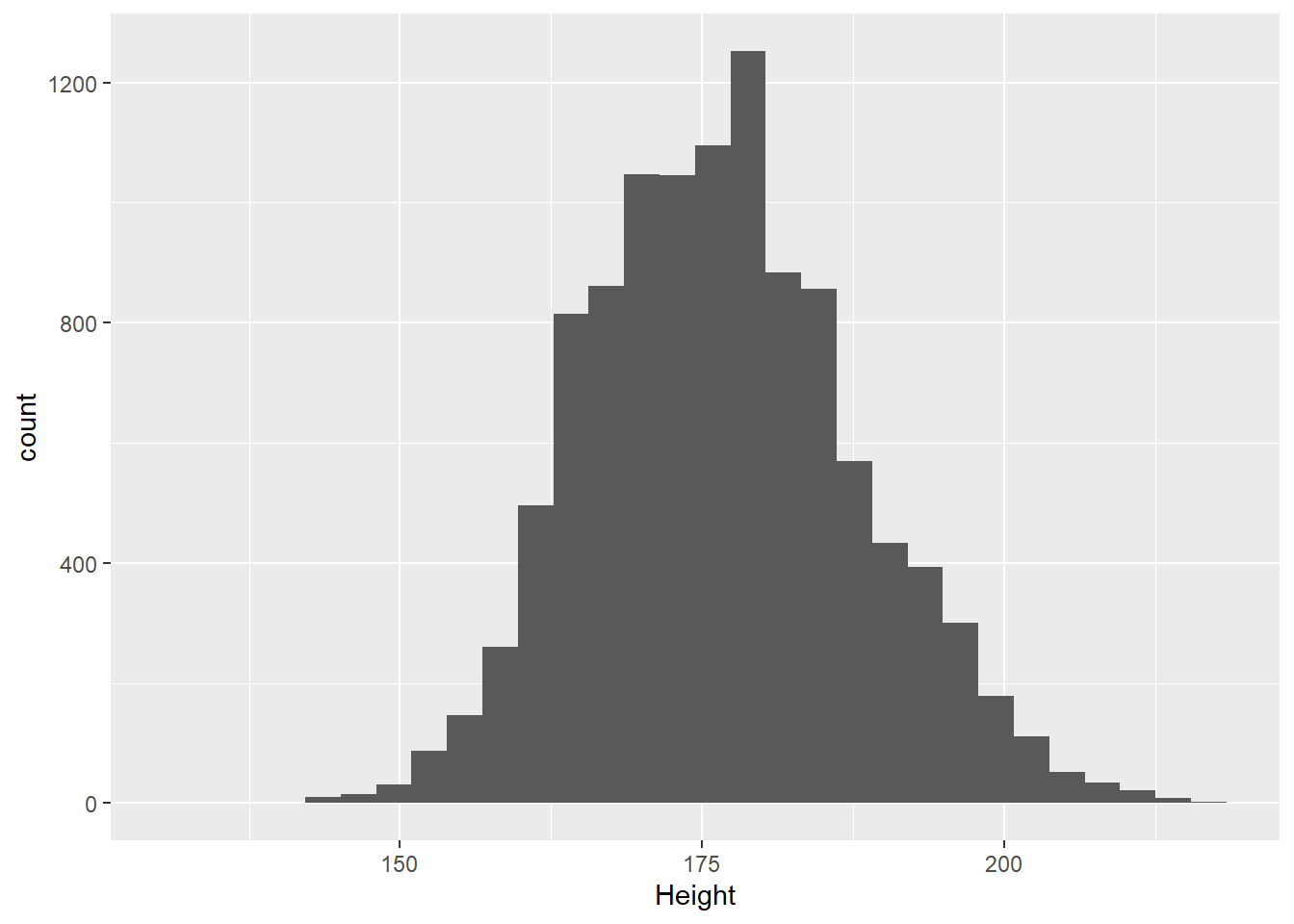
From the plot above we can see quite a wide spread of heights across the population of athletes. I wonder if the distribution of heights for males and females differs.
Exercise 9: Create two histograms which shows the distribution of the athletes height in 2016 by sex. Try to create just one plot when doing so.
Show a hint
Use facet_wrap() on Sex.
Show the answer
colors <- c("blue", "lightblue")
FacetHisto <- AthletesDataDF%>%
  ggplot(aes())+
  geom_histogram(aes(y=after_stat(density),x=Height, fill=Sex))+
  facet_wrap(~Sex) +
  scale_fill_manual(name="Sex", labels=levels(AthletesDataDF$Sex),values=setNames(colors, levels(AthletesDataDF$Sex)))

FacetHisto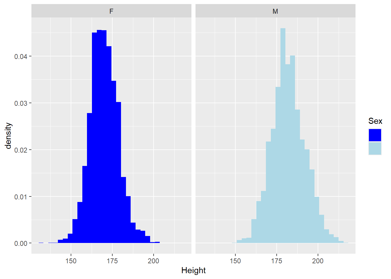
The two graphs above tell us a little bit about the difference between men and women, but it would be even better if we could directly compare the female and male histograms against the total population. To do so we will plot a third histogram but this histogram will be plotted in the already existing facets.
Show the code
AthletesDataDF2 <- AthletesDataDF %>%
  select(-Sex)

Histo2 <- FacetHisto +
  geom_histogram(data=AthletesDataDF2, aes(y=after_stat(density),x=Height), alpha=0.5)
Histo2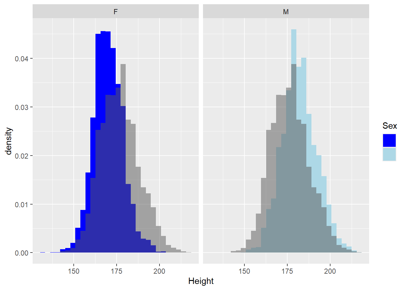
We can now see that our expectation of females being slightly shorter is correct.
Next up let’s have a look at box-plots. We have seen height differs between Males and Females but I am wondering if we can use height as a selection method for certain sports.
Exercise 10: Create boxplots which show the distribution of the athletes height in 2016 by sport. Can you order the sports from those with the tallest to shortest athletes?
Show the code
Mediantest<-median(AthletesDataDF$Height,na.rm=TRUE)

Boxplot <- AthletesDataDF%>%
  drop_na(Height)%>%
 ggplot(aes(y = reorder(Sport, Height, median), x = Height, fill = Sport)) +
  geom_boxplot() +
  theme(legend.position = "none")+
  geom_vline(aes(xintercept=Mediantest, colour="red"))+
  ylab("Sport")
Boxplot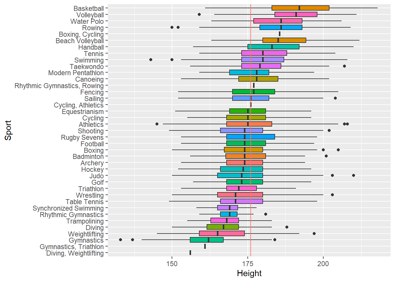
Exercise 11: Save the dataframes DatabyAthleteAvg, DatabyAthletePerYear, TotalsPerCountryYear, CountryDatawithPop, above as .RData file named Practical7.RData .
Show the answer
save(DatabyAthleteAvgDF, DatabyAthletePerYearDF, TotalsPerCountryYearDF, CountryDatawithPopDF, file="C:/Users/wkb14101/OneDrive - University of Strathclyde/MSc SDA/R Projects/B1703/data/Practical7b.RData")