library(tidyverse)
ATP <- read_csv("C:/Users/wkb14101/OneDrive - University of Strathclyde/MSc SDA/B1703/Data for practicals/ATP.csv")24 Practical 11b: Advanced plots in R part 2
In this practical we continue with creating and refining advanced plots. We will look in to more advanced ways in which we can visualise data (i.e. timelines/ gantt charts, radar plots, and slope graphs).
24.1 Getting your data
The data file we used in our previous practical was a fairly straight forward data file where all we had to consider was the year. Next up we are going to look at a data file which contains historical data week by week. The data set you will use first includes the World Tennis Ranking data from 2000 until now. We will use this to create a visualisation which shows who was leading the world rankings when and for how long they led the world rankings (gantt chart).
The datasets used in the exercises below can be found here
Exercise 1: Load in ATP.csv and name the data frames ATP.
Show the answer
24.2 Creating gantt charts
If you had a look at the data you will see this is a substantial data file. You will also have seen that the date isn’t formatted correctly so we will correct that first.
Exercise 2: Ensure the ranking_date variable is formatted as a date.
::: {.callout-note collapse=“true”}
ATP$ranking_date<- as.character(ATP$ranking_date)
ATP$ranking_date<- as.Date(ATP$ranking_date,format="%Y%m%d")
:::
As we plan to create a chart which shows who was leading the world rankings over time we can reduce our data set and focus just on those who were ranked number 1.
Exercise 3: Create a subset of data with only those players who had a rank 1 and name this subset ATPLeaders. With the subset count the number of players who held the top spot between 2000 and 2023.
Show the answer
ATPLeaders <- subset(ATP, rank==1)
paste("Number of world leaders: ",n_distinct(ATPLeaders$player))
[1] "Number of world leaders: 13"From the exercise above you will see we have 13 players who have led the world rankings. We have however many more rows in our ATPLeaders data frame meaning most players will have led the world tour for more than 1 week. If we want to create a gantt like visual we will need to indicate the first week a player made it to the world rank and also the last week. For example, Andre Agassi led the ranks in January 2000 and he ended that period in September 2000 and then had another stint at the top in 2003. We will create a new variable called Start_End and indicate the start of a period as “Start” and the end as “End”.
Exercise 4: Create a variable called Start_End and add this to the ATPLeaders data frame.
Show the answer
ATPLeaders <- ATPLeaders[order(ATPLeaders$ranking_date),] #This step is important, we need the dates in order.

ATPLeaders <- ATPLeaders %>%
  mutate(Start_End=if_else(player !=lag(player),"Start", # #If you haven't come across lead(), this function takes the value in the next cell of the relevant column. Lag() does the opposite.
                           if_else(player !=lead(player), "End",""))) #this line examines whether the next row's player is the same to the current row, if not it will assign "End" to the Start_End column.

ATPLeaders[1,19]<-"Start" #I ensure that the first line also receives a Start or it will be an incomplete period
Next up we can reduce our data frame further by getting rid of the date periods between the start and end of a players reign.
Exercise 5: Remove all rows which aren’t the start or end of a players world lead.
Show the answer
ATPLeaders <- subset(ATPLeaders, Start_End== "Start" | Start_End=="End")The last bit of data prep we need to do before we can finally create our gantt chart is to create a column with a start date and one with an end date for each period.
Exercise 6: Adjust ATPLeaders so the start and end dates are in separate columns and all players have only 1 row per period.
Show the answer
ATPLeaders <- ATPLeaders %>%
  mutate(Start=ranking_date,
         End=lead(ranking_date)) %>%
  subset(Start_End=="Start")
# I then remove the Ends as we have all relevant information in the first line (and in fact the information in the End line is incorrect)

ATPLeaders[42,21]<-today() #ensure that the last period has an end date

ATPLeaders<-ATPLeaders[order(ATPLeaders$player, ATPLeaders$Start),]

ATPLeaders <- ATPLeaders %>%
  group_by(player) %>%
  mutate(period=row_number(),
         Duration = difftime(End, Start, units="weeks")) #I give each individual period a number per player. This allows us to see how many times they have been at the top.
Next up let’s create our gantt chart. There are several ways in R to do this but I prefer to use geom_segment.
Exercise 7: Can you create a gantt chart using geom_segment?
Show the answer
Gantt<-ATPLeaders %>%
  mutate(name_last=as.factor(name_last)%>%
  fct_reorder(Start, min)) %>%
ggplot() +
    geom_segment(aes(x=Start, xend=End, y=name_last, yend=name_last), colour="orange", linewidth=5) +
    xlab("Year")+
    theme_minimal()

Gantt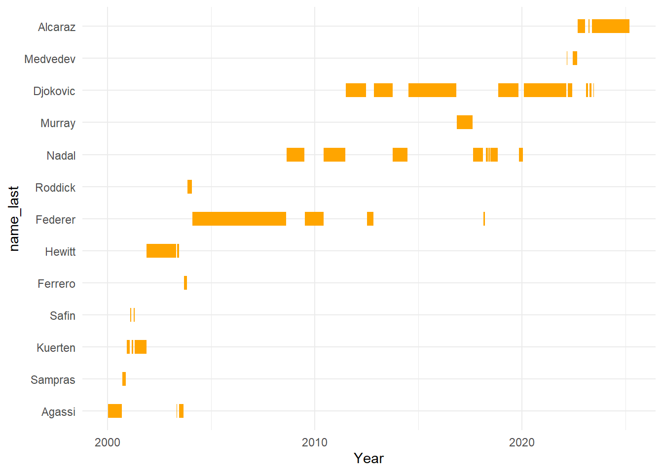
From the visualisation above we can see how from 2004 the big 4 dominated the world rankings. Between 2000 and 2004 we had 8 different world leaders, yet from 2004 to 2022 the top was taken by just 4 players. We can put more emphasis on this by annotating our graph. We can also improve the formatting of the graph a bit more.
Exercise 8: Try to add a rectangle which highlights the main period of the big 4 and see how you can improve the chart further.
Show the answer
startFed<-filter(ATPLeaders, name_last == "Federer" & period == 1) #Federer started the big 4 era so we want to know when he led the world ranks first
endDok <- filter(ATPLeaders, name_last == "Djokovic" & period == 5) #Djokovic ended the big 4 era so we want to the last period he led before another player outside of the big 4 took over (which is period 5)

Gantt2<- Gantt +
  geom_rect(aes(xmin=startFed$Start, xmax=endDok$End, ymin=0, ymax=Inf), fill="lightblue", alpha=0.01)+
  ylab(label="")

Gantt2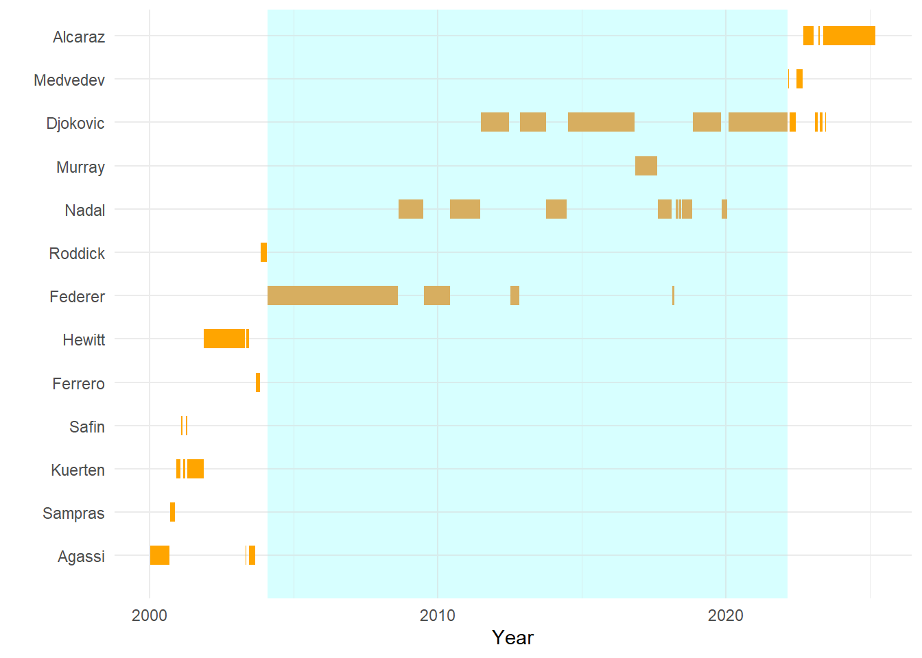
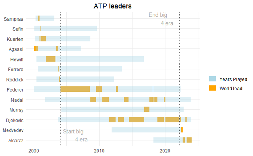
Another thing worth adding may be the total period the players were playing at the top level. We can do that by going back to our original data frame (ATP) and pulling out all data (so not just their number 1 ranking) for any player who has ever led the rankings between 2000 and now. From there we can extract the first time they entered the rankings and the last time they were listed on the rankings. Once we have done this we can then add another geom_segment to our plot to visualise the “active” time period.
Exercise 9: See if you can recreate the figure below:
Show the answer
Leaders<-c(ATPLeaders$player) # Creating a vector with player id's for all player's who have led the ranks at one point in time.

ATPL<-filter(ATP, ATP$player==Leaders) #filter original data for just the world leading players using the vector created in the line above

ATPL<-ATPL[order(ATPL$player, ATPL$ranking_date),] #important to order on player and ranking_date, not doing this would provide us with the wrong timeperiods.

ATPL <- ATPL %>%
  mutate(Start_End=if_else(player !=lag(player),"Start",
                           if_else(player !=lead(player), "End",""))) #This bit of code looks for the start of a players ATP career and the end.

ATPL[1,19]<-"Start" #Ensure that the first line in the data frame also receives a Start or it will be an incomplete period

ATPL <- subset(ATPL, Start_End== "Start" | Start_End=="End") #Remove all entries between the start and end of a players career

ATPL <- ATPL %>%
  mutate(Start=ranking_date,
         End=lead(ranking_date)) %>%
  # remember when using geom_segment we want the two time points in two seperate columns, this is what happens here.
  subset(Start_End=="Start")
#Remove the rows which have "End" as we have all relevant information in the rows with "Start" (and in fact the information in the End line is incorrect)

ATPL[13,21]<-today() #ensure that the last line in the data frame has an end date

ATPL<-ATPL[order(ATPL$player, ATPL$Start),]

Gantt3<-ATPLeaders %>%
  mutate(name_last=as.factor(name_last)%>%
  fct_reorder(Start, min)) %>%
  ggplot() +
    geom_segment(aes(x=Start, xend=End, y=name_last, yend=name_last, colour="orange"), size=5) +
    xlab("Year")+
    theme_minimal() +
  # above I recreate the original gantt plot but in this bit of code you will have seen colour has been added to the aes() part. This is to ensure we can use it as a label later (in the original gantt it was outside of aes() which means no label was assigned to it)

  #below the years played is added to the gantt
  geom_segment(data=ATPL, aes(x=Start, xend=End, y=name_last, yend=name_last, colour="lightblue"), size=5,alpha=0.4)+
  ylab(label=NULL)+ #removing the y-axis label
  xlab(label=NULL)+ #removing the x-axis label
  scale_color_manual(values = c(lightblue = "lightblue", orange = "orange"),
                     labels = c(lightblue = "Years Played", orange = "World lead"))+ # this is were the legend gets created
  labs(colour="", title="ATP leaders")+ #We don't want a legend title hence colour="".
  theme(plot.title = element_text(hjust=0.5))+
  geom_vline(ATPL, xintercept = startFed$Start, linetype=3)+ #adding the reference lines using the start of federers career and the end of djokovic career as xintercepts.
  geom_vline(ATPL, xintercept=endDok$End, linetype=3)+
  annotate("text", label="Start big
           4 era", x=startFed$Start+700, y=1.5, size=4, colour="darkgrey")+ #Adding annotations. The exact x and y placement of the annotations is always a bit of trial and error.
  annotate("text", label="End big
           4 era", x=endDok$Start-365, y=13, size=4, colour="darkgrey")
Gantt3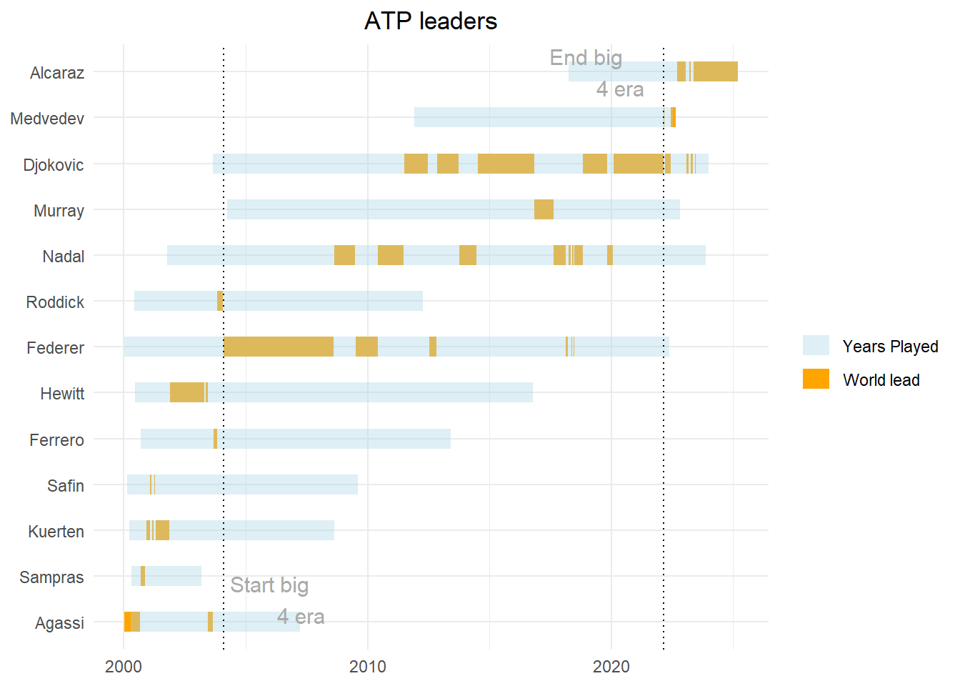
24.3 Radar charts
In this section we will focus in on the big 4 and see how they compare to the world lead in 2010 (Andre Agassi). Are they really performing that much better or is the depth in the field less?
You may have noticed that some variables within the dataset are performance outcomes (e.g. 1st serve points won, breakpoints converted, etc). We will use these to compare our players. As mentioned the players we are interested in are Federer, Nadal, Murray, Djokovic and Agassi.
Exercise 10: Create a new dataframe called BigFour which only includes the data for the Big Four and Agassi (note these are the only players with performance outcome data).
Show the answer
BigFour <- ATPL %>%
  filter(!is.na(service_games_won))
Next we can start creating our radar chart. We will use the fmsb package for this.The way we format our data for a radar chart is very specific. Each row must be an individual case (i.e. player) and each column is a quantitative variable. The first 2 rows provide the min and the max that will be used for each variable.
Exercise 11: Create a new dataframe called BigFour2 and make sure column one contains the players last name and only the following performance outcomes are displayed: 1st_serve_won, 2nd_serve_won, service_games_won, return_games_won, break_points_converted, break_points_saved for Agassi and Federer (ignore the others for now).
Show the answer
library(fmsb)
BigFour2 <- BigFour %>%
  filter(name_last=="Agassi" | name_last=="Federer") %>%
  select(name_last, "1st_serve_won", "2nd_serve_won", service_games_won, return_games_won, break_points_converted, break_points_saved)
  colnames(BigFour2) <- c("name", "1st_serve_won", "2nd_serve_won", "service_games_won", "return_games_won", "break_points_converted", "break_points_saved")
Next we will need to add the minimum and maximum for each variable. As all these outcomes are percentages we will say the maximum is 100 and the minimum is 0.
Exercise 12: For each variable add a minimum and a maximum value (max on row 1, min on row 2). Once you have done this use the radarchart() function to create the first draft of our radarchart.
Show the answer
#add the max and min values
BigFour2 <- rbind(rep(100,7), rep(0,7), BigFour2)

#print simple radar chart
radarchart(BigFour2[,c(2:7)])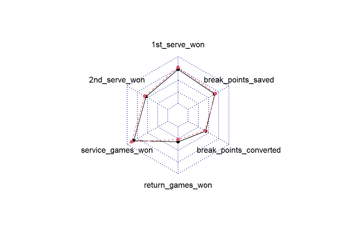
This is a pretty basic chart and visually not very attractive. We’ll have a look at how we can improve this.
Show the code
#we assign row names to a vector which we will use later to create a legend.
rowname<-BigFour2[c(-1,-2),1]
rowname<-rowname[[1]]
labels<-c(colnames(BigFour2[,c(2:7)])) # we will use these for our variable labels.

# We will use this function, which includes a set of basic settings for a nice radar chart. You can adjust the settings but having a function ready saves a lot of formatting if you regularly create radar charts.

Radar_chart<- function(data, color = "lightblue", vlabels = colnames(data), vlcex = 0.7, caxislabels = NULL, title = NULL, ...){ #this line contains all the input we can give later on. Below this line is the function code.
    radarchart(
        data, axistype = 1,
        # Customize the polygon
        pcol = color, pfcol = scales::alpha(color, 0.4), plwd = 2, plty = 1,
        # Customize the grid
        cglcol = "grey", cglty = 1, cglwd = 0.8,
        # Customize the axis
        axislabcol = "grey",
        # Variable labels
        vlcex = vlcex, vlabels = vlabels,
        caxislabels = caxislabels, title = title, ...
    )
}

op <- par(mar = c(2,0.5,2,0.5)) #this sets the margins and determines how your labels are displayed. Bit of trial and error to get it right.

Radar_chart(BigFour2[,c(2:7)], caxislabels = c(0, 25, 50, 75, 100), title= "Agassi vs Federer", color= c("orange", "lightblue"), vlabels=labels) #we use the function created and add relevant input.
legend(x=1, y=0.4, legend=rowname, horiz=FALSE, bty="n", pch=20, col=c("orange", "lightblue"), text.col="black", cex=1, pt.cex=1.5) # add the legend, make sure your colours are matching the ones in the radar_chart function.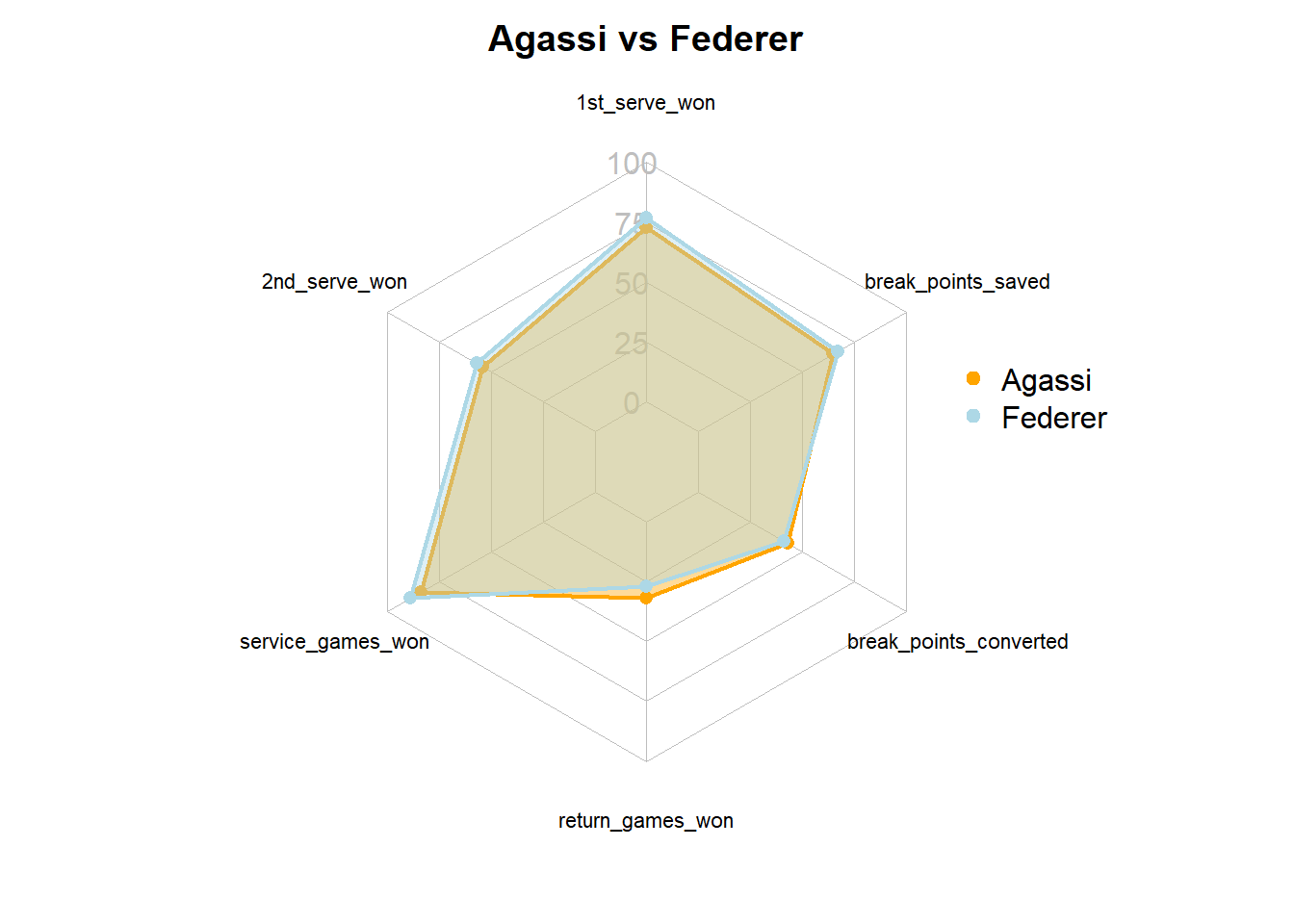
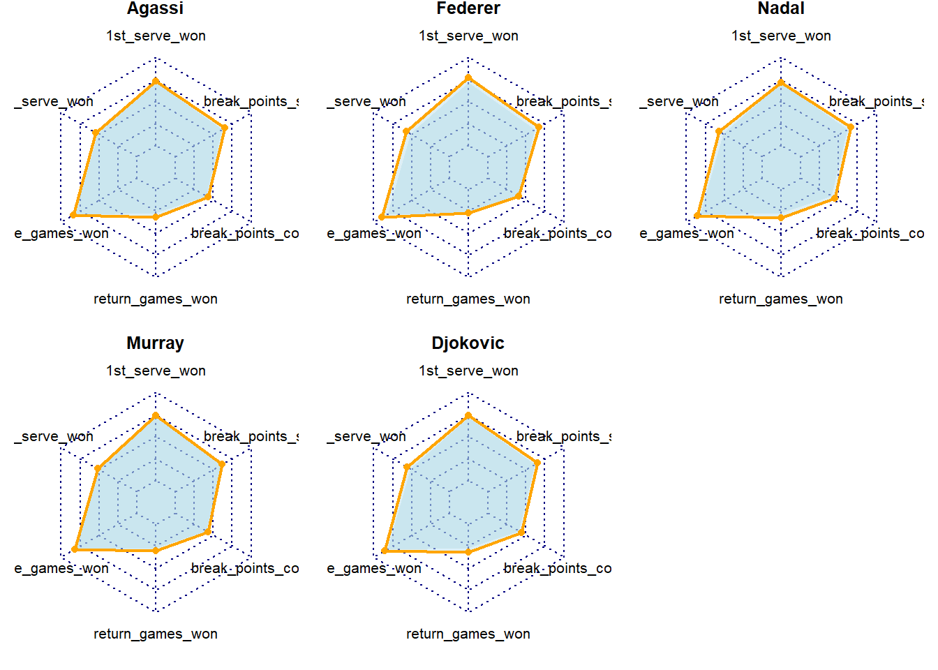
If we wanted to compare all of the big 4 players to Agassi it is better to create separate spider charts as plotting more than 3 on top of eachother becomes messy.
Show the code
# Define colors and titles
BigFourAll <- BigFour %>%
  select(name_last, "1st_serve_won", "2nd_serve_won", service_games_won, return_games_won, break_points_converted, break_points_saved)
  colnames(BigFourAll) <- c("name", "1st_serve_won", "2nd_serve_won", "service_games_won", "return_games_won", "break_points_converted", "break_points_saved")

#calculating minimums of group.
col_min <- BigFourAll %>%
  summarise(name="",
            "1st_serve_won"=min(BigFourAll$"1st_serve_won", na.rm=TRUE),
            "2nd_serve_won"=min(BigFourAll$"2nd_serve_won", na.rm=TRUE),
            service_games_won=min(BigFourAll$service_games_won, na.rm=TRUE),
            return_games_won=min(BigFourAll$return_games_won, na.rm=TRUE),
            break_points_converted=min(BigFourAll$break_points_converted, na.rm=TRUE),
            break_points_saved=min(BigFourAll$break_points_saved, na.rm=TRUE))

BigFourAll <- rbind(rep(100,7), rep(0,7), col_min, BigFourAll)

titles <- c(BigFourAll[c(4:8),1])
titles <- titles[[1]]

# Split images in two rows of 3.
par(mar = rep(0.8,4)) #adjust margins
par(mfrow = c(2,3)) #split images

# Create the radar chart. Note we use the normal radarchart function not the function we created earlier as we will need to adjust some of the settings
for(i in 1:5){
  radarchart(
    BigFourAll[c(1:3, i+3),c(2:7)], #the radarchart functions always takes row 1 and 2 to plot the radar min and max values. Anything after that will be plotted as data onto the radar. In this case we tell the chart to take row 3 (the minimum) and plot those in grey on avery chart and also plot the value for each player in red.
    pfcol = scales:: alpha("lightblue",0.4),
    pcol= c(NA,"orange"), plty = 1, plwd = 2,
    title = titles[i]
    )
}
24.4 Slope graphs
In the previous example we examined a long period of time. What if we are interested in change from one point in time to another? For example, we may want to visualise the progress of athletes from the start to the end of the season or training block. Or, as we will do in this example, we may want to visualise how teams are performing compared to the previous season. Slope charts are a pretty good choice to show a change over 2 timepoints. A slope chart is basically a line chart with two time-points.
For this exercise we will use some historical Premier League data from 2012/2013 and 2013/2014. We will focus in on the first 15 weeks of play.
Exercise 13: Load in PLHistorical.xlsx, which can be found here and name the dataframes PL.
library(readxl)
PL <- read_xlsx("C:/Users/wkb14101/OneDrive - University of Strathclyde/MSc SDA/B1703/Data for practicals/PLHistorical.xlsx")
We will create a slope chart which highlights the team who improved most percentage wise and the team who declined most. For this we will first need to look at the change between the two years.
Exercise 14: Add a new column to the PL dataframe named PerChange. This column should display the percentage of change between 2012 and 2013 using 2012 as the baseline.Based on this column identify the best improved club and save the club name in a vector called Top, do the same for the most declined club naming the vector Bottom and last created a vector Others which includes the club names of all others.
Show the answer
PL<-PL[order(PL$Club),]

PL<- PL %>%
  group_by(Club) %>%
  filter(n()>1)%>%  # Filter to ensure those religated or promoted in 2012 are not included (they will only have 1 datapoint)
  mutate(PerChange=if_else(Year=="2012", ((lag(Points)- Points)/(Points))*100, NA))

#Identify most improved and most declined club.
Top <- as.vector(max(PL$PerChange, na.rm=TRUE))
TopClub<-PL%>%
  filter(Year=="2012" & PerChange == Top[[1]])%>%
  select(Club)
TopClub<-as.vector(TopClub[['Club']])

Bottom <- as.vector(min(PL$PerChange, na.rm=TRUE))
BottomClub<-PL%>%
  filter(Year=="2012" & PerChange == Bottom[[1]])%>%
  select(Club)
BottomClub<-as.vector(BottomClub[['Club']])

OthersClub<-PL%>%
  filter(Year=="2012" & PerChange != Top[[1]] & PerChange != Bottom[[1]])%>%
  select(Club)
OthersClub<-as.vector(OthersClub[['Club']])

PL <- PL %>%
  mutate(Improved = case_when(
    Club %in% TopClub ~ 1,
    Club %in% BottomClub ~ 3,
    Club %in% OthersClub ~ 2))
Exercise 15: Now create a slope chart with year on the x-axis and positino on the y-axis and most, points displayed in an interactive tooltip, and least improved in green and red.
Show the answer
SlopeChart<-PL %>%
  ggplot(aes(x=Year,
             y=Position,
             group=Club,
             color=factor(Improved)))+
  scale_y_reverse()+
  geom_line_interactive(size = 1.2,
                        alpha = 0.4) +
  geom_point_interactive(
                aes(tooltip = paste(Club, "\n", "Points: ", Points)), #specifies tooltip for ggiraph
                         fill = "white",
                         size = 2.5,
                         stroke = 1.5,
                         shape = 21) +
  geom_text_interactive(data = PL %>% filter(Year == 2013),
                        aes(x = Year + 0.2 , y = Position,
                            label = Club),
                        check_overlap = T,
                        vjust = 0.5, # Adjust vertical alignment if necessary
                        hjust = 0)+
  geom_text_interactive(data = PL %>% filter(Year == 2012),
                        aes(x = Year - 0.2, y = Position,
                            label = Club),
                        check_overlap = T,
                        vjust = 0.5, # Adjust vertical alignment if necessary
                        hjust = 1)+
  scale_color_manual(
    values=c("1"="green", "2"="grey", "3"="red"),
    labels=c("Most improved", "Other", "Least improved"))+
      labs(color="Improvement")

SlopeChart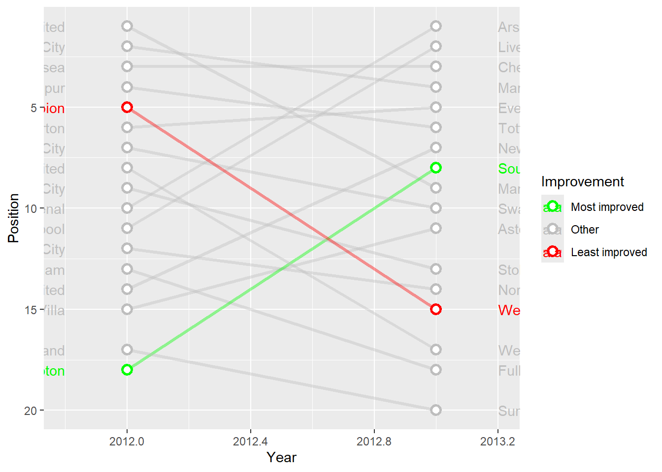
Exercise 16: Now edit the chart further so team names are visible, years are listed at the top and axis are removed.
Show the answer
SlopeChart <- SlopeChart +
  labs(x = NULL, y = NULL) +
  scale_x_continuous(expand = c(1, 1),  # Adds space to the right for labels
                     limits = c(min(PL$Year)-1, max(PL$Year) + 1), #set x-axis limits
                     breaks = seq(2012, 2013),
                     position = "top") + #label the axis at the top.
  theme_minimal() +
  theme(
    panel.grid = element_blank(),
    plot.background = element_rect(fill = "gray95", color = NA),
    panel.background = element_rect(fill = "gray95", color = NA),
    axis.text.y = element_blank(),
    axis.text.x = element_text(color = "gray50", size = 10,
                               face = "bold"),
    legend.position = "none"
  ) #you can set pretty much anything within a theme. We can't cover these all in class but definitely worth looking at the different options available.


SlopeChart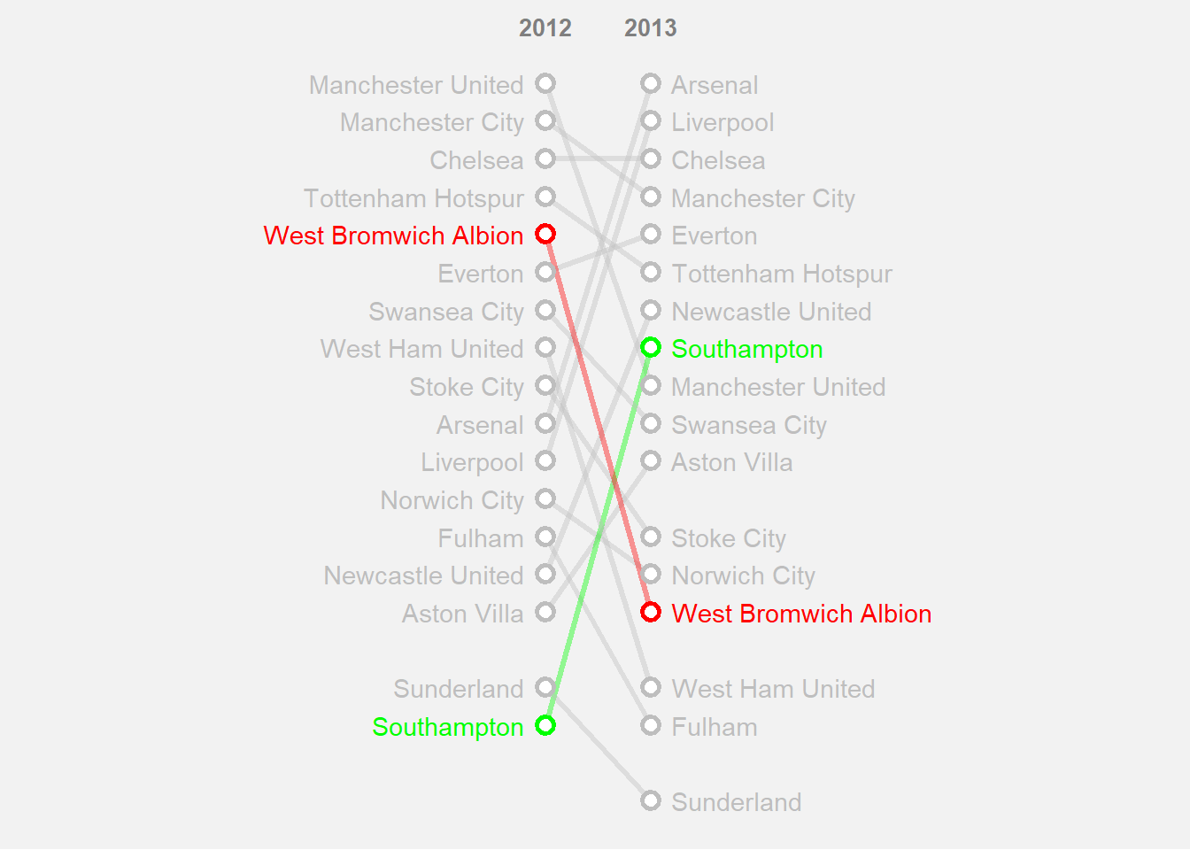
# Make the chart interactive
girafe(ggobj = SlopeChart,
       width_svg = 8, height_svg = 5, #sizes the output plot you do not have to include this.
       options = list(
          opts_tooltip(
            opacity = 0.8, #opacity of the background box
            css = "background-color:#4c6061; color:white; padding:10px; border-radius:5px;"),
       opts_hover_inv(css = "stroke-width: 1;opacity:0.6;"),
       opts_hover(css = "stroke-width: 4; opacity: 1;")
       )
)